| Image |
Comment |
| 11/21/2006 03:54:21 PM |
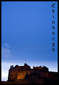
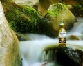
Well you didn't come for the weatherby mambaComment: Your text doesn't really help much here. Your text actually helps me realize how much negative space you have above your subject. The building structure at the bottom is way out of focus and lacks any real detail. It also looks to be clipped short.
The time of day looks as if it would have been perfect for this shot. |
 Photographer found comment helpful. Photographer found comment helpful. |
| 11/20/2006 11:29:20 AM |
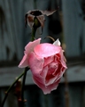
The Last Roseby NikonJebComment: The photo lacks focus. You could have made the colors jump out more also. Some text on the photo may have helped as well. If the rose were more sharp this would score higher. |
| Photographer found comment helpful. |
| 11/20/2006 11:27:54 AM |
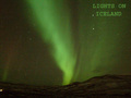
Lights on - Icelandby bogusComment: Way too much noise, there is no sharpness, and even your words aren't focused. I'm not sure if you added noise afterwards, but the noise as over done here. |
| Photographer found comment helpful. |
| 11/20/2006 11:26:34 AM |
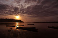
Night at the Damby bryantbusComment: Technical: The lights are bothersome when looking at the photo. Too bright, too much of an orange tent. The orange color then saturates more than half of the photo (even areas where there is no light). You don't see much detail of what you are looking at. There also isn't much focus in your subject.
Other: Compared to most of the other photos in this challenge it is of lower quality (but this challenge is also filled with some AMAZING photos). So don't be discourage by a lower score. |
| Photographer found comment helpful. |
| 10/31/2006 09:35:49 PM |
|
| Photographer found comment helpful. |
| 10/04/2006 04:14:56 PM |
|
| Photographer found comment helpful. |
| 10/04/2006 04:14:09 PM |
|
| Photographer found comment helpful. |
| 10/04/2006 04:11:01 PM |
|
| 09/27/2006 08:46:20 AM |
IMGP5520 small.jpgby LeokComment: Besides the one you entered in the leading lines ....this is probably my favorite one of the group. Again great composition. Enhancing the color in her eyes would make this one even better. |
| Photographer found comment helpful. |
| 09/27/2006 08:39:22 AM |
IMGP5650 small.jpgby LeokComment: It looks as if she is laying on a light table and the background is just slightly to bright and contrasty. It's only bothersome at the tips of her limbs and anywhere where her clothes meet the background because they blend in with the background making it hard to see the edge. Otherwise a nicely done photo. Nice composition. I would like to see a little more contrast in her hair. |
| Photographer found comment helpful. |
Home -
Challenges -
Community -
League -
Photos -
Cameras -
Lenses -
Learn -
Help -
Terms of Use -
Privacy -
Top ^
DPChallenge, and website content and design, Copyright © 2001-2026 Challenging Technologies, LLC.
All digital photo copyrights belong to the photographers and may not be used without permission.
Current Server Time: 06/26/2026 09:29:18 PM EDT.