|
|
|
Showing 471 - 480 of ~707 |
| Image |
Comment |
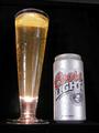
| 05/10/2002 08:39:00 AM | Rock Onby nrouteComment: Nicely done. Very clean and sharp, with no distracting elements aside from those reflections. The upward angle has caused some perspective distortion - the can and glass lean towards eachother. Not a big deal, but it does feel a little odd looking up through the glass. That's a wicked hotspot at the bottom. |
| 05/09/2002 04:17:00 AM | Titleist: The #1 Ball in Golf by mattpgaComment: Nice. I'd have made it a vertical, as the right side in particular doesn't add much to the image and you'd have left some space for copy (if this were a real product shot for an add). Would have given the ball somewhere to go, as well. Just a guess, but was the original underexposed? There's a grayish cast overall , and lots of noise in the blue channel. Almost as if you'd tried to increase the brightness but couldn't go far enough because of the increased noise. If this isn't the case, I'd try shifting the white level to 250 or 245, and maybe raising the gamma to 1.10. Still quite good. |
| 05/09/2002 04:48:00 AM | |
| 05/10/2002 02:00:00 AM | |
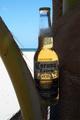
| 05/10/2002 12:22:00 AM | La Cerveza Mas Finaby elliottwhitleyComment: Very inviting. Foreground is very dark, though. A reflector to bounce a little light onto the palm tree and front of the bottle would help a lot. |
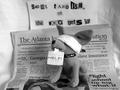
| 05/09/2002 04:27:00 AM | Hostage Situation!by albapeteComment: I was pretty proud of myself for thinking of this as a solution to the 'no added text' problem. You should be, too. Great idea, and, except for a slight blowout in the blindfold, very well photographed. I can't decide whether B/W was the right choice. It does match the message, but I can't help but thinking, since color is the easy way these days, if the kidnappers would have bothered with a conversion. |
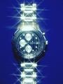
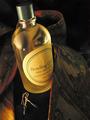
| 05/10/2002 12:43:00 AM | An Eye For Detailby hokieComment: I really like the warm tones here, and I finally found the #$%& eye after reading a hint in the forums. Pretty subtle - could be a fold in the necktie, and I'm not sure what subliminal effect an eye would have. Now a jellybean, on the other hand... The one thing that bugs me a little is the combination of the tie, aftershave and... earrings? I guess it's the old married couple's dresser, but it could also be interpreted as a very bad fashion decision. Also not wild about the lable on the bottle being turned quite so far right. Probably better if the whole thing were legible. All in all, and with a bonus for the reflection, a very nice image. |
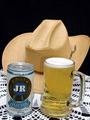
| 05/10/2002 01:22:00 AM | This one's for you ...by pnichollsComment: I suppose that black space would be good for putting copy, but for posting here I'd like to see the composition tighter. It isn't really necessary to show all of the hat - just enough to make it recognizeable. Looks like both your table and tripod were not level, which makes for a very after-several-beers feeling in the viewer. |
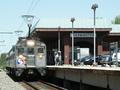
| 05/11/2002 04:06:00 AM | SEPTA: It's Better Than Driving!by ClubJuggleComment: More an ad for a service than the product specified in the challenge, but really more a snapshot than anything. Might have been more effective to think of some way to show that the SEPTA is better than driving - like a view of the train speeding past a line of stopped traffic or something. |  Photographer found comment helpful. Photographer found comment helpful. |
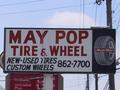
| 05/11/2002 04:08:00 AM | Wanna Tire?by heritconComment: Funny sign, but not really an appealing image of a product in any way that I can come up with... well, I guess there's the image of the tire in the sign, but that's as far as I can stretch. There was a 'signs' challenge a while back where this would have fit better, IMO. |
|
Showing 471 - 480 of ~707 |
Home -
Challenges -
Community -
League -
Photos -
Cameras -
Lenses -
Learn -
Help -
Terms of Use -
Privacy -
Top ^
DPChallenge, and website content and design, Copyright © 2001-2026 Challenging Technologies, LLC.
All digital photo copyrights belong to the photographers and may not be used without permission.
Current Server Time: 07/17/2026 06:08:34 AM EDT.
|