|
|
|
Showing 221 - 230 of ~707 |
| Image |
Comment |
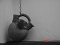
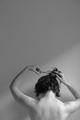
| 06/04/2002 05:49:00 AM | Still waiting to be used...by ragde_77Comment: Of course, the date stamp has to go. A very good subject for B/W - lots of texture and curves to catch light. Avaliable light was a good choice, too. Sadly, the tonal range is limited to black - middle gray, so most of the detail and play of light doesn't show. |
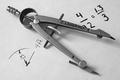
| 06/06/2002 12:40:00 AM | Mr. Langridge's Compassby tlalondeComment: Very nice detail and contrast. The paper could be a little whiter, but I like the texture you can see in it. The writing / drawing could possibly be more consistent looking. The thin and thick lines don't work as well as they could, IMO. Also not sure I like the compass obscuring some of the printing. Small nits. Well done! |
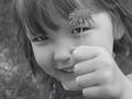
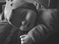
| 06/06/2002 06:04:00 AM | Angelicaby i3ullseyeComment: I envy you the cooperative child. Mine actually will look in the direction of the camera - if anyone other than me is holding it. I really like what you've done here. Might have been better without the flash, as it makes those pinpoint highlights in her eyes, but that's not a biggie. Kind of wish her hand were a little more to the right so it didn't block so much of her mouth and the stem didn't cross her eye, but it's effective, in a way. She's looking at the viewer through the flower. If you were to print this, I'd leave the flower colored, as the rest is slightly soft. Very nice. |
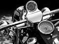
| 06/06/2002 06:14:00 AM | Black&Chrome by vin rigbyComment: A natural for B/W. You did a good job on the chrome, and the overall exposure is very good. Only way I can think of to imrove it would be to have it pointing down the road, but that's next week's challenge. Nice job. |  Photographer found comment helpful. Photographer found comment helpful. |
| 06/04/2002 11:57:00 PM | |
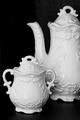
| 06/09/2002 04:17:00 AM | High Teaby Dangerous_bluesComment: Shows nice gradations in the pot and sugarbowl. Good exposure and contrast. The one highlight near the bottom of the pot is slightly distracting, and I'm not sure that cutting off the pot at R was the best compositional choice. Looks slightly tilted to R. |
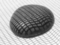
| 06/06/2002 12:46:00 AM | grid rockby lecookComment: Good choice. Textures, play of light and shadow, geometry... my only suggestion is to give the darks just a bit more density. |
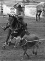
| 06/06/2002 07:05:00 AM | Yeeeee-haw!by lecalanComment: Nice and sharp, but the huge DOF makes the bg around the cowboy a little distracting. Could you have caught the guy who's roped the cow as well if you'd been in landscape orientation? |
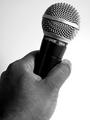
| 06/04/2002 11:33:00 PM | Macro Mic Checkby TmanComment: Great composition, and no-nit technicals. My one suggestion is for the B/W conversion - since you've gone for pure black shadows on the back of the hand and on the grip of the mic, and have that good, bright gradient background, I'd have darkened up the mids just a little to give the detailed part of the hand a little more weight. Bumping up your score on 2nd viewing. |
| 06/06/2002 01:03:00 PM | Hair Cutby KimblyComment: I saw this on your pbase portfolio, and thought 'she'd better submit that'. Good eye for the light. I wish your right elbow were tucked into the frame. Took a while to see the clippings on your shouldesr, but they'd show on a print. |
|
Showing 221 - 230 of ~707 |
Home -
Challenges -
Community -
League -
Photos -
Cameras -
Lenses -
Learn -
Help -
Terms of Use -
Privacy -
Top ^
DPChallenge, and website content and design, Copyright © 2001-2026 Challenging Technologies, LLC.
All digital photo copyrights belong to the photographers and may not be used without permission.
Current Server Time: 07/16/2026 12:17:50 PM EDT.
|