| Image |
Comment |
| 05/16/2003 11:18:53 AM |
|
 Photographer found comment helpful. Photographer found comment helpful. |
| 05/16/2003 11:16:51 AM |
|
| 05/16/2003 11:15:41 AM |
houseby nomoreschiComment: Beautiful photo! Love the colours (how can you go wrong with warm orange tones). The greys of the stones/cement set of the oranges beautifully. To my eyes, the picture looks slightly "curved" to the top, as if the building weren't entirely straight (might be the bifocals); you couldn't get a tall ladder to stand on when taking the picture? Just kidding. So, they use plastic shopping bags there also? ~9 |
| Photographer found comment helpful. |
| 05/15/2003 10:20:19 PM |
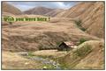
1910 Hand Colored Postcardby autoolComment: From the Critique Club
Hello, Richard,
I am so glad I get to look at your postcard again, in detail. It's a lovely postcard. I don't see anything wrong with the photo. The only thing I need to say (again, I guess) is that the green text to the top left seems out of place. I think that if it wouldn't have been for that green text, this would have been a lot of people's favourite postcard.
The colouration, the framing, the composition, everything (except the green text) is just right. I like the little bit of grey/blue sky shadowed by the brook at the bottom. I love the hill line, the juicy green grass by the brook, the shininess of the water as it comes around the corner.
I thought for a moment that a "raggedy" edge would make this look more like an old hand-coloured postcard. But then, you were creating an old postcard, and, when new, they wouldn't have had a raggedy edge.
Anyway. Congratulations on an excellent entry! By the way, you have quite an eclectic collection of photos in your portfolio. Nice.
Ursula I Abresch
|
| 05/15/2003 07:33:44 PM |
ice cream hutby deceptiveComment: Ice cream hut? I never would have thought of painting one shades of green. Very nice photo, clear, attractive, good colours. I like the little rounded corner on the black frame. ~10 |
| Photographer found comment helpful. |
| 05/14/2003 09:37:30 PM |
In spring showers...by CDR1986Comment: Is that the stem on the back of a daffodil? Beautiful how you caught the little green worlds in the raindrops. Very nice. ~9 |
| 05/14/2003 09:30:27 PM |
|
| Photographer found comment helpful. |
| 05/14/2003 09:28:56 PM |
|
| 05/14/2003 09:27:33 PM |
Wine and Cheeseby orussellComment: You eat pickles with your wine? I've never tried that. I like this picture, it's "comfortable", and the unusual border actually works here. ~8 |
| Photographer found comment helpful. |
| 05/14/2003 09:22:08 PM |
secondary coloryby AesculapiusComment: Aren't "Taschen" pockets? How come all these books are called Taschen? Are they pocket-books? Nice picture, btw. |
Home -
Challenges -
Community -
League -
Photos -
Cameras -
Lenses -
Learn -
Help -
Terms of Use -
Privacy -
Top ^
DPChallenge, and website content and design, Copyright © 2001-2026 Challenging Technologies, LLC.
All digital photo copyrights belong to the photographers and may not be used without permission.
Current Server Time: 07/17/2026 05:11:48 PM EDT.


![[purple to green] hey! where's orange and who's that guy?!?!?](https://images.dpchallenge.com/images_challenge/0-999/97/120/Copyrighted_Image_Reuse_Prohibited_21437.jpg)