| Image |
Comment |
| 11/21/2003 10:40:53 PM |
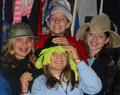
Fun in the Dressingroomby RxP13Comment: On board flash, red eye, dead center composition, title not really showing propaganda. I'm sure they're having fun, but this image doesn't seem to fit into this challenge. 4 -danny |
| 11/21/2003 10:39:39 PM |
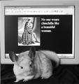
"I do"by AllyrelliaComment: That's what a chinchilla looks like? Cute lil buggar! I'm sure it was difficult to get the guy to stay still long enough for the shot, but your overall focus even on the monitor is soft. To get the 'ad' feel you're wanting, you need a tact sharp focus. A sharpening in your editing software after resize will help some. 5 -danny |
 Photographer found comment helpful. Photographer found comment helpful. |
| 11/21/2003 10:37:29 PM |
Drink, Drive, and Die!by PDavisComment: Not sure the capabilities of your camera, but did you try a portrait mode view looking at the underside of both feet, shallowish DOF and the beer bottles and keys on the bed in the foreground? Something that would look more like an ad compain and not a hodge podge of ideas. 5 -danny |
| Photographer found comment helpful. |
| 11/21/2003 10:34:07 PM |
|
| Photographer found comment helpful. |
| 11/21/2003 10:31:33 PM |
Psst...Wanna Buy a Watch?by mariomelComment: I DO!
Did you try a portrait orientation for this shot? or a square crop to loose most of the right brighter part of the image. 6 -danny |
| Photographer found comment helpful. |
| 11/21/2003 10:30:29 PM |
Which one to choose?? hmmmm...by andlbComment: With the portrait orientation of the magazine, a portrait mode in your shot would be compositionally more pleasing. You also shot under tungsten lighting with your white balance not adjusted for it. This leaves a yellow cast to your shot. 5 -danny |
| 11/21/2003 10:27:57 PM |
|
| 11/21/2003 10:26:48 PM |
|
| Photographer found comment helpful. |
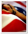
| 11/21/2003 10:25:47 PM |
Fallenby mediamstComment: Your image is 489 pixels on the long side. When you save the image, save it at 72 dpi and 640 pixel on the long side. This will give us a better view of your details. The image overall is powerful in it's statement. Good lighting and composition. I wouldn't mind seeing more of the hand. 8 -danny |
| 11/21/2003 10:23:43 PM |
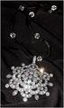
POUR MOI - French Luxury Jewels Since 1781by BBBastetComment: Nice crop and layout. The overall lighting is lacking in this shot. You may need multiple lights and a light box around the jewels. There is a how to under the Learn link of someone who photo'd a watch, and they show step by step how they set up the lighting to get the best results. 5 -danny |
| Photographer found comment helpful. |
Home -
Challenges -
Community -
League -
Photos -
Cameras -
Lenses -
Learn -
Help -
Terms of Use -
Privacy -
Top ^
DPChallenge, and website content and design, Copyright © 2001-2026 Challenging Technologies, LLC.
All digital photo copyrights belong to the photographers and may not be used without permission.
Current Server Time: 06/12/2026 07:18:23 AM EDT.