| Author | Thread |
Comments Made During the Challenge  |
|
|
11/25/2003 12:19:41 PM |
|
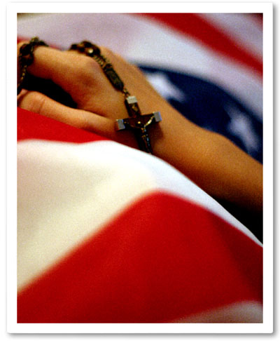
Good Idea! I think the hand and cross could have used more focus. |
|
|
|
11/25/2003 07:43:13 AM |
|
|
|
11/25/2003 01:27:04 AM |
|
I fail to understand the connection between the two philosophical/religious elements of the crucifix and the flag. Was this a particular ceremony or was it staged? If it was staged a little fill flash might have helped although the focus on the hand with a very shallow DOF is great effect. I don't like the drop shadow border selection especially with the single line border around the whole image. |
|
|
|
11/25/2003 01:01:52 AM |
|
Beautiful photo but i don't understand the message. |
|
|
|
11/24/2003 12:54:04 AM |
|
To me this is the most powerful photo in this challenge, the soft focus is great for this, the colors are very nice and the composition is top notch...10 |
|
|
|
11/23/2003 07:38:47 PM |
|
Good composition, and the overall blurriness gives a reflective mood. |
|
|
|
11/21/2003 10:25:47 PM |
|
Your image is 489 pixels on the long side. When you save the image, save it at 72 dpi and 640 pixel on the long side. This will give us a better view of your details. The image overall is powerful in it's statement. Good lighting and composition. I wouldn't mind seeing more of the hand. 8 -danny |
|
|
|
11/21/2003 12:41:25 AM |
|
|
|
11/20/2003 10:04:12 PM |
|
I don't like the border here... in my opinion, it could better without it... |
|
|
|
11/20/2003 10:52:57 AM |
|
A strong image with a nice abstract touch whilst retaining the recognition factor. To me the message is anti war - I'll be interested to know what message was intended. The image quality seems a little grainy. |
|
|
|
11/19/2003 06:07:45 PM |
|
A drop shadow border may look OK on a white page, but against the DPC grey it doesnt look right. |
|
|
|
11/19/2003 09:05:22 AM |
|
 Photographer found comment helpful. Photographer found comment helpful. |
Home -
Challenges -
Community -
League -
Photos -
Cameras -
Lenses -
Learn -
Help -
Terms of Use -
Privacy -
Top ^
DPChallenge, and website content and design, Copyright © 2001-2026 Challenging Technologies, LLC.
All digital photo copyrights belong to the photographers and may not be used without permission.
Current Server Time: 06/28/2026 11:20:30 PM EDT.