| Author | Thread |
Comments Made During the Challenge  |
|
|
11/25/2003 02:28:53 PM |
|
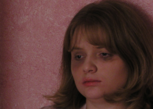
Photo is a bit dark. (Under exposed) Really hoping that this is make-up or something has been done to improve the situation. 7 |
|
 Photographer found comment helpful. Photographer found comment helpful. |
|
|
11/23/2003 06:24:00 PM |
|
| Photographer found comment helpful. |
|
|
11/23/2003 03:30:14 PM |
|
Show don't tell/ the title is too much. but let me stress. Great shot. Is it cropped too much or is the resolution low or is it just blurry? |
|
| Photographer found comment helpful. |
|
|
11/23/2003 01:36:11 AM |
|
this is aserious subject you bring to light. The bruises look so real. I hope they are not. Good subject. A bit grainy though, not sure if that was your intended effect. |
|
| Photographer found comment helpful. |
|
|
11/21/2003 10:34:07 PM |
|
Hrm... I can see a statement of you meaning to have the soft focus and underexposed shot, but to me it makes the image seem more of a snap shot than a planned shot. Did you try a black and white conversion with higher contrast? This might have given you more of an artistic interpretation. 5 -danny |
|
| Photographer found comment helpful. |
|
|
11/21/2003 05:24:35 PM |
|
| Photographer found comment helpful. |
|
|
11/21/2003 12:23:57 PM |
If this is reality based, get away from that person and never look back!!! Abuse is a progressive disease. It gets worse not better.
As for the photo, it is appropriately out of focus and dark. |
|
| Photographer found comment helpful. |
|
|
11/20/2003 01:42:16 PM |
|
i like the topic and the idea. i think the lighting to could be more dramatic to add to the effect. the focus is also too soft. |
|
| Photographer found comment helpful. |
|
|
11/20/2003 12:24:28 PM |
|
Very strong message here, well done. the whole pic looks a trifle dark tho, sum more light on the subject mite b needed. |
|
| Photographer found comment helpful. |
|
|
11/20/2003 03:00:51 AM |
|
Portrays an awful feeling very effectively. Good shot. |
|
| Photographer found comment helpful. |
|
|
11/19/2003 01:34:03 PM |
|
this is sad, really sad, and you are showing it in your picture. a true painfull feeling! |
|
| Photographer found comment helpful. |
|
|
11/19/2003 10:49:52 AM |
I thought your picture and message were good, though I wish you hadn't included the parenthetical addition - leave some to us, I think we could have figured it out! I think that the only way the photograph might have been better was to use either a black or white background... that pink takes away from the seriousness of the shot, since it's a black and white (hard, clear) issue. I also wish her face was a bit more in focuse. Maybe making the picture black and white would be nice too.
Overall, you did a nice job, and I liked your entry. |
|
| Photographer found comment helpful. |
|
|
11/19/2003 04:43:22 AM |
|
Not bad, but you could have used this as an anti abusive propaganda too with a different name. Focus a bit soft and lights need improvement IMHO but I understand that you wanted to hide the make up. 8 |
|
| Photographer found comment helpful. |
|
|
11/19/2003 12:11:45 AM |
|
Wow. Believeable and powerful. Some technical notes: I would guess you were going for dark tones, but I think a bit more contrast would have helped. Also, I think the light falloff towards the left is a bit too delineated and sudden. If it were mine, I am not sure whether I would have cropped it or tried for a more gradual drop off. Overall: Superb! |
|
| Photographer found comment helpful. |
Home -
Challenges -
Community -
League -
Photos -
Cameras -
Lenses -
Learn -
Help -
Terms of Use -
Privacy -
Top ^
DPChallenge, and website content and design, Copyright © 2001-2026 Challenging Technologies, LLC.
All digital photo copyrights belong to the photographers and may not be used without permission.
Current Server Time: 06/28/2026 06:47:29 AM EDT.