| Image |
Comment |
| 09/03/2006 12:05:29 AM |
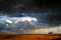
Desolationby angela_packardComment: With the 'textures' present this photo really takes on the appearance of a painting. The colors on the ground, the textures seen in the darkening sky and the single building really sets a mood for an isoloted place. A lone stop far off the beaten path of the more well-traveled roads by the looks of things and the deserted road off on the left hand side. Again this photo projects a feel of a painting representing a slice of rustic Americana. |
 Photographer found comment helpful. Photographer found comment helpful. |
| 09/02/2006 11:57:55 PM |
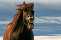
Freestyleby BrinComment: My, what a lovely smile you have! And a loud whinning laugh to go with it! Maybe this pony is not uttering a sound at all at the time of this capture but with your shot I actually *hear* a horse laugh. Wonderful capture of a candid moment of this animal. Love the rich tones on it's coat. My only critique is that I wish that the eyes were open. Not so easy to accomplish because a moment is all one sometimes gets so I am not dinging you for it but mearly expressing that it is a shame that the eyes could not be open at the moment of capture. |
| Photographer found comment helpful. |
| 09/02/2006 11:49:07 PM |
The Collectorby freakin_hilariousComment: Colors are vibrant, but the yellow-orange hue on the honeybee appears a tad too vibrant. It almost glows on my screen. The lavender hues appear fine it is just that there seems to be too much saturation which is very evident from the stripes on the honeybee. Composition is average and could be better if you brought the viewer in for a closer look - A closer crop to the bee and the flowers it is near would improve this composition. The bee would be your main focus with a few flowers being the supporting cast. |
| Photographer found comment helpful. |
| 09/02/2006 11:42:28 PM |
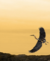
Ascentby graphicfunkComment: What really makes this shot beautiful is the stork and the golden hues of the sky. Absolutely love the outsretched wings of this stork/crane taking flight. It takes flight into a golden sky. The golden hues are both warm & soothing. The color of the sky makes me think of a early morning when there is a hushed quiet that is only broken by the flapping of wings. I am looking at this image and I do see one simple way to posibly improve on it should you like the suggestion. Are you familiar with some of those Japanese paintings done on corkboard. Some are very beautiful and elegant. Most of those I have seen feature birds such as peacocks, storks or cranes. Because they are painted on cork the composition of such art is mostly tall, rectangular panels. I think you can easily mimic that Japanese styled artwork by cropping 1/3 of the picture from the left. That way the ascent of the stork/crane dominates the scene even more. |
| Photographer found comment helpful. |
| 09/02/2006 11:30:22 PM |
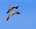
Synchronous Flyingby CEJComment: Great capture! What really makes this photo interesting is that you caught the wings of these two birds in sync. From a side profile the downward flap of the wings shows us all the lovely detail and shades of color in their wing feathers. There is an awful lot of negative space dominating this shot and I am left wondering why. I think the composition would benefit from a tight crop or zoon on just these two birds. They are your main focus so a tighter crop would keep the viewers attention set solely on them. |
| Photographer found comment helpful. |
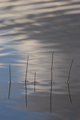
| 09/02/2006 11:16:43 PM |
Morning Meditationby ellamayComment: A very Zen-like photo almost haiku in composition and simple beauty. I do like the idea but I feel that some elements of the composition need improvement to move it out of the average category and into the wonderfully elegant category. This capture has much potential. First, a closer crop, say a square crop on just the reeds and some of the water. As such you have too much negative space both above and below the reeds that do nothing for the composition as a whole. A tighter frame would keep the focus on the main subjects -the reeds. Next, the dual color tones seen here is not complementary to the zen-like mood or composition. The water has a blue hue on one side while the other side is a brownish shade. I wonder if you could have moved to change angle to get just a solid blue shade for the composition. This would have enhanced the zen-like feel for the blue symbolically represents harmony and just one dominent color gives it that simple elegance that dominates much of zen photography. |
| Photographer found comment helpful. |
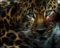
| 09/02/2006 11:06:55 PM |
Watching From The Shadowsby idnicComment: Love the sharpness of detail and textures in this photo of this predator. The clarity is such that you can see and 'feel' the individual hairs on his/her fur coat - that is the texture I speak of. You can 'feel' it's softness should one dare to touch it. By viewing the photo of this creature, it is the safest way for us to 'touch' it:-) Love how there is a slight patch of light that falls just on the eyes and seems to illuminate & call greater attention to them. Those staring eyes are hypnotic as well as the beauty of this animal. Love the colors too - very bold and vibrant neither washed out or in heavy shadow. A wonderful capture. |
| Photographer found comment helpful. |
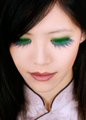
| 09/02/2006 10:58:01 PM |
Waiyanby kiwinessComment: It is said that 'the eyes are the window to the soul' and that 'a woman's eyes are captivating' but I have never before seen a photo capture a woman's eyes that are closed AND STILL be captivating & compelling to look at! The composition and color bear a certain individuals style on DPC and indeed you may or may not be said individual;-) Anywho, back the the photo. The colors of violet-blue and green on those eyelashes are stunning and vibrant. She 'fans' those beautiful colors and the viewer is instantly attracted to her. She is exotic not just in her culteral beauty but in those colors of the eyes. Well done. |
| Photographer found comment helpful. |
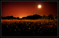
| 09/02/2006 10:50:06 PM |
'Moon' flowersby MadMan2kComment: The colors are bold and vibrant in these shot. The reds, oranges and golds are very warm hues and as such are more readily equated with the sun rather than the moon. It is the title that tells our eyes not to be deceived. It is the moon that illuminates this field of flowers. Given that, it influences me to think of warm October nights and the illumination of the flowers sets a tone & mood of us glimpsing an otherworldly realm - of magic, fairies, and spirits that walk the earth. The moon is full and it illuminates a magical world rarely seen. My only critique is that there are some drop-out/specks near the moon and some off to the right hand side of the sky. Those can be cloned out so as not to offer distraction. |
| Photographer found comment helpful. |
| 09/02/2006 10:38:53 PM |
[ R E F L E C T ]by ericwooComment: I really like how you composed this shot. The colors are fabulous too as that they pop off the page. I find it interesting and compelling on the position of the flag - you have the strips facing down and whether it was intentional or not it does make one reflect on the 'fallen' towers and the fallen. The ones who died and the ones who laid down their lives - the fallen heroes. The fireman in the foreground makes us think of those who gave of themselves on the fateful day of 9/11 - and it doesn't have to be JUST that day but every day these public servants go out there 'to protect and to save lives'. This photo makes the viewer reflect on their contribution to the Nation. Now, I do have a critique and it is with regards to lighting. I think that you needed to cast more light on the helmet and fireman for he is a bit too much in shadow. Yes, one could say compositionally that plays well into the mood - he is in the shadow because of a pervading sadness with regards to fallen comrades. BUT with less shadows falling on his helmet and left shoulder, the fireman would be much more prominent and have an even greater impact on the photo composition because his uniform will be more visible (especially the crest on the front of the helmet which now rests in shadow and is barely visible). |
| Photographer found comment helpful. |
Home -
Challenges -
Community -
League -
Photos -
Cameras -
Lenses -
Learn -
Help -
Terms of Use -
Privacy -
Top ^
DPChallenge, and website content and design, Copyright © 2001-2026 Challenging Technologies, LLC.
All digital photo copyrights belong to the photographers and may not be used without permission.
Current Server Time: 06/11/2026 06:31:35 PM EDT.


![[ R E F L E C T ]](https://images.dpchallenge.com/images_challenge/0-999/536/120/Copyrighted_Image_Reuse_Prohibited_387738.jpg)