| Image |
Comment |
| 09/21/2007 10:03:16 AM |
Once upon a time there was a nut and cheese ball...by aimeethetooComment: Ah, now look what you did! I am hungry for some cheese...going to get the Mahon Spanish cheese in the fridge to nibble on:-) O.K. back to the critique. Lighting and color tones are simply excellent in your composition! Love the model's expression and the title really plays up the humor of the photo. I really don't have any suggestions on how to improve upon this image. Good job on this one! |
 Photographer found comment helpful. Photographer found comment helpful. |
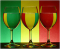
| 09/21/2007 09:53:58 AM |
Rastafarian Refractions (A Tribute to AlexSaberi)by shalrathComment: Wow, nice lighting and color refractions in the glass! You have some good colors and a very nice tonal variation in the colors seen here. My only suggestion is that the it is a little dark and the vibrancy of the colors in your composition could do with a bit more zing. Simply playing around with Saturation (not too much as that you don't want over-saturation) and boasting the contrast on Brightness/Contrast levels could make the colors really pop off the page. |
| Photographer found comment helpful. |
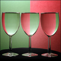
| 09/21/2007 09:53:14 AM |
Take Your Pickby MWittComment: Wow, nice lighting and two-tone color refractions in the glass! You have some good colors and a very nice tonal variation in the colors of your composition. My only suggestion is that the it is that the contrast is a little flat. Boast up the Contrast in the Brightness/Contrast levels and it will visually pop even more. Saturation is a tad light. I think the composition would perhaps benefit from a little more deepness and saturation in the tones. Simply playing around with Saturation levels (not too much as that you don't want over-saturation) as well as the Brightness/Contrast levels would really take this from above average to stellar. |
| Photographer found comment helpful. |
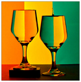
| 09/21/2007 09:35:36 AM |
Homage to Hughletherenby brownsmComment: A very good attempt in emulating the original. Colors appear a bit dark and some portions of the glass are not as well illuminated as the original. There is something going on to the left of the composition that is giving off a red cast to the black surface. Lighting really plays a key role in helping an image pop visually. Play with your lighting set-up to make sure all objects are illuminated evenly and can be clearly visible - especially that water drop in the glass. BTW nice timing on the capture of that waterdrop as that I am sure it took many tries just to get it. The other thing in how your composition defers from the original is that you place one glass on a platform while the original relies on 'illusion' by placing one glass slightly forward while the other hangs back (if you look at his tutorial you will see the placement of the glasses Hughletheren Blue Ribbon Homage None-the-less a good photo but the lighting needs to be much better. |
| Photographer found comment helpful. |
| 09/21/2007 09:23:00 AM |
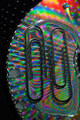
Primary Glass after Jackoby banmornComment: Lovely set-up and wonderful colors! The patterns of refraction in the glass are nice but only fully capture two colors instead of the three. My guess is that you needed taller more elongated glasses instead of the more rounded bowl shaped ones here to get the same effect as Jacko's. While the colors are beautiful the tones need to have more contrast and tonal variation. My guess is that lighting perhaps plays a key role. Playing with the lighting set-up may give you that same tonal variation in the shades of the color. Just found this on how Jacko' created his Primary Colors. If you follow the link to camera angles you will notice how the light source plays on the backdrop (specifically Primary colors angles. Here you see some nice spot on lighting that gradually fades into some deeper shades as it falls into shadow. That's what you need in your backdrop colors for they appear flat and one-dimensional. Adding that tonal variation in the shot with greatly increase the visual 'wow' of this composition. |
| Photographer found comment helpful. |
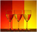
| 09/21/2007 09:07:19 AM |
Triple Glass Refraction 2by gg3rdComment: Lovely set-up and wonderful colors! Nice choice of warm colors and a fade from the red to orange to a yellow hue. The patterns of refraction in the glass are lovely to look upon. I really only have two suggestions on how to improve the visual impact of this piece. The first is that while the colors are beautiful the tones need to be a bit more vibrant - playing around with the saturation levels will increase the vibrancy of the hues and make it pop more visually. Second is the angle. It appears to me that the camera was tilted slightly down at the glasses. I think that if the base of the camera was at level with the base stem of the glasses it would give off the appearance of the glasses being more at eye level to the viewer. Of course that may have changed the pattern of the refraction but for good or bad I don't know. |
| Photographer found comment helpful. |
| 09/21/2007 08:56:24 AM |
Tribute to Gaurawa's Surface Tension by 4trtoneComment: This is a good attempt at trying to emulate the original. However there are several areas that need improvement to catapult this into an above average shot. First you have the nice psychedelic colors & patterns as the backdrop for the paperclips but they need to encompass the whole backdrop to increase visual impact. Showing the edge of the CD and a black backdrop beyond it breaks up the patterns we see in the prismatic colors. When showcasing one major element you really need to have ONE solid backdrop; adding more just distracts the eye. Perhaps the CD was not a good choice because you don't have alot of space to encompass the paperclips without getting the edge in the picture. Hmmm, just a suggestion since I don't know all the details on the setup on creating this shot: mayhap some holographic or shiny wrapping paper might have done the trick? Next, lighting needs to be better. The paperclips appear just as dark shapes. Using one overhead desk lamp or maybe several light sources around the objects would illuminate them more not to mention minimize or eliminate the shadows thrown off such as the shadow we see on the bottom right paperclip. Lighting them better will show off there metallic sheen. Angle of shooting your subject can greatly increase visual impact. I think it would greatly improve the visuals if you shot this from an overhead looking down angle. The reasons is that it would REALLY showcase the patterns & colors of the background especially within the paperclips. |
| Photographer found comment helpful. |
| 09/21/2007 08:34:32 AM |
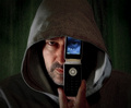
iMode 2.0by RulerZigzagComment: Nice job in emulating the original. Colors and sharpness of details are wonderful! Lighting is well done well but could be better for the right hand side of the model falls too much into shadow - another (dimmed for you don't want to lose too much shadow) light source to evenly light the model will help. My other suggestions on how to improve this above average shot is the framing and pose of the model. I think it would improve visual impact if you zoomed in just a tad closer - bring us closer to the person will show us more details. Lastly the pose of the model has his hand on the phone but his finger covers the buttons. The devil is in the details, I know, but showing us more of the object that is projecting the iMode eye would increase visual impact because it strengthens the visual cues that this is a phone. Have your model cup the outside edges of the phone with his fingers and it will showcase this important element in the composition. Aside from that good job. |
| Photographer found comment helpful. |
| 09/21/2007 08:18:36 AM |
iMode IIby MAKComment: Very nicely done! This really emulates the original very closely. Colors and sharpness of details are wonderful. My only suggestion on how to improve this one is that the lighting could be better to fully illuminate more details on the iMode eye and the buttons on the phone. As it is now, we know it is a phone but we need more 'visual' cues to strengthen that connection. The number buttons are too much in the shadow. The iMode eye while visible some of the eye gets lost in shadow when you venture towards the left half. Either have another dimmed light source shining forward on your model OR since this is Advanced Editing you could select those portions that are too dark, feather the selection (to avoid hard edges), and then play with Brightness/Contrast and/or Gamma correction. |
| Photographer found comment helpful. |
| 09/20/2007 01:37:39 PM |
The Only Note She Left (I Hate You Too/Two)by jonfrommkComment: Nice lighting, sharp details and good color tones on your emulation of the original. There is one element lacking in here that would increase the visual impact of the composition. It is the choice of ring. The plain gold band stereotypically is more readily associated as the man's wedding ring. A majority would be looking for a ring that illustrates the stereotypical feminine ideal "diamonds are a girls best friend". Many woman's wedding bands have diamonds (or can be found in engagement rings). There are some wedding bands that are just the plain gold band for simplicity but ask many people and the majority would say a diamond wedding band fits the standard vision of a woman's ring. By placing a ring with a diamond in the composition it would strengthen the imagery & emotional impact of a woman leaving a 'wedded' relationship that founded on the bonds of love. None-the-less great job on all the technicals of the photograph. |
| Photographer found comment helpful. |
Home -
Challenges -
Community -
League -
Photos -
Cameras -
Lenses -
Learn -
Help -
Terms of Use -
Privacy -
Top ^
DPChallenge, and website content and design, Copyright © 2001-2026 Challenging Technologies, LLC.
All digital photo copyrights belong to the photographers and may not be used without permission.
Current Server Time: 06/19/2026 02:23:56 AM EDT.