| Author | Thread |
Comments Made During the Challenge  |
|
|
09/22/2007 10:35:15 PM |
|
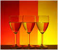
The glasses being uneven (at the top) steals from an otherwise good composition. There seems to be also some angle to the subjects, as the water is well leveled, but the table's edge is not. |
|
 Photographer found comment helpful. Photographer found comment helpful. |
|
|
09/21/2007 09:53:58 AM |
|
Wow, nice lighting and color refractions in the glass! You have some good colors and a very nice tonal variation in the colors seen here. My only suggestion is that the it is a little dark and the vibrancy of the colors in your composition could do with a bit more zing. Simply playing around with Saturation (not too much as that you don't want over-saturation) and boasting the contrast on Brightness/Contrast levels could make the colors really pop off the page. |
|
| Photographer found comment helpful. |
|
|
09/20/2007 05:45:53 AM |
|
don't care for the colors, but you missed that the background of Alex' shot is out of focus and ONLY the refractions are sharp, which is essential for the overall impression. Besides that, your glasses don't stand even. |
|
| Photographer found comment helpful. |
|
|
09/20/2007 12:32:54 AM |
|
I really like the vividness of the colors reflected in the bases. Seems a bit muddy on top, light falloff I guess. And it sure does show how irregular some wine glasses are shaped. 6 |
|
| Photographer found comment helpful. |
|
|
09/19/2007 02:58:06 AM |
|
Nice work...although a bit noisy on the background. |
|
| Photographer found comment helpful. |
|
|
09/17/2007 07:49:46 PM |
|
I gotta say...I prefer yours. I like your color scheme more and it is sharper than his. Sorry Alex. |
|
| Photographer found comment helpful. |
|
|
09/17/2007 06:37:20 PM |
|
The symmetry of the glasses is going to hurt you on this one - what's up with the tilting middle glass? |
|
| Photographer found comment helpful. |
|
|
09/17/2007 01:55:31 PM |
|
Great colors! Nice rule of thirds! |
|
| Photographer found comment helpful. |
|
|
09/17/2007 01:34:03 PM |
|
Beautiful lighting! You did great. |
|
| Photographer found comment helpful. |
|
|
09/17/2007 07:43:55 AM |
|
|
|
09/17/2007 04:47:41 AM |
|
the middle glass is really bothering me. |
|
| Photographer found comment helpful. |
Home -
Challenges -
Community -
League -
Photos -
Cameras -
Lenses -
Learn -
Help -
Terms of Use -
Privacy -
Top ^
DPChallenge, and website content and design, Copyright © 2001-2026 Challenging Technologies, LLC.
All digital photo copyrights belong to the photographers and may not be used without permission.
Current Server Time: 06/28/2026 08:39:27 PM EDT.