DPChallenge: A Digital Photography Contest You are not logged in. (log in or register
 
Browse Settings
Currently viewing:
Registered Useryanko

Show comments:

Per page:

Order:

Comments:


Comments Made by yanko
Pages:   ... [524] [525] [526] [527] [528] [529] [530] ... [640]
Showing 5261 - 5270 of ~6391
Image Comment
Overcoming Challenges as a Team
05/08/2006 03:02:06 AM
Overcoming Challenges as a Team
by Skip

Comment:
Very nice photo. I'm wondering if this was hurt because it looked like a setup shot vs capturing something real. The lack of logos/decals on their shirts adds to that perception. The guy at the top in the white clearly has it but he isn't as noticeble.
Photographer found comment helpful.
Backlit Under Clouds
05/08/2006 02:49:28 AM
Backlit Under Clouds
by Rebecca

Comment:
Greetings from your own critique club.

First Impression:
Lacks contrast. That's probably more to do with staring at so many DPC images that push that to the max however. If that wasn't the case I might have been attracted to the framing of this more so.

Composition:
Speaking of framing I like this the most in your photo. The horizon isn't in the middle which is good and the main focus, the top of the rock is located in the "rule of thirds" area. I don't think there is anything I would change in the way you composed this shot.

Subject:
Is interesting. Good texture although I probably would have sharpened it or boosted the contrast a tad more. However, I may not be the best judge for this since I'm often accused of doing that too much to my images. :)

Technical (Colour and light):
A bit overexposed and there's a haze in there that saps the color somewhat. Also, it would have been better if you managed to get more light raked over the bottom part of the rocks like how the top part is. However, that may have been impossible given the environment or timing of this shot.

Improvement:
Really just remove the haze and boost contrast a bit. If you us photoshop I suggest using the unsharp mask tool which can help with both. If you are unfamilar with using that tool for that purpose here is a link that explains it. Also, I might add if you want to appeal more to the DPC voters I'd also suggest boost the saturation. In a lot of images I've seen do well the "wow" factor is carried or supported heavily by bright bold colors. However, that's something for you to decide if you want to cater to that. The image in my opinion doesn't need it but that's just me.

Summary:
A good image. Looking at the voting pattern of this photo it seems to me that even the slightest of tweaks (like the contrast/haze adjustment) could have really helped the score by turning those 4 votes into 5s and 6s. When it comes to these challenges that's all you're really trying to do (i.e. minimize the low votes). Anyway, I hope this critique is helpful and didn't come off as harsh. If you have any questions feel free to email or PM me. I look forward to seeing more of your work!
Photographer found comment helpful.
Acceptance at the End of Day
05/08/2006 01:50:17 AM
Acceptance at the End of Day
by Bear_Music

Comment:
This is so good. I imagine if the bark on those trees were lighter this would have placed very high.
Photographer found comment helpful.
Dead Photographers Cult
05/08/2006 01:20:35 AM
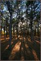
Dead Photographers Cult
by ClubJuggle

Comment:
Great idea and execution. If this was used on a poster I would expect it to be processed more to boost constrast further so as to stand out more at a larger distance. 8.
Photographer found comment helpful.
Down Parson's Creek
05/08/2006 01:17:20 AM
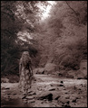
Down Parson's Creek
by dahkota

Comment:
For this challenge I think more contrast would have been better and also having it in b/w. I could definitely see text added in the top right corner with dark burn from the top down. Gets a 7 in the first run through.
Photographer found comment helpful.
Protest!
05/08/2006 01:05:08 AM
Protest!
by JMS

Comment:
What is wrong with people? You don't have to agree with the message.
Hope of the future
05/08/2006 01:03:06 AM
Hope of the future
by kiwiness

Comment:
Man you can do no wrong. Only 3 votes of a 3 or lower? Don't get me wrong I don't see this as DNMC entry but judging some comments on other entries I would have expected this to garner more than it did.

Message edited by author 2006-05-08 01:03:27.
Photographer found comment helpful.
Controversial Exhibit at the National Gallery
05/08/2006 01:00:18 AM
Controversial Exhibit at the National Gallery
by kosmikkreeper

Comment:
That is such an odd photo. It looks like something out of a video game.
Photographer found comment helpful.
HIGH ACADEMY takes the Cup
05/08/2006 12:59:22 AM
HIGH ACADEMY takes the Cup
by manic35

Comment:
Underrated!
Photographer found comment helpful.
(TIME Cover) "America's Fading Glory"
05/08/2006 12:58:54 AM
(TIME Cover) "America's Fading Glory"
by SJCarter

Comment:
I'm wondering how this would have scored if you didn't title this "(Time Cover)". As it is you still got DNMC votes but probably more without the title.
Photographer found comment helpful.
Pages:   ... [524] [525] [526] [527] [528] [529] [530] ... [640]
Showing 5261 - 5270 of ~6391


Home - Challenges - Community - League - Photos - Cameras - Lenses - Learn - Help - Terms of Use - Privacy - Top ^
DPChallenge, and website content and design, Copyright © 2001-2025 Challenging Technologies, LLC.
All digital photo copyrights belong to the photographers and may not be used without permission.
Current Server Time: 09/12/2025 06:17:34 PM EDT.