| Image |
Comment |
| 06/12/2006 10:00:02 PM |
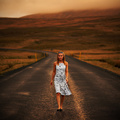
Out from somewhere by LalliSigComment: Larus you ribbon hog. Ok, maybe the pickings were slim but you chose this one? About the only thing you improved upon the original was you showed more skin! :P |
 Photographer found comment helpful. Photographer found comment helpful. |
| 06/12/2006 03:30:34 AM |
Soarby SJCarterComment: Cool image. I really like how the image is balanced so well. I think that one leg up in the air like that does it for me. One thing I might think about tweaking a bit is the string. I would probably just draw a thin line in there so that it doesn't look like it's cut into pieces. |
| Photographer found comment helpful. |
| 06/12/2006 03:23:38 AM |
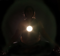
Enlighteningby DigiFotoBuddyComment: Greetings from CTP2
Cool concept although for me the execution didn't quite make it. I really think you needed a much stronger backlight to make your subject glow around the edges kinda like how the hair is but all over. That would give your subject more presence in the frame as well as give a stronger impression that she is radiating with enlightenment beyond just the flare. However, after reading your setup I'm not sure how you would accomplish that while keeping the spot light you capture in the shot that small.
Really the only issue for me is the subject is just too dark. I think you need to go either full blown silhouette in which case you need more contrast from the background or show more features on the subject using a fill light of some sort. |
| Photographer found comment helpful. |
| 06/12/2006 03:11:51 AM |
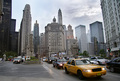
City Architectureby DigiFotoBuddyComment: Greetings from CTP2
I like the focal points in this image. I also like how the traffic flow leads you into the image.
As far as the challenge theme is concern, I think people get a bit too literal with that. To me this shot is about the "city" which may not be a 100% about the architecture but the city scene you captured tells me a lot about why these buildings exist. A shot of just one skyscraper would tell me just the who and the what but this photo also tells me the why. So for me this fits the challenge theme perfectly.
In terms of improvements, I'm not sure I have any for this image. It looks really good as is. However, if this was my image I think I'd probably mess around with the channel mixer and gradient map to get more contrast in the sky but I doubt I'd produce a better result than what you already have. |
| Photographer found comment helpful. |
| 06/12/2006 02:56:04 AM |
Just a Boneby GunnsiComment: Greetings from CTP2
Well it looks like you got hammered here pretty good. For starters, that's a room as far as I can tell even though it's outside. You couldn't tell with a lot of the images if the room was indeed empty or if it was indeed a room period yet many did well including taking a ribbon so I don't get the DNMC votes frankly.
However, you probably knew this was a bit of a risk going in so I think you needed to really give the voters that something extra to tell them why you are entering this shot and you didn't do that. The bone just seems like it was tossed there and you shot it. I do like how the wall curves around and frames the bone but beyond that I don't really see the appeal of this scene you captured. If that wall was indeed left by the vikings maybe you should have shot a viking helmet instead of a bone? Sorry I am not more helpful than that! :) |
| Photographer found comment helpful. |
| 06/12/2006 02:45:30 AM |
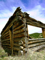
Humble Homesteadby RebeccaComment: Greetings from CTP2
The first thing that strikes me about this is it's sharpness. I think I got a splinter just looking at that detail. :P Speaking of which, you might want to revisit this place for the next texture challenge.
The composition is a little odd to me. Maybe if both sides of the structure ran off into a vanishing point like the left side it would have worked better, IMO. Regardless, I like how you tried to be different here. I would also say rotate the image a bit since the building looks like it's leaning but that actually enhancing the fragile aspect to this.
As far as the sky is concern, it didn't really bother me at first until I read some of those other comments you received. The color does look fake looking but more than that it just looks out of place in an otherwise traditional looking photograph. The color on the building looks good however.
Overall a good image. I like the direction you were going here. Even though I saw a few others like this in this challenge I thought this whole concept of old architecture to be out of the box great thinking so congrats on that front. |
| Photographer found comment helpful. |
| 06/11/2006 04:11:27 PM |
06-10-06 15-10-02 20D_2-01.jpgby dwterryComment: Nice capture here. The subject is bursting in color and is super sharp. The background however is a bit hazy. Might want to use the color balance tool for that. Say give the midtones more blue and cyan? Or maybe think about a selective desaturation of the background? Message edited by author 2006-06-11 16:12:11. |
| Photographer found comment helpful. |
| 06/11/2006 04:02:01 PM |
|
| Photographer found comment helpful. |
| 06/11/2006 03:58:53 PM |
|
| Photographer found comment helpful. |
| 06/11/2006 03:53:52 PM |
Water's Edgeby glad2badadComment: I can't find your original to compare however this looks really nice. The background is quite busy but you made it look good and is not distracting, IMO. In fact having the boat there helps place the subject in context. As for the subject itself you captured it very nicely with good lighting. Such a simple everyday subject made to look good. |
| Photographer found comment helpful. |
Home -
Challenges -
Community -
League -
Photos -
Cameras -
Lenses -
Learn -
Help -
Terms of Use -
Privacy -
Top ^
DPChallenge, and website content and design, Copyright © 2001-2026 Challenging Technologies, LLC.
All digital photo copyrights belong to the photographers and may not be used without permission.
Current Server Time: 06/23/2026 02:57:41 AM EDT.