| Author | Thread |
|
|
06/19/2006 01:11:31 PM |
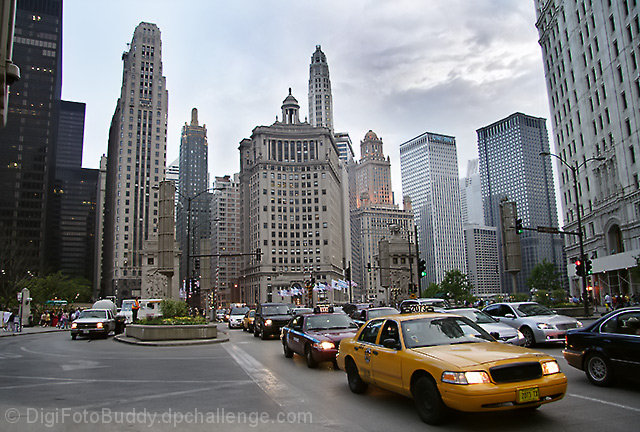
Hello from Álex, CTP MkII
First Impression: wonderful wide shot
Composition: good, like it
Subject: OK for me, but probably too wide for some people on this challenge. By wide I mean that some people, for comments I've seen in others shots, including mine was expecting more shots on details. But I think this shot is perfect for the challenge.
Technical: very good: great DOF, with everything in focus, very natural colors.
Improvement: I'm not sure if correcting the deformation in the perspective of the lateral buildings would help or not, just an idea...
Summary: Well done, maybe chicago deserves a visit...
Álex
|
|
 Photographer found comment helpful. Photographer found comment helpful. |
|
|
06/19/2006 04:22:10 AM |
CPTII, oi!
Dude, this one's more of a cityscape than an architecture entry.
That isn't to say that it doesn't meet the challenge, though. Actually, it does. Quite deviated from the norm, however.
I quite like the buildings in the BG (OMG the subjects's the BG hehe) and the general feel of the whole thing borders on melancholia.
Nice work, Shailesh. |
|
| Photographer found comment helpful. |
|
|
06/15/2006 10:16:39 AM |
CTP2 Gunnsi
First impression:
Citylife, nice and clear photo.
What can you do better?
You did the same mistake that I did in this challenge. Picture of many houses, this is something the voters didn't like.
Only improvement is to select one architecture next time. :-)
This picture is very good but for another challenge.
|
|
| Photographer found comment helpful. |
|
|
06/13/2006 07:52:44 AM |
|
i like this and I think it meets the challenge quite nicely... |
|
| Photographer found comment helpful. |
|
|
06/12/2006 03:11:51 AM |
Greetings from CTP2
I like the focal points in this image. I also like how the traffic flow leads you into the image.
As far as the challenge theme is concern, I think people get a bit too literal with that. To me this shot is about the "city" which may not be a 100% about the architecture but the city scene you captured tells me a lot about why these buildings exist. A shot of just one skyscraper would tell me just the who and the what but this photo also tells me the why. So for me this fits the challenge theme perfectly.
In terms of improvements, I'm not sure I have any for this image. It looks really good as is. However, if this was my image I think I'd probably mess around with the channel mixer and gradient map to get more contrast in the sky but I doubt I'd produce a better result than what you already have. |
|
| Photographer found comment helpful. |
|
|
06/06/2006 04:42:38 PM |
::: Greetings from Critique Club :::
Hi, as requested, here is an indepth critique of your submission.
First Impression - the most important one:
Overall, it seems to be more of a cityscape shot than an architecture shot to me. But, I do like it as a cityscape.
Composition:
A typical architecture shot should draw ones eye to the details of a building. This really has more of a composition that one would see in a subjectless landscape. Compositionally, the yellow cab in the foreground becomes more of a subject than the buildings.
Subject:
The way you have composed this shot puts more emphasis on the taxi in the foreground than the architecture of the city.
Technical (Color, focus, and light):
Focus looks sharp. Color and lighting are both nice. Nothing wrong with the technicals.
To grow its vote?:
Meet the challenge in the eyes of more voters. If the challenge had been cityscapes this shot would have done really well. But, just seems out of place in this challenge.
Summary:
This shot does show competence on the part of the photographer and overall is a good shot.
Hope to see more from you soon,
Leroy |
|
| Photographer found comment helpful. |
|
|
06/05/2006 10:55:10 PM |
Hi from ctp2:
My first impression of this is that it shows busy city life more than the architecture. My eye is drawn to the traffic before the buildings. The ligthing and composition are really nice, though, and it's a great picture. |
|
| Photographer found comment helpful. |
|
|
06/05/2006 10:52:16 PM |
Hello Shailesh!
I think most of the voters' issue with this photo is that it looks more like a snapshot of a city than a photo devoted to that city's architecture. There's too much going on in the foreground with the cars and whatnot, and we can't really see any of the detail on the buildings. The colors are a bit dull and flat. It would be a good candidate for a little Joey Lawrence style grunge treatment, perhaps. For improvement I would suggest focusing more strictly on the buildings, bring out the detail, and pop the color up a bit. |
|
| Photographer found comment helpful. |
Comments Made During the Challenge  |
|
|
06/03/2006 08:11:34 PM |
|
Brings back memories. Even the cloudy sky is typical. Good picture. |
|
| Photographer found comment helpful. |
|
|
06/02/2006 03:22:51 PM |
|
a decent image but it seems too processed (waxy) and i find my eye drawn more to the taxi in the fron than the architecture itself. good use of leading lines with the traffic, though. |
|
| Photographer found comment helpful. |
|
|
05/30/2006 02:59:11 PM |
|
Very interesting city view. |
|
| Photographer found comment helpful. |
|
|
05/30/2006 02:12:02 PM |
|
Needs perspective correction |
|
| Photographer found comment helpful. |
|
|
05/29/2006 12:44:59 PM |
|
Really nice, captures the atmosphere. |
|
| Photographer found comment helpful. |
|
|
05/29/2006 10:12:46 AM |
looks llike chicago to me!
if you took this on the 25 at 1 or around there i walked right past you down and back. on the otherside of the street. lol damn those gray skys and bad weather.
chicago represent! |
|
| Photographer found comment helpful. |
|
|
05/29/2006 08:31:31 AM |
|
Attractive and good.. Nice picture. |
|
| Photographer found comment helpful. |
|
|
05/29/2006 03:47:54 AM |
|
There is to much going on in this picture. Too many buildings and too many irritating objects like the cars. Next time you could choose one building and make it simple. |
|
| Photographer found comment helpful. |
Home -
Challenges -
Community -
League -
Photos -
Cameras -
Lenses -
Learn -
Help -
Terms of Use -
Privacy -
Top ^
DPChallenge, and website content and design, Copyright © 2001-2026 Challenging Technologies, LLC.
All digital photo copyrights belong to the photographers and may not be used without permission.
Current Server Time: 06/28/2026 09:41:14 PM EDT.