|
|
|
Showing 981 - 990 of ~1613 |
| Image |
Comment |
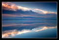
| 06/28/2008 02:56:48 PM | Cooking Lake Sunriseby slickwillyComment: Critique Club Review:
Color Saturation and Hue are all excellent. Brightness and contrast are also very well done. Focus and depth of field are very well done.
Horizon is nice and level. I like the way that the clouds exit the frame right at the corners on the left. Very nice touch.
So, why didn't this picture score better, when there is so much to like? I would say two reasons. First and foremost, the title didn't really expain the "success", and it wasn't obvious in the picture itself. A title that incorporated your feeling of success by getting up that early for a change, probably would have boosted your score. Many voters get pretty litteral about the challenge subject. The second, and smaller reason is the border seems a bit heavy to me. It is bold, and in extreme contrast to the image. It tends to pull my eye away from the image a bit, which is a distraction.
Overall, a very well done image, and one I could see hanging on my wall. In another challenge, this image would have done much better. |  Photographer found comment helpful. Photographer found comment helpful. |
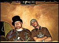
| 06/27/2008 06:47:26 PM | DJ Triplebypass and DJ Gil T. Azellby heavyjComment: Critique Club Review:
Color Saturation and Hue are good. Colors work well here. Brightness and contrast: There are a couple of spots that are blown-out, the neck and cheeks near the nose of (I assume, the puffy one to be) Triple Bypass. The elbow of Gil,is approaching the same point. The wall between them, where I expect it is the reflection of the flash, is also going the bitter edge before it burns out.
I like the post processing here. Gives the picture a nice feel. As others have noted, cropping a bit down from the top would have removed a distracting element.
I also like the way the heads are tilted in unison. It makes it look a little more posed, and less snap-shot-ish.
The technicians in the crowd would have graded you down for centering your subject. But I can see this on a promo poster for these guys.
Nice job.
| | Photographer found comment helpful. |
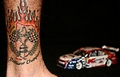
| 06/27/2008 06:37:21 PM | Aussie V8 Team Prideby bcenuComment: Critique Club Review:
Color Saturation and Hue are all good. Brightness and contrast are also good. Skin tones are well done, and look very realistic.
The car distracts from the picture. I try to look at the tatoo, but the eye is consistently pulled away. Even though the car is soft, all the negative space winds up highlighting the car. The leg almost becomes the frame of the picture, which further pushes the attention to the out of focus car.
The tatoo is cut off at the top of the picture, and the foot cut off at the bottom. I would like to have seen the tatoo more in context. Thing that come to mind, are a photo at the track, or perhaps all the team members tatoos repeated across the image next to each other.
Congratulations on back to back wins, that wasn't easy. | | Photographer found comment helpful. |
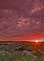
| 06/27/2008 06:28:56 PM | "You will find the key to success under the alarm clock." Benjamin Franklinby alpharichComment: Critique Club Review:
Wow! I'm going to have to start getting up earlier in the morning.
Color Saturation and Hue are all done excellently. Brightness and contrast are very good also. Focus and depth of field also are excellent.
Yes the lens flare helps and hurts a bit. More help than hurt. The starburst is great, the dots not so much.
I really like the colors here.
There may be a little too much cloud at the top of the frame. The sunrise pulls the eye down, so the top becomes almost a wasteland. The grass in the foreground looks almost a little oversharpend.
I'm not sure what it is above the rock, but I like it. It is almost like a little bonus for spending extra time looking at the picture.
Overall a very well done photo. I could see this on my wall or in a magazine.
Does it fit the challenge, doesn't matter at this point. Though as I age, waking up in the morning is a sign of success....
Congratulations on making the top twenty of the class... | | Photographer found comment helpful. |
| 06/27/2008 06:18:56 PM | A New Beginning!by leadham28Comment: Critique Club Review:
Color saturation and hue are done well. Brightness and contrast are very good as well. Nothing blown out, no details lost in shadows.
Focus is good. A shallower depth of field, would have helped concentrate the attention of the subjects. The blue object to the left of the girl distracts. The sign grows out of his head. A softer focus in the background would have minimized this. His gown would help tell the rest of the story.
The technicians in the voting crowd would vote this down a bit for centering the subject. However, what I see in this composition (and I have the advantage of seeing your comments as I write), is that the picture should be about Dane. He is getting upstaged in this photo. The girl is almost head-on facing and looking into the camera. Dane appears to have to bend over to fit into the frame, and the line across the chest of his robe leads the eye to her. Add to that she is in a bright blue dress, and he in a dull black, and she wins each time you look at the image.
Try this... Close your eyes, and open them just for a second, then close them for a couple of seconds, and repeat three or four times. The eyes go to the girl every time.
Overall a nice photo and one family and friends will enjoy into the future. | | Photographer found comment helpful. |
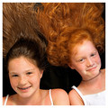
| 06/27/2008 06:05:21 PM | Compare and Contrastby levyj413Comment: Critique Club Review:
Color Saturationa and Hue are very good. The skin tones are very well done. Brightness and contrast are good, although the whites of the dresses are right at burn-out in a couple of areas.
Focus and depth of fied are excellent. Everything that should be nice and sharp, is.
The liquid or wetness of the hair, is a bit odd, and distracts a little from the photo. Makes you wonder why two girls appear to be lying in a pool of water. It also flattens and discolors the hair a bit. A tiny bit wider shot so that the shoulders were not cut off, would be interesting, but then was there enough hair to carry it?
Overall a very good picture. As for the score, I think you have already hit on the issue. It has already been done with more girls and more hair, by scalvert. Had it not been done before, I think you would have made top ten. Voters are funny that way. | | Photographer found comment helpful. |
| 06/27/2008 05:51:21 PM | View of successby dippydazComment: Critique Club Review:
Color Saturation and Hue: Excellenty done! I love the colors in this image. The blues really tie the image together, and the chairs really pop.
Brightness and contrast are very good.
Focus is very good. Nice sharp photo.
I wish this were an advanced editing challenge, cloning out the white tower would be helpful.
The biggest problem I see is that you have two major elements fighting. I like the contrast of the regimentaion "everybody get in line" of the resort, and the free form of nature behind it. But you have two major leading lines fighting to the death here. The chairs and the wall lead the eye towards the left of the frame. The tower grabs the eye then the patterns on the beach and the vegetaion try to make the eye go to the top of the frame. At this point the pop of the chairs hurts the picture as they try to pull the eye back.
This winds up being really two pictures in one, eternally fighting for attention.
|
| 06/27/2008 05:34:11 PM | A Portrait of Successby jodeleeuwComment: Critique Club Review:
Interesting image... I try not to get too involved with the message of the piece, unless the photographer's comments allude to what they were trying to say. Mainly because many people recieve messages the photographer never sent. In this case though, the image begs to be interpreted because there is little else. So I'm going to guess that the message was that the image doesn't matter, winning does. Am I right?
Yes the white of the "image" is blown out. However, I personally think that it adds to the piece here. It ensures that there is no detail and the "portrait" is empty and featureless.
Focus also seems a bit shallow. The top of the frame appears to be starting to go soft. The computer monitor, would have been better turned off. As it is, it distracts the eye. The back wall, or whatever is behind the picture works. I like that texture in this composition. Had you removed all the other distractions, or made them much softer, I think this would have made a stronger statment, and your score would be higher.
I think your score is a bit lower than you deserved. The problem being that this is one of those pictures that you really need to sit and read for a bit. During the voting, people get in a hurry with all the photos to vote on. One of the reasons I like the Critique Club is that I can take time with a single photo and really explore it. Really see it.
So again I say, this is a very interesting image. Not as colorful, not as busy as the others, but very interesting if you spend a bit of time with it. I'd like to see this one done a again.
Nice job... | | Photographer found comment helpful. |
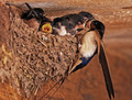
| 06/27/2008 05:18:15 PM | Mothers always do everything to feed up their childrenby CyMaNComment: Critique Club Review:
Color, Saturation, and Hue are all very well done. This is about as realistic as it gets. Brightness and Contrast are very good as well. You did a good job lighting this scene.
Focus is good, but depth a field feels a bit short. While the background is well isolated, at the same time, it feels like softness is creeping into the subject area. The image feels a bit over processed, looking at the area above the babies in the middle of the nest. The background is so immediately soft, and the outline of the babies so sharp.
In the foreground the nest starts to go soft just a tiny bit too soon for my eye. My eye knows that the nest has a rough exterior, but sees softness in the area next to where it attaches at the wall.
I think I might have liked a tighter picture, or less zoom. The detail nest competes with the birds for the eye here. I want to look at the birds, but my eye keeps travelling to the nest.
Overall an enjoyable picture. I believe that you were successful in telling your story. Welcome to the top 25.
| | Photographer found comment helpful. |
| 06/26/2008 07:32:44 PM | Emotional wedding guestsby albc28Comment: Critique Club Review:
A suprise wedding?? Wow! Oops... This is supposed to be a critique, so off we go.
Color and saturation are excellent, brightness and contrast are excellent as well. Focus is nice and sharp. A shallower depth of field may have helped isolate background distractions better.
By your comments this is really more of a snapshot than a portrait. Though the other side of the problem is that genuine emotions like these would be lost, had you posed this picture. In pictures like these, timing is everything. The girl at the right of the frame could be cropped out, but her disembodied hand with the drink would then be an even larger distraction that it is. The person in the plaid shirt needs cropping as well as style lessons.
This has the bones of a really good picture. If you are handy with photoshop, then it can be a picture that will be treasured over the years.
| | Photographer found comment helpful. |
|
Showing 981 - 990 of ~1613 |
Home -
Challenges -
Community -
League -
Photos -
Cameras -
Lenses -
Learn -
Help -
Terms of Use -
Privacy -
Top ^
DPChallenge, and website content and design, Copyright © 2001-2026 Challenging Technologies, LLC.
All digital photo copyrights belong to the photographers and may not be used without permission.
Current Server Time: 07/20/2026 05:55:02 PM EDT.
|