Critique Club Review:
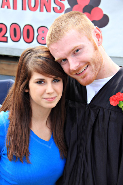
Color saturation and hue are done well. Brightness and contrast are very good as well. Nothing blown out, no details lost in shadows.
Focus is good. A shallower depth of field, would have helped concentrate the attention of the subjects. The blue object to the left of the girl distracts. The sign grows out of his head. A softer focus in the background would have minimized this. His gown would help tell the rest of the story.
The technicians in the voting crowd would vote this down a bit for centering the subject. However, what I see in this composition (and I have the advantage of seeing your comments as I write), is that the picture should be about Dane. He is getting upstaged in this photo. The girl is almost head-on facing and looking into the camera. Dane appears to have to bend over to fit into the frame, and the line across the chest of his robe leads the eye to her. Add to that she is in a bright blue dress, and he in a dull black, and she wins each time you look at the image.
Try this... Close your eyes, and open them just for a second, then close them for a couple of seconds, and repeat three or four times. The eyes go to the girl every time.
Overall a nice photo and one family and friends will enjoy into the future. |