|
|
|
Showing 901 - 910 of ~1613 |
| Image |
Comment |
| 08/23/2008 06:41:26 PM | working in clean roomby ytshuvaComment: Critique Club Review:
Color Saturation and Hue: All three are done well. Nothing is over saturated, hues are realistic, skin tones are great.
Brightness and contrast: Contrast is excellent, however it appears that to get the reflection bright enough, the highlights such as the gloved hand, and some areas on the back of the head, are blown out and featureless.
Focus and depth of field: Focus is excellent. Depth of field is good, but I find myself wondering if I like the back of the head soft or not.
The background in this image is a bit distracting. The grid pattern changes from the top to the bottom of the picture, and then there is that featurless bright white area at the upper left of the image that distracts a bit. Since this is an advanced editing challenge, the white spot, and the brightness of the gloves and head covering could be dealt with.
I really like the reflection in the wafer. Crisply sharp, and great detail. The pose works very well. The intent gaze of the subject at the wafer is very appropriate for this job illustration.
Very nice work. Congratulations on your top 25 finish. |
| 08/23/2008 06:19:37 PM | The Studentby PatsfanComment: Critique Club Review:
Color Saturation and Hue: Colors are rich, saturation is not overdone, and hues are realistic. Skin tones are done particularly well.
Brightness and contrast: Brightness is spot on. Contrast is good, but there are a couple of highlight areas on the shirt that appear to be at the edge of burnout. Not bad, but borderline. Something to keep an eye on.
Focus and dept of field: Focus is nice and sharp. Depth of field looks a tiny bit short. The subjects right hand is far enough forward that it is starting to go soft.
The dark area to the lower left of the subject comes across as a bit odd. The chair to the subject's left and the red wall form one horizon, and then it suddenly changes. The right elbow is cut off by the edge of the image, and detracts a bit. If the subject would be posed with the hand an arm a bit further back, the focus and elbow issue, would both dissapear.
Overall, a nicely done, very humerous image. Nice work. |  Photographer found comment helpful. Photographer found comment helpful. |
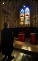
| 08/21/2008 10:06:38 PM | Morning Serviceby heavyjComment: Critique Club Review:
Color, Saturation, and Hue: Colors are good, Saturation is appropriate for this subject, and Hues are realistic.
Brightness and contrast: Image could be a little brighter, the area above and around the window is a little dark for me, which brings the image down a bit. If the brightness were adjusted, likely contrast would have to be also, to keep the highlights from burning out.
Focus and depth of field: Overall focus appears to be a tiny bit soft. Nothing really bad, but I would think it would be a little sharper with this camera/lens combo. Depth of field is excellent.
The image appears to lean a bit to the left. The vertical architectural detail on the left border of the image, and the surface of the altar, and the stained glass windows themselves, all appear to slope a bit downwards to the left. The other thing that may have hurt you a bit is that this image involves the dreaded R word. (Religion) If an image has much to do with western religions, some will vote them lower. (Intersting that this was taken in Japan. Had this been an image in a Buddhist temple, you might have gotten a little higher score. Others are offended by any religion.)
I like the saturation on the statined glass. The is just a bit of washout at the top of the right hand window. I also like the way you have captured the light on the floor.
Nice job of posing the subject. The light on his face works really well. Shows this is a thoughtful piece, not a simple snapshot. Though, as I look I think you may have tried for too much in one image. To fit whole window and all of him in, and both in focus, there is so much there that neither is dominant, neither is large enough to get all the interesting detail in there.
Overall, I like the richness of the color throughout. Nice work. | | Photographer found comment helpful. |
| 08/20/2008 08:54:44 AM | One of many by tjmuellerComment: I'm surprised your image did not score higher. Perhaps because the droplets are small, the two second voters did not take the time to really look at this photo. This is a very imaginative and creative shot. Perhaps a little larger grid on the screen would improve the score. As is I think you should have made at least the top 20 or so. My image scored a little higher than yours, but I have to say that yours is better. Message edited by author 2008-08-20 08:55:34. | | Photographer found comment helpful. |
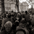
| 08/10/2008 05:50:49 PM | Eye Contact by jjbeguinComment: If there are no models involved, then beware the man in the hat with the dark coat. I think he means you harm. ;-)
Very nice image. And especially so, since he was not a planted model. | | Photographer found comment helpful. |
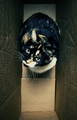
| 08/10/2008 04:41:55 PM | Fragileby snafflesComment: Critique Club Review:
Color Saturation and Hue: Colors are good, nothing is over or under saturated, and hues are accurate for the subject.
Brightness and contrast: Brightness is good, and contrast is good as well. Shadows and highlights both hold the details well.
Focus and depth of field: Focus is sharp, but depth of field is shallow. The cat and the "Fragile" sticker, which appears to be the inspiration for the title of the image, both appear too soft. A smaller aperature will give you a better depth of field. As it is, the subject is soft, and the punctures and tears in the box compete for attention.
I do get a kick out of the expression on the cat's face. They will steal the show, every time. | | Photographer found comment helpful. |
| 08/10/2008 04:35:13 PM | My Cat Likes to Hide in Boxesby freakin_hilariousComment: Critique Club Review:
Color Saturation and Hue: Colors are good, Saturation is very good, and Hues appear accurate for the subject.
Brightness and contrast: Brightness and contrast are excellent. Whites are white. Shadows have good detail, and even the white fur holds the detail well in all but the brightest highlighted areas.
Focus and depth of field: Focus is excellent, as is depth of field. Detail is apparent from the top of the box to the bottom.
Sharpness appears a little over processed as evidenced by a little bit of the jaggies in the thinner section of the cat's whiskers. However this could also be an artifact of resizing.
You did a nice job on the lighting. The catch-lights in the cat's eyes are done very well. And of course the cat has the standard "are you about done?", look that most cats get when we want them to do something for us.
The box shape makes it so that the cat is centered left to right, which may have hurt your score somewhat with the technical purisits. Challenge purists would have voted slightly lower also, as the cat is the subject, rather than the box.
| | Photographer found comment helpful. |
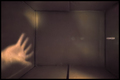
| 08/10/2008 04:19:54 PM | Flyingby WyrdlingComment: Critique Club Review:
Color, Saturation and Hue: Colors appear pale, due to over brightness. Saturation appears a bit low for the same reason. Hues appear accurate.
Brightness and contrast: Picture is overly bright, and contrast appears low. Most likely because the scene is heavily back-lit.
Focus and depth of field: Focus is hard to juge because of the lighting. But does appear a little soft. Depth of field is adequate.
While the picture is full of technical issues, the sky is featureless, the box is washed out by the back-lighting, etc., it is still interesting and entertaining. The sky is the sky and the only thing that can be done, is throw the box in a different direction to help the lighting and wait for a different day with a more interesting sky.
I think you caught the box at just the right moment, at just the right angle at the top of the frame, so that even though the picture came in last, it still is more interesting than some of those who scored higher.
|
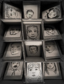
| 08/10/2008 04:01:53 PM | Do not put me in your...by posthumousComment: Critique Club Review:
Color, Saturation, and Hue: N/A, image is monochrome.
Brightness and contrast: Contrast is good, shadows hold detail, and the highlights are not blown out. Brightness could be a little brighter, but is still very good.
Focus and depth of field: Both are excellent.
While the image is centered, which may have affected the vote of some tehcnical purisits, I don't know of a better way to do this one. Though an image from a bit further back could be interesting also. I think the lighting is excellent. I really like the play where the center column is up-lit, and the outer columns are down lit. I also like the way the top row is different. Had it been the same as the other two, I think there would have been too much repitition.
The only thing that I would say could be called "wrong" here, is that there is no central subject in the image. Everything pretty much gets equal time and space. The image does impart the message and tell the story well. It's just that there is no place for the eye to stop. So the eye wanders continuously, and mine actually got a little tired.
However, that being said, this is a very strong image, tells a strong story, and is not simple eye candy.
Very well done! Congratulations on making the top 25. You earned it. | | Photographer found comment helpful. |
| 08/05/2008 06:25:02 PM | Pinhole Cameraby pointandshootComment: Oh man, you was robbed! Does not anyone get this picture? Yes pinhole cameras are soft focus, and fuzzy and all that, but you captured the very basis of what started photogrphy.
I still think this is a way cool image, and appreciate the effort that went into this. | | Photographer found comment helpful. |
|
Showing 901 - 910 of ~1613 |
Home -
Challenges -
Community -
League -
Photos -
Cameras -
Lenses -
Learn -
Help -
Terms of Use -
Privacy -
Top ^
DPChallenge, and website content and design, Copyright © 2001-2026 Challenging Technologies, LLC.
All digital photo copyrights belong to the photographers and may not be used without permission.
Current Server Time: 07/18/2026 06:01:42 PM EDT.
|