| Author | Thread |
|
|
05/08/2013 08:20:35 AM |
|
 Photographer found comment helpful. Photographer found comment helpful. |
|
|
08/10/2008 04:01:53 PM |
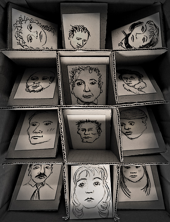
Critique Club Review:
Color, Saturation, and Hue: N/A, image is monochrome.
Brightness and contrast: Contrast is good, shadows hold detail, and the highlights are not blown out. Brightness could be a little brighter, but is still very good.
Focus and depth of field: Both are excellent.
While the image is centered, which may have affected the vote of some tehcnical purisits, I don't know of a better way to do this one. Though an image from a bit further back could be interesting also. I think the lighting is excellent. I really like the play where the center column is up-lit, and the outer columns are down lit. I also like the way the top row is different. Had it been the same as the other two, I think there would have been too much repitition.
The only thing that I would say could be called "wrong" here, is that there is no central subject in the image. Everything pretty much gets equal time and space. The image does impart the message and tell the story well. It's just that there is no place for the eye to stop. So the eye wanders continuously, and mine actually got a little tired.
However, that being said, this is a very strong image, tells a strong story, and is not simple eye candy.
Very well done! Congratulations on making the top 25. You earned it. |
|
| Photographer found comment helpful. |
|
|
08/09/2008 09:29:20 AM |
|
Wow you are quite the artiste. I love all those sketches. Great concept for the challenge. I like the lighting too for the dramatic effect it creates. |
|
| Photographer found comment helpful. |
|
|
08/04/2008 12:41:45 PM |
|
Had I voted and given this the thought it deserves you might have had a ten. |
|
| Photographer found comment helpful. |
|
|
08/04/2008 07:55:29 AM |
|
Nice job Don and congrats on a great score. |
|
| Photographer found comment helpful. |
|
|
08/04/2008 06:49:48 AM |
|
one of the best in the challenge in my opinion. |
|
| Photographer found comment helpful. |
|
|
08/04/2008 05:58:15 AM |
|
Well now this is a very good photo, maybe the highest suck team score this week, well done. |
|
| Photographer found comment helpful. |
|
|
08/04/2008 12:14:20 AM |
|
Huh? Creative, artistic, and it still scored a 6+? I think there's a disturbance in The Force. But you do have to admit it definitely met the challenge. Very good idea and very well executed on all counts. |
|
| Photographer found comment helpful. |
Comments Made During the Challenge  |
|
|
08/03/2008 11:31:10 PM |
|
Good concept and choice of tones. |
|
| Photographer found comment helpful. |
|
|
08/03/2008 06:51:14 PM |
|
| Photographer found comment helpful. |
|
|
08/03/2008 09:59:28 AM |
|
What an interesting answer to this challenge. |
|
| Photographer found comment helpful. |
|
|
08/02/2008 02:41:16 PM |
|
| Photographer found comment helpful. |
|
|
08/01/2008 12:34:49 PM |
|
Very creative. I really love this one. |
|
| Photographer found comment helpful. |
|
|
08/01/2008 09:39:36 AM |
|
this is my favorite so far in this challenge,did you do the drawings too? kudos if you did! but even if you didnt this holds my interest and is very fun to explore.i like how the girl/lady in the bottom-middle seems to stand out as he main subject and the rest are people shes somehow involved with... |
|
| Photographer found comment helpful. |
|
|
07/31/2008 01:21:35 PM |
|
| Photographer found comment helpful. |
|
|
07/30/2008 04:32:53 AM |
|
great idea, love it. Hope this does well.. |
|
| Photographer found comment helpful. |
|
|
07/29/2008 08:04:39 PM |
|
Wow, I like it! Very creative and emotionally meaningful. Plus the lighting is very well done in my opinion. |
|
| Photographer found comment helpful. |
|
|
07/29/2008 06:02:11 PM |
|
There is a lot to see here, even though it is so simple. The differing angles of the drawings add a visually interesting dimension. |
|
| Photographer found comment helpful. |
|
|
07/28/2008 09:03:20 PM |
|
I like the message here! Well done |
|
| Photographer found comment helpful. |
|
|
07/28/2008 07:49:18 PM |
|
clever idea and good artist well thought out 9 |
|
| Photographer found comment helpful. |
|
|
07/28/2008 12:46:10 PM |
|
Great concept--however, focus is a little off and lower middle picture looks a bit different from the rest. Not sure if it was intentional; if so I'm sorry but I didn't quite 'get' it. Hope this helps. 7 |
|
| Photographer found comment helpful. |
|
|
07/28/2008 08:46:57 AM |
|
| Photographer found comment helpful. |
|
|
07/28/2008 02:07:47 AM |
|
Someone put a lot of work into this. I like the different angles the etchings are positioned at and the shadows and lights created. Nice. |
|
| Photographer found comment helpful. |
Home -
Challenges -
Community -
League -
Photos -
Cameras -
Lenses -
Learn -
Help -
Terms of Use -
Privacy -
Top ^
DPChallenge, and website content and design, Copyright © 2001-2026 Challenging Technologies, LLC.
All digital photo copyrights belong to the photographers and may not be used without permission.
Current Server Time: 06/30/2026 03:49:39 PM EDT.