| Image |
Comment |
| 09/18/2005 11:14:17 PM |
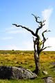
Dead Woodby HattieComment: ** Greetings from the Critique Club **
Pros: Composition is executed perfectly within the rule of thirds.
I like the DOF - the feeling of depth is excellent. Nice contrast.
Subject matter is pleasing to me as I like old snarly trees, old wooden items, etc.
Cons: The yellows seem a bit over saturated.
- Linda |
 Photographer found comment helpful. Photographer found comment helpful. |
| 09/18/2005 11:07:46 PM |
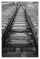
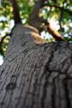
branchby tcmartinComment:
Pros: Excellent use of gray tones. I really like the composition and angle here. I'm a sucker for railroad tracks too. Even your frame was well done in my opinion.
Cons: none - just a wonderful photo
- Linda Message edited by HBunch - Removed Critique Club status. |
| Photographer found comment helpful. |
| 09/18/2005 06:18:35 PM |
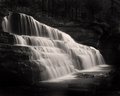
Canyon Fallsby alfrescoComment: JP you've done really great on this shot! You don't usually see as many of the ledges at Canyon Falls as the water flow and level would have made them subdued. Great idea with the B&W too. I love it.
- Linda |
| Photographer found comment helpful. |
| 09/18/2005 05:56:38 PM |
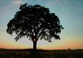
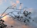
Branching From The Lightby ColeyComment: ** Greetings from the Critique Club **
Pros: I love the colors f the sky. The lone tree is a classic. Yours has an added element that sets it off nicely - the sun spot in the trunk.
Cons: As others have mentioned - the buildings in the back distract, but just a bit.
- Linda |
| Photographer found comment helpful. |
| 09/18/2005 03:26:41 PM |
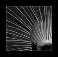
Peacock "branches"by lifeComment: ** Greetings from the Critique Club **
Pros: I love the contrast and sharp lines. The feathers 'branch' out nicely for a welcome creative twist on the challenge. Focus and DOF are very good. I noticed a commenter or two below that felt the focus was soft - on the contrary it is very sharp as the long feathers have very sharp edges and detail - the smaller feathers are fluffy on a peacock and should look soft. I think you did a great job.
Cons: The small dark clump of feathers in the lower right bottom section are distracting. Not the one in the corner - but the ones further in.
- Linda |
| 09/18/2005 04:58:26 AM |
In The Evening Skyby KOKOCATComment: ** Greetings from the Critique Club **
I get the feeling you were going for simplicity, and that you did achieve - just does not have anything to grab my attention. It is just my opinion, but I feel a photo should say something - tell a story or convey a message of some sort. This seems to be the type of photo shot just to meet the challenge - not shot becasue you wanted a phot of this to hang on your wall or look back upon later. I have done that myself in past challenges and try to avoid that now. The colors in the sky are very pretty.
- Linda |
| 09/18/2005 04:52:36 AM |
The Branches Within A Branchby princessfriesenComment: ** Greetings from the Critique Club **
As many of your comments stated already - I have to agree that there simply is not enough in focus here. There is not any particular thing that grabs my eye and holds it. Instead I am distracted by the blurred areas making my eye draw away and jump place to place, searching for a point of focus.
- Linda |
| Photographer found comment helpful. |
| 09/18/2005 04:46:09 AM |
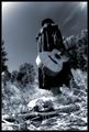
The Strangerby fotodudeComment: ** Greetings from the Critique Club **
This shot is full of emotion and tells a story. I really like that in a photo. Great angle and composition. Only real negative is that it does not meet "High Contrast" - the tones are all in the mid-range. More of a gray scale portrait than High Contrast. Also - the skull looks a bit blown out.
- Linda |
| Photographer found comment helpful. |
| 09/18/2005 04:40:21 AM |
Sophisticatedby idnicComment: ** Greetings from the Critique Club **
I really like this shot for some reason. I am not one who goes for studio shots much - but this was executed well. The model looks natural - not as if she has a forced look on her face. I think the composition and cropping is what really makes this shot. If this is a self portrait it was executed wonderfully! Definitely meets the challenge.
- Linda |
| Photographer found comment helpful. |
| 09/18/2005 04:36:25 AM |
there is no grayby snowdogComment: ** Greetings from the Critique Club **
Pros: Beautiful blue background. Angle of shot is excellent. DOF is very well done. Not so much high contrast, but still a neat idea and very nice shot.
Cons: The lighting is a bit harsh as it produces glare on the wooden pots that I find distracting. The white pieces look a little over exposed.
- Linda |
Home -
Challenges -
Community -
League -
Photos -
Cameras -
Lenses -
Learn -
Help -
Terms of Use -
Privacy -
Top ^
DPChallenge, and website content and design, Copyright © 2001-2026 Challenging Technologies, LLC.
All digital photo copyrights belong to the photographers and may not be used without permission.
Current Server Time: 06/24/2026 03:12:03 AM EDT.