| Image |
Comment |
| 10/20/2013 11:08:07 PM |
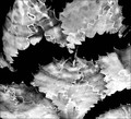
Abandonedby lunachickenComment: I love how the sand looks like metal...moire taffeta...either way it has this really nice movement. |
 Photographer found comment helpful. Photographer found comment helpful. |
| 10/19/2013 10:21:16 PM |
|
| Photographer found comment helpful. |
| 10/19/2013 10:16:02 PM |
"A River Runs Through It" by Norman Maclean by rjksteschComment: 6...this is quite nice and fits the book. I can't stand the border. I'm not anti-border, just anti this border. That little white border is really fighting the image for attention, and it's winning. And the way the black in almost nonexistent at the top and bottom...I don't know why or for what purpose. A simple black border would have been perfect. |
| Photographer found comment helpful. |
| 10/19/2013 10:11:13 PM |
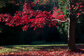
The Secret Gardenby giantmikeComment: 6...the first thing that popped into my mind was Weirwood from Game of Thrones. It's those bright red leaves. I like it more for those series of novels. I suppose it works for Secret Garden, but it seems like an obvious thing for that. Technically, I wish there was more information to see in the trees trunk, but I know this wasn't a simple exposure. A little more space on the left would have given the branch a bit of breathing room too, but that may not have been possible. |
| Photographer found comment helpful. |
| 10/19/2013 10:03:53 PM |
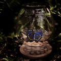
The Bell Jarby grahamgatorComment: 6...It's a nice enough image, the sharpness of the butterfly is fabulous, but I see nothing of the referenced book really. I suppose this could be metaphorical, but I would at least expect to see and actual bell jar. Technically, some of the darks seem too dark, loosing information in the shadows, particularly in the ground and the area at the top of the jar. |
| Photographer found comment helpful. |
| 10/19/2013 09:58:10 PM |
To the Lighthouse: Virginia Woolfby vikasComment: 7...that's a tough exposure to make. The sky may be slightly hot, but if the colors were even slightly duller, the entire image wouldn't be as appealing IMO. The water is really beautiful. |
| Photographer found comment helpful. |
| 10/19/2013 09:55:06 PM |
|
| Photographer found comment helpful. |
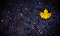
| 10/19/2013 09:50:47 PM |
The Last Leafby dahlinComment: 6...such a good story. As far as this photograph, I enjoy the contrast between the warm golden leaf and the cool hard ground. I might have tried cloning out the stem on the left there and the one at the top right. I find the vignette is fighting the composition as it's too centered. The image would have been fine without it, or if the center of the vignetting were over the actual leaf. |
| Photographer found comment helpful. |
| 10/18/2013 09:38:27 PM |
The Old Curiosity Shop-Charles Dickensby MonaComment: 3...no. This is lazy. At least show me what's in the darn window. ETA, I wanted to add to my original gut reaction. I'm still giving this a 3 and here's why...it's just visually unappealing to me.The composition is lazy/flat/boring. Show the viewer the curiosity shop, not just the sign. And to be perfectly honest, beautiful light, of which there is none here, can make the most boring things come to life...even to Sorry We're Closed signs living in bad compositions. |
| Photographer found comment helpful. |
| 10/17/2013 10:43:35 PM |
"Their Eyes Were Watching God" by Zora Neale Hurston by rodfulkComment: 3...this is so cold and hard. I don't see a connection to the story at all. Nothing about this says early 20th American South, much less the story of an African American woman making here way through life in that era. To me this just looks like a photograph of another persons sculpture. |
| Photographer found comment helpful. |
Home -
Challenges -
Community -
League -
Photos -
Cameras -
Lenses -
Learn -
Help -
Terms of Use -
Privacy -
Top ^
DPChallenge, and website content and design, Copyright © 2001-2026 Challenging Technologies, LLC.
All digital photo copyrights belong to the photographers and may not be used without permission.
Current Server Time: 07/19/2026 05:44:11 AM EDT.