| Image |
Comment |
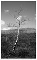
| 05/01/2007 06:45:04 PM |
Day 1by daboardergirlComment: Very simple subject. Lends itself well to black and white, but background trees seem to cut image too much in half. Maybe a lower vantage, like kneeling down, and shooting upwards to get those background trees lower in the composition. |
 Photographer found comment helpful. Photographer found comment helpful. |
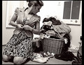
| 05/01/2007 06:42:10 PM |
Nothing To Wearby ShannonLeeComment: Nice choice of objects to really get across the black and white idea. Love the basket and grate in the background. You really went to town with your choices here. Very well presented. |
| Photographer found comment helpful. |
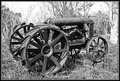
| 05/01/2007 06:38:52 PM |
Day 1 - They call me Rustyby CapeSailComment: Subject shows nice contrasts in the shadows and in the overall structure of the tractor. Background sky seemed a bit too blown out for my tastes. Perhaps maintaining the entire white appearance by cloning out the background trees would give the tractor an even more defined contrast. |
| Photographer found comment helpful. |
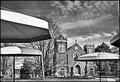
| 05/01/2007 06:34:52 PM |
Church Across the Streetby HipychikComment: I really like the blocky look to your processing. It creates an almost lithographic, vintage feel to the image. Very nicely composed. |
| Photographer found comment helpful. |
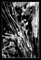
| 05/01/2007 06:33:31 PM |
DAY 2. B&W. grass desaturated .by rozComment: I like the defined highlights, but I do find some of the bokeh to be a bit distracting from the beauty and simplicity of the grasses. It almost seems it might lend itself better to a much smoother background. The border was a nice touch. |
| Photographer found comment helpful. |
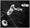
| 05/01/2007 06:31:26 PM |
Mini Daisy Day 1by KatmystiryComment: Very nice contrast between darks and lights. You did a really good job on separating the stem from the very dark background. |
| Photographer found comment helpful. |
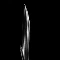
| 05/01/2007 06:29:13 PM |
by boysetsfireComment: Nice swirl look in the composition. Seems a bit dark, but my monitor is probably calibrated differently. |
| Photographer found comment helpful. |
| 04/29/2007 07:44:41 PM |
Leafby karinnComment: Like the simplicity. Works well as a low key black and white. Would it look better with less black around it, sort of a portrait style rather than a landscape style? |
| Photographer found comment helpful. |
| 04/29/2007 07:10:43 PM |
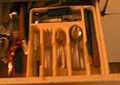
FORKS & KNIFES & SPOONSby TJinGuyComment: Well, really oof, and the lighting is really lacking. Also color balance could use a change to make less orangy. Image size also causes another problem. |
| 04/29/2007 07:09:24 PM |
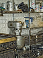
Chef Jeff's Placeby FrostyPawsComment: Like the post processing and the composition. YOu've taken an otherwise boring image and made it pop. Nice job. |
Home -
Challenges -
Community -
League -
Photos -
Cameras -
Lenses -
Learn -
Help -
Terms of Use -
Privacy -
Top ^
DPChallenge, and website content and design, Copyright © 2001-2026 Challenging Technologies, LLC.
All digital photo copyrights belong to the photographers and may not be used without permission.
Current Server Time: 07/24/2026 07:15:45 PM EDT.