| Image |
Comment |
| 02/10/2003 06:26:44 PM |
|
 Photographer found comment helpful. Photographer found comment helpful. |
| 02/10/2003 06:25:55 PM |
|
| Photographer found comment helpful. |
| 02/10/2003 06:25:09 PM |
|
| Photographer found comment helpful. |
| 02/10/2003 06:24:44 PM |
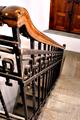
Stairwellby jimmyn4Comment: Cool looking place, character. I'm not too crazy about the focus. |
| Photographer found comment helpful. |
| 02/10/2003 06:22:45 PM |
|
| 02/05/2003 10:10:16 PM |
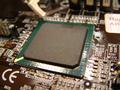
Timesquare in Electrocityby deadbirdComment: CC
Hi there deadbird,
Fits The Challenge-Sure a square chip.
Digital Processing-There isn't much color but the color we do is good. The light is harsh and takes away from another wise cool shot.
My Opinion-I don't dislike the shallow DOF, it can be a bonus to many shots. I think it would of worked here if the foreground was in better focus. The glare from the lighting is also a distraction. Maybe a lower ISO would of helped here. Keep shootin'!
|
| 02/04/2003 02:40:13 PM |
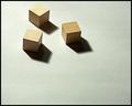
Three Squareby DougPazComment: CC:
Fits The Challenge-Very well.
Composition-simple/good example of negative space.
Background-fits the photo well.
Digital Processing-Good job.
My Opinion-I like you work Doug. Your photos are always done with thought and creativity. This shot is appealing to me because of the negative space and the simple composition. I had an idea simular to yours but didn't have the wooden cubes. The light and shadow is also good adding to this rich shot. Well done. Message edited by author 2003-02-04 14:41:18. |
| Photographer found comment helpful. |
| 02/04/2003 11:22:07 AM |
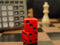
Calculating the Risksby briphotoComment: CC
Hello briphoto
Fits The Challenge-Yes, Square
Composition-
Background-Busy chess board, chess piece and a ?calculator? on the left.
Digital Processing-Good colors but the levels could of been adjusted a little bit, it's dark.
My Opinion-There is a lot going on in this shot. I do like the colors they all seem to go together along with the lighting. I find the focus a little soft and feel this could of been sharper focused on the two dice. I like the colors here the best, they are very inviting.
Good luck, and keep shootin'!!!!!!!!!
Message edited by author 2003-02-04 11:23:24. |
| 02/03/2003 08:17:19 PM |
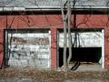
Unusedby BAMartinComment: CC:Hello BAMartin
Fits The Challenge-Yes.
Composition-Good. My personal taste would of liked less on the top.
Background-Bricks, very nice, good rich color, interesting texture.
Digital Processing-It's a bit bright but I'll admit it could be my monitor. The focus is a little soft in both the near and far ground.
My Opinion-I think cropping out the full roof would of helped the eye focus more on the red brick and garage doors. It's a very busy picture, roof, brick, white doors, tree, leaves, shadows. The eye can't find anywhere to land. The brick would of been the spot and by cropping both the top and bottom it would of made the viewer focus on the brick alone.
I hope that long sentence makes some sense and helpful. If you have any other questions please contact me any time.
|
| Photographer found comment helpful. |
| 02/03/2003 06:11:19 PM |
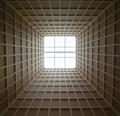
SkyLightby myqylComment: CC:
This should be easy- this shots twin won a ribbon.
Fits The Challenge-Yes.
Composition-Very nice, centered.
Digital Processing-Doubt there is much, and if so I can't see it, which makes it all the better.
My Opinion-What makes this a good shot? Symmetry with perspective and depth that draws the viewer into the shot giving it a 'wow'.
Really nice work and good find Myqyl, congratulations on your win this week.
|
| Photographer found comment helpful. |
Home -
Challenges -
Community -
League -
Photos -
Cameras -
Lenses -
Learn -
Help -
Terms of Use -
Privacy -
Top ^
DPChallenge, and website content and design, Copyright © 2001-2026 Challenging Technologies, LLC.
All digital photo copyrights belong to the photographers and may not be used without permission.
Current Server Time: 07/22/2026 06:50:33 PM EDT.