| Image |
Comment |
| 11/14/2005 03:24:08 AM |
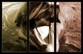
More Anchovies, Please!by aboutimageComment: I think that such triptychs would have worked much better if the frames did not distort the image. The resulting image could have only drawn the frame boxes around, and not actually moved/shifter other images |
 Photographer found comment helpful. Photographer found comment helpful. |
| 11/14/2005 03:21:21 AM |
Preserving Our Traditionsby mpembertonComment: Excellent images that tell a story. Perhaps it could have been on a ligher/brighter side, as the image describes something positive.
|
| 11/14/2005 02:40:29 AM |
halfdome-reflection-2.jpgby rachelellenComment: Very nice! It does come across a tad dark. Perhaps you can try lightening it up a notch (without blowing highlights of course), perhaps with a gradient map and levels adjustment layer, so that only the bottom part gets affected. |
| 11/14/2005 02:22:47 AM |
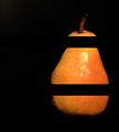
Sl ic edby JutildaComment: Very nice idea. I think that it would have worked much better if you haven't sliced it, but rather just striken over it with black frames.
The bottom separator looks fine, because of the nonexistent curve at the secession point. On the top, it looks like it is a part of another pear. |
| Photographer found comment helpful. |
| 11/14/2005 02:18:38 AM |
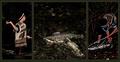
Eye emotions: solemn, joyful, tiredby sz1_Comment: Very nice use of space - the smaller height does not bother me at all with this one!
On the #1, the reflection of the window (?) is unnecessary. It ruins it for me. The #3 is perfect, and #2 does not look human, probably because of the another unnatural bright spot.
Lovely composition, good luck! |
| Photographer found comment helpful. |
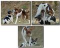
| 11/14/2005 02:15:38 AM |
Dog 1, Pup 0by mksnowhiteComment: It looks like it is going after the photographer now...
I'm not sure about the composition of the images. I like it, but at the same time it bothers me that there is so much empty space in the 2nd row. And, the image #3 is smaller than the other two. It does break the monotony, but not in a good way, it seems to me. Good luck! |
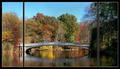
| 11/14/2005 02:09:40 AM |
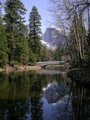
The Bow Bridgeby pawdrixComment: You could have cropped more on the right, and placed the right side separator more to the left, so that you have symmetry of the bridge. The frame #3 is a bit dark, too, so it would not have hurt if you lost it. |
| Photographer found comment helpful. |
| 11/14/2005 01:10:51 AM |
|
| Photographer found comment helpful. |
| 11/14/2005 12:19:34 AM |
Morning, Afternoon and Eveningby Nikolai1024Comment: I love it! (I had the same idea, but did not work out). Love the expression on image #3. If I may only suggest, the framing could have been accentuated with a 1-pixel frame, since your portraits have dark background and there is no clear distinction between the sections. |
| Photographer found comment helpful. |
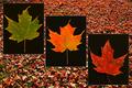
| 11/14/2005 12:15:16 AM |
Changeby TooCoolComment: SImply wonderful! The only thing I'm not sure about is the rules... you were supposed to compose the image out of max. 3 photos, and you have used 4. If you had two leaves you might have gotten away with this. Anyway, 10 from me. |
| Photographer found comment helpful. |
Home -
Challenges -
Community -
League -
Photos -
Cameras -
Lenses -
Learn -
Help -
Terms of Use -
Privacy -
Top ^
DPChallenge, and website content and design, Copyright © 2001-2026 Challenging Technologies, LLC.
All digital photo copyrights belong to the photographers and may not be used without permission.
Current Server Time: 07/18/2026 03:21:02 AM EDT.