| Author | Thread |
|
|
11/22/2005 09:08:19 PM |
|
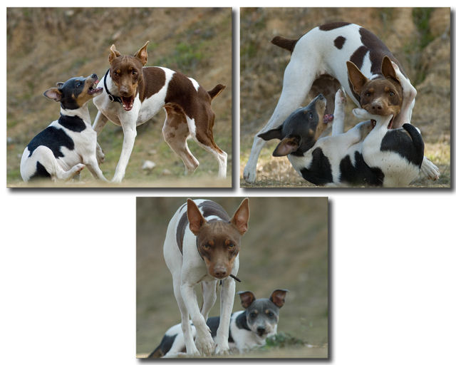
Love the imagesand the story they tell, I would have liked to seen all 3 arranged in either a row or colunm. |
|
|
|
11/21/2005 02:44:09 AM |
|
I wouldn't consider 5.57 a failure...there are folks here that would've loved that score! :-) |
|
|
|
11/21/2005 12:14:28 AM |
|
Hi everyone...thanks for all your nice comments. I really didn't like how small the pics looked to resize them at 640 so took a chance and put them this way. I guess it wasn't well recieved but thanks anyway for the great comments. |
|
Comments Made During the Challenge  |
|
|
11/20/2005 04:21:31 PM |
|
Love the title, love the idea, 7, would have been higher if the bottom pic was the same size or bigger than the top. |
|
|
|
11/19/2005 09:14:04 PM |
|
Nice run of images, the bottom photo could have taken up more space. |
|
|
|
11/17/2005 03:33:54 AM |
|
|
|
11/15/2005 09:03:37 PM |
|
the pup did manage a nice kick in th mouth... |
|
|
|
11/15/2005 07:51:33 PM |
|
A really cool progression with excellent, sharp photos but the layout really detracts. The empty white space makes this feel more like I'm looking at the photos in photoshop than viewing a final presentation. Flip that bottom one up to the side and you've got a great image. |
|
|
|
11/15/2005 12:27:05 PM |
|
Really cute photos but the layout just doesn't work well for me. I would have rated this much higher if it had been layed out better with borders rather than drop shadows. 6 |
|
|
|
11/15/2005 10:12:30 AM |
|
I love the story element behind this triptych. Well done. |
|
|
|
11/15/2005 09:51:30 AM |
|
I wish the photos had been in a single row. |
|
|
|
11/15/2005 03:06:15 AM |
|
This layout doesn't work for me. Looks like a page out of a photo-album and not like something that could be hung on the wall. |
|
|
|
11/15/2005 03:04:03 AM |
|
Excellent series of photos. Well composed, they clearly communicate a story. |
|
|
|
11/15/2005 02:54:18 AM |
|
Good clear pics with nice lighting. The triptych frame is a little different than I'm used to. Colors on the dogs look great and you've captured some cute scenes. |
|
|
|
11/14/2005 10:10:24 PM |
|
This is a fabulous sequence of photos! I'm not very keen on the layout, but does allow you to make each of the three bigger than you could otherwise, which is helpful. |
|
|
|
11/14/2005 09:42:27 PM |
|
Am sure you got nailed for all of the negative space, love the individual shots! |
|
|
|
11/14/2005 08:44:04 PM |
|
too much empty white space going on. would be better if it was in a line. |
|
|
|
11/14/2005 07:05:40 PM |
|
very good pictures but I don't care for the set up |
|
|
|
11/14/2005 05:12:33 PM |
|
7 - Very good. Another good use of the triptych to show a 'range'. Criticism; undecided on the framing/placement choice, it works but, if possible, depending what you had to work with, the bottom one full width, may have balanced this out better, or rather reduced the 'dead space' there. I do like the bottom shot though, good capture - as is on all. Good colors and contrast control. Just a touch more contrast in the bottom one as is with the top two, would also have made this better in my opinion. |
|
|
|
11/14/2005 03:27:54 PM |
|
|
|
11/14/2005 03:06:09 PM |
|
Cute. The little one looks kind of like a tri colored version of my dog, who's tan and white. |
|
|
|
11/14/2005 11:34:58 AM |
|
Not fond of the layout, but the pics are excellent and tell a great story. Poor Pup. He will be back for another fight someday I expect. 10 |
|
|
|
11/14/2005 11:00:01 AM |
|
OOOOH....not hinged like a triptych....so how do i vote this one? I lke the center bottom shot. |
|
|
|
11/14/2005 08:01:22 AM |
|
Awwwww. . .how cute!!! Yep. . .that one tells a story too. What a look of pride on that victor's face :) I love this one. |
|
|
|
11/14/2005 05:07:36 AM |
|
|
|
11/14/2005 03:18:47 AM |
|
Very good shots, each of them - but doesn't seem to work as a triptych. Not saying it doesn't meet the challenge - just doesn't work for me visually. |
|
|
|
11/14/2005 02:15:38 AM |
It looks like it is going after the photographer now...
I'm not sure about the composition of the images. I like it, but at the same time it bothers me that there is so much empty space in the 2nd row. And, the image #3 is smaller than the other two. It does break the monotony, but not in a good way, it seems to me. Good luck! |
|
|
|
11/14/2005 12:43:39 AM |
|
ROFL. THis is GREAT. Love the shadowing around the images. Really cute. |
|
|
|
11/14/2005 12:21:20 AM |
|
Home -
Challenges -
Community -
League -
Photos -
Cameras -
Lenses -
Learn -
Help -
Terms of Use -
Privacy -
Top ^
DPChallenge, and website content and design, Copyright © 2001-2026 Challenging Technologies, LLC.
All digital photo copyrights belong to the photographers and may not be used without permission.
Current Server Time: 06/30/2026 03:18:26 PM EDT.