| Image |
Comment |
| 10/01/2004 11:06:06 AM |
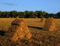
Haystacks - A Tribute to the Impressionist Masterby ColeyComment: This, to me, is a photo which would definately look better in B&W. It would show off all the textures and shadows a lot better. When I looked at this the first thing I noticed was the blue of the sky, which, due to me living in England, looks quite unnatural. In a B&W photo I would look at the haystacks first without the distraction of the blue. 5 |
 Photographer found comment helpful. Photographer found comment helpful. |
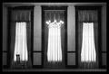
| 10/01/2004 11:04:19 AM |
The Blue Windowby aKiwiComment: The colours here are really nice and vibrant. I would like to see the right side of the photo on its own, with a crop down the middle, because I think the sun at the bottom right spoils the simplicity and composition, and I'm not sure why it's there. 6 |
| Photographer found comment helpful. |
| 10/01/2004 11:03:16 AM |
Warmthby joannsComment: This photo has great lighting and clarity. I think some of the right should be cropped though, so she is less centered. I normally don't like big borders but in this case I think it works really well. 9 |
| Photographer found comment helpful. |
| 10/01/2004 11:02:14 AM |
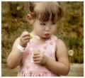
Captivatedby sherComment: No offence meant, but I think she looks more shifty than captivated. If she was looking at the bubble it would make this shot a lot lot better. Also the grain is a bit distracting and the overall image quality (I can't quite put my finger on why) is not great. It all seems a bit fuzzy. I think black and white would have worked better too, because the greeny brown colour in the background isn't very attractive. 5 |
| Photographer found comment helpful. |
| 10/01/2004 10:59:40 AM |
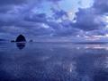
Solitudeby ZoomdakComment: II love the colours here, and the reflection is great. Is that the moon between the clouds? Fantastic shot. I think if you cropped in a bit closer on the rock (but not too much) it would be even better. 9 |
| Photographer found comment helpful. |
| 10/01/2004 10:58:37 AM |
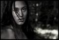
Natural Womanby heidaComment: I find the way her hair is over the catchlight in [her] right eye is a bit distracting, and it makes her look evil, with no detail in the eye at all. I do like the desaturation and the background though. 7 |
| Photographer found comment helpful. |
| 10/01/2004 10:57:14 AM |
Haunting Absenceby tyt2000Comment: This is a great shot, something like I would expect to see in a film. It's a bit blurred but I really like that about it. It's imperfections give it a haunting character. 10 |
| Photographer found comment helpful. |
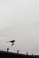
| 10/01/2004 10:51:51 AM |
Megalomaniaby RemieComment: I am a fan of negative space and silhouettes, and in this case you have very interesting silhouettes, however I think there is too much sky with no detail. If the sky had better defined clouds to make it more dramatic, I think this crop would work, as it does suggest we are tiny as humans and there is a huge expanse of space for us to explore above us, but I think in this case, a landscape crop on the people, cutting off just above the glider, would look better. 7 |
| 10/01/2004 10:49:31 AM |
The Bearded Ladyby ellamayComment: The green colour looks a bit unnatural to me. I think tweaking the green channel in post processing would help. I would also adjust the levels a bit so that the white on the wings is brighter. 6 |
| Photographer found comment helpful. |
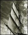
| 10/01/2004 10:48:29 AM |
Aloft by BradComment: This is great. I really like the angle because it adds to the height of the mast. The clouds look great and dramatic, and the B&W really suits the photo well. 10 |
| Photographer found comment helpful. |
Home -
Challenges -
Community -
League -
Photos -
Cameras -
Lenses -
Learn -
Help -
Terms of Use -
Privacy -
Top ^
DPChallenge, and website content and design, Copyright © 2001-2026 Challenging Technologies, LLC.
All digital photo copyrights belong to the photographers and may not be used without permission.
Current Server Time: 04/12/2026 08:14:29 AM EDT.