| Author | Thread |
Comments Made During the Challenge  |
|
|
10/07/2004 11:26:52 PM |
|
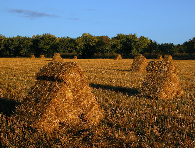
Great colors. I love the prominence of the front stack, but the obvious inclusion of all the others. 10. |
|
 Photographer found comment helpful. Photographer found comment helpful. |
|
|
10/07/2004 09:51:03 PM |
|
I would use less sky , a little more top perspective for a van gogh, but you have captured the "movement" of the gold colors. Maybe a bit more monet than van gogh in some respects... |
|
| Photographer found comment helpful. |
|
|
10/07/2004 01:45:41 PM |
|
A nice exposure, but I would prefer more contrast with the shadows to add more drama. A composition that plays more to the shapes of the haystacks might strengthen this imho. |
|
| Photographer found comment helpful. |
|
|
10/07/2004 10:18:57 AM |
|
Good framing - leads the viewer into the photo. |
|
| Photographer found comment helpful. |
|
|
10/07/2004 01:26:22 AM |
|
beautiful colors. i think i might like it more if shot from an angle that had more foreground and less sky. |
|
| Photographer found comment helpful. |
|
|
10/06/2004 02:43:25 PM |
|
It really has an impressionist look and fill. Maybe a bit more of "Unsharp mask" could even increase the effect :) |
|
| Photographer found comment helpful. |
|
|
10/06/2004 12:02:44 AM |
|
6. The photo does not jump out at me. It doesn't scream..."Hey, I'm special and one of a kind". It's a stack of haystacks with some horizontal lighting. I think going out there with a ladder would have conjured up more dramatic results and angles. It's a good pic, don't get me wrong...but you're going head-to-head with fantastic shots in this competition. Couldn't you light a couple on fire? Just kidding. ;) On the positive I will say the colors are great. the contrast of orange and blue is great. |
|
| Photographer found comment helpful. |
|
|
10/05/2004 11:02:00 PM |
|
Your contrast I think is too strong and the shot is a tad too dark. Looks like you used a polarizer in low light at the wrong angle and didn't really get the benefit of the filter. Composition is not inspiring. 4 |
|
| Photographer found comment helpful. |
|
|
10/05/2004 10:02:50 PM |
|
Good colors and contrast just not very interesting to me 6 |
|
| Photographer found comment helpful. |
|
|
10/05/2004 09:06:51 PM |
|
How lucky to find these! I like the design of the hay stacks but the overall composition of the shot doesn't really appeal to me. I tried my magic envelope and think a tighter crop on the right, leaving the main haystack as the focus might make it appeal to me more. Also the late afternoon soon really didn't help this, the colors are great but the light is still a bit harsh. A 7 |
|
| Photographer found comment helpful. |
|
|
10/05/2004 05:40:14 PM |
|
Great lighting at the perfect time of day. The study of texture is fantastic. I relly like the long shadows as well - they add a nice sence of time and a strong compositional element. I have two suggestions for imporovement: a) The top of the closest bale merges with the one directly behind. It would be best to have a bit of separation between them. (Get higher or a step closer to the front one.) b) The title is doesn't show much imagination - I'm sure you could make it relate to how you feel about the scene much better. |
|
| Photographer found comment helpful. |
|
|
10/05/2004 05:14:59 PM |
|
love the diagonals. you took this at absolutely the right time of day, with the shadows moving in the direction of the grain rows. Even the wisp of cloud cooperated. nice colours, and the deep DOF works nicely. bump up from original vote. |
|
| Photographer found comment helpful. |
|
|
10/05/2004 11:22:40 AM |
|
Interesting study. Like the cast of shadows. Nice perspective and color. |
|
| Photographer found comment helpful. |
|
|
10/05/2004 12:23:55 AM |
|
I have never seen triangle haystacks before! Very cool photo |
|
| Photographer found comment helpful. |
|
|
10/04/2004 11:10:37 PM |
|
Monet would be proud... very reminiscent of his Wheatstacks (End of Summer) ... very appropriate for a September Free Study. Exposure and lighting are well done, deep DOF works well to capture the distant landscape along with the detail of the stacks. |
|
| Photographer found comment helpful. |
|
|
10/04/2004 09:03:02 PM |
|
I like the perspective and the long cast shadows. exposure is right on and makes for a very pleasant pastoral scene. One can image why Monet and others found such haystacks an inspiration as the light and textures are interesting and constantly changing. |
|
| Photographer found comment helpful. |
|
|
10/04/2004 07:35:55 PM |
|
always a nice subject, in this case for some reason the trees are interfering with the flow of your subject but still a good shot. |
|
| Photographer found comment helpful. |
|
|
10/04/2004 02:20:42 PM |
Cool haystacks!! Never seen anything like this before.
Taken at the right time of day to get some good shadows on them, like your perspective as any lower we wouldn't be able to see the other haystacks there. 8 |
|
| Photographer found comment helpful. |
|
|
10/04/2004 01:31:21 PM |
|
simple and beautiful but it just doesn't jump out @ me 6 |
|
| Photographer found comment helpful. |
|
|
10/04/2004 01:30:03 PM |
|
This is a really nice landscape picture. Great depth of field -- everything is crisp and clear from front to back. 7 |
|
| Photographer found comment helpful. |
|
|
10/04/2004 11:03:34 AM |
|
I would like it more if the shadows were even longer. NIce job. 7 |
|
| Photographer found comment helpful. |
|
|
10/04/2004 05:35:30 AM |
|
Sorry but this photo doesn't bode that well with me - it's just a field of hay? I am sure I am missing something here? |
|
| Photographer found comment helpful. |
|
|
10/03/2004 09:45:45 PM |
|
| Photographer found comment helpful. |
|
|
10/03/2004 04:55:10 PM |
|
It's a nice composition, but it's a bit low on my WOW factor...I like it anyway, though! |
|
| Photographer found comment helpful. |
|
|
10/03/2004 10:05:31 AM |
|
I think the low sun might have been wiping out a little detail. I'd like the stacks to stand out a bit more from the stubble. Beautiful colors and tones. |
|
| Photographer found comment helpful. |
|
|
10/03/2004 06:48:03 AM |
|
I'm not really a fan of Monet's haystacks... maybe this is why when I look at this photo and admire the long shadows and rich colours I wish I were there to point my camera at something else! The haystacks don't really stand out enough against the ground for the composition to really 'wow' me, and it's a shame the wispy clouds on the left don't really add much interest to the sky. The greens in this photo are a bit dull... I'd have livened them up a tad in PS. I think the main problem with the composition is that there is no clear POF... my eye doesn't really know where to settle and where to flow to. 4 |
|
| Photographer found comment helpful. |
|
|
10/03/2004 04:38:28 AM |
|
That is a special shape of haystacks, never seen it before. Haystack images like this are done so often they don't create any excitement with me and neither does yours. It is a nice scene, with o.k. composition, and nice warm evening light, but no wow factor for me. |
|
| Photographer found comment helpful. |
|
|
10/03/2004 03:35:31 AM |
|
Great DOF and good use of shadows. |
|
| Photographer found comment helpful. |
|
|
10/02/2004 08:26:50 PM |
|
I have never seen triangular haystacks. Looks like the picture was taken late in the day. Focus seems a bit off. |
|
| Photographer found comment helpful. |
|
|
10/02/2004 07:47:03 PM |
|
I like it - great repeating elements. |
|
| Photographer found comment helpful. |
|
|
10/02/2004 11:35:54 AM |
|
Nice use of repeating subjects in both the foreground and background. I also like the use of an out of frame vanishing point. Lighting is interesting. Is it morning or afternoon? A bit more of the sky could have been cropped out. 7 |
|
| Photographer found comment helpful. |
|
|
10/02/2004 08:53:18 AM |
|
I'm not sure about the title, but I like this photo. My only suggestion, and I don't know how the scene is, would be to take the photo so you captured more of the field. 7 |
|
| Photographer found comment helpful. |
|
|
10/02/2004 07:56:34 AM |
|
This is perfect lighting, but I think the subject might have a difficult time among the other competitors. |
|
| Photographer found comment helpful. |
|
|
10/02/2004 06:10:06 AM |
|
lighting could have been better on the subject, dof |
|
| Photographer found comment helpful. |
|
|
10/02/2004 02:35:09 AM |
Very nicely presented I love the golden tones
Nice work |
|
| Photographer found comment helpful. |
|
|
10/02/2004 12:29:08 AM |
returning for comments.
I sure would hate to be in charge of the upkeep of this beautiful property. I see the kiss of fall in the distance and I like the subdued rendition with the wonderful tones. Bumping up. |
|
| Photographer found comment helpful. |
|
|
10/02/2004 12:27:58 AM |
|
The golds are very rich. This photo tells a story and yet leaves me wanting to know more. Good angle and shot. |
|
| Photographer found comment helpful. |
|
|
10/01/2004 07:01:47 PM |
|
The horizon is a bit tilted, otherwise a nice composition. Seems dark though. |
|
| Photographer found comment helpful. |
|
|
10/01/2004 06:22:43 PM |
|
This isn't a very interesting photo. Technically it isn't bad but it just doesn't stand out amoung the other photos in this challenge (4). |
|
|
|
10/01/2004 05:51:32 PM |
|
pretty colors - the mid-tones of the nearest 2 stacks are a little too close to the immediate backgrounds, in my opinion, making me look for the edge |
|
| Photographer found comment helpful. |
|
|
10/01/2004 11:06:06 AM |
|
This, to me, is a photo which would definately look better in B&W. It would show off all the textures and shadows a lot better. When I looked at this the first thing I noticed was the blue of the sky, which, due to me living in England, looks quite unnatural. In a B&W photo I would look at the haystacks first without the distraction of the blue. 5 |
|
| Photographer found comment helpful. |
|
|
10/01/2004 02:42:43 AM |
|
wonderful late summer afternoon feeling to this pic, makes me feel the need to open a bottle of cider and watch the sun go down |
|
| Photographer found comment helpful. |
|
|
10/01/2004 02:35:08 AM |
|
| Photographer found comment helpful. |
Home -
Challenges -
Community -
League -
Photos -
Cameras -
Lenses -
Learn -
Help -
Terms of Use -
Privacy -
Top ^
DPChallenge, and website content and design, Copyright © 2001-2026 Challenging Technologies, LLC.
All digital photo copyrights belong to the photographers and may not be used without permission.
Current Server Time: 06/28/2026 03:53:01 PM EDT.