| Image |
Comment |
| 07/02/2004 11:42:39 AM |
Tessby sixmacsComment: Good lighting and expression on the model's face. I would have preferred to see it without the lamp and pillow/furniture in the background. Good effort. :o) |
 Photographer found comment helpful. Photographer found comment helpful. |
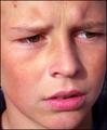
| 07/02/2004 11:41:37 AM |
Worried...by kevrobertsonComment: Great focus and detail. Filling the frame is important in portraits, and you've certainly done that. The worried expression creates an emotive response in the viewer. :o) |
| Photographer found comment helpful. |
| 07/02/2004 11:40:33 AM |
Roger the Plumberby biggood53Comment: Wonderful pose. The lighting is a bit harsh and one-sided, however, leaving the face shadowed to the point that many details in his expression are lost. The light right under the brim of his hat kind of blows out the forehead a bit as well. This could be a very good portrait with a few minor lighting adjustments. :o) |
| Photographer found comment helpful. |
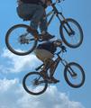
| 07/02/2004 10:33:58 AM |
Go Big or Go Home!by BassieComment: Now that's a pretty cool capture, my friend. You have now risked life and limb for DPC...LOL! Have you tried sharpening the kids up a bit? :o) |
| Photographer found comment helpful. |
| 07/02/2004 10:29:37 AM |
territoryby jus6681Comment: Had to add this to my faves...I have a cowboy thing, I guess! :o) Wonderful colors, DOF is excellent; love the angle. Beautiful! |
| Photographer found comment helpful. |
| 07/02/2004 10:25:56 AM |
An Extraordinary Dietby BooZonComment: You'll have to hook me up with that one... LOL ;o)
Excellent take on the challenge. One of my favorites. :o) |
| Photographer found comment helpful. |
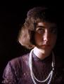
| 07/02/2004 10:20:30 AM |
Margaretby melismaticaComment: This has a sort of VIctorian appeal to it. I like the choice of costume and hat. The portrait is too dark on her right side, IMHO. I would rather see a bit more detail all over than just on one side. The light seems to blow out on the pearls a bit. This does have potential, perhaps with minor lighting adjustments. :o) |
| Photographer found comment helpful. |
| 07/02/2004 10:18:53 AM |
Katby rubyrednailsComment: This is a nice portrait...she seems a bit close to the background, creating some shadowing/halo looking effect around her shoulders and neck. I understand that you were probably going for a soft focus look, which is great, but it is just a touch too soft for my taste around her eyes, which I think should appear sharper and more detailed. It works well for the rest of the portrait, however. Very good effort. :o) |
| 07/02/2004 10:13:19 AM |
Amyby sagestudioComment: Nice portrait; could use a bit more brightness in her face, IMHO. The light on her shoulder is a tad distracting. Nice, muted background. :o) |
| Photographer found comment helpful. |
| 07/02/2004 10:11:49 AM |
Carmela Violaby johnmComment: Love your sense of humor. It's refreshing when things get a bit serious on this site! :o) Great background and lighting. There are some severely highlighted/shadowed areas on the face which make details difficult to see, but overall it's a cutie. :o) |
| Photographer found comment helpful. |
Home -
Challenges -
Community -
League -
Photos -
Cameras -
Lenses -
Learn -
Help -
Terms of Use -
Privacy -
Top ^
DPChallenge, and website content and design, Copyright © 2001-2026 Challenging Technologies, LLC.
All digital photo copyrights belong to the photographers and may not be used without permission.
Current Server Time: 06/19/2026 11:19:47 PM EDT.