| Image |
Comment |
| 08/25/2002 01:14:00 AM |
threeby FranziskaLangComment: Composition, sharpness are good. It's simple and direct. The shadow is nice. Maybe it's just me, but there seems to be too much yellow. A different color in the background would probably make it more appealing to me and make the subjects "jump" out a little more. Not white---but something with less yellow. |
 Photographer found comment helpful. Photographer found comment helpful. |
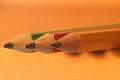
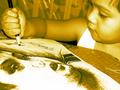
| 08/25/2002 01:51:00 AM |
I still need my pencil.by jenaromComment: Well composed and thought out. It might have been more effective if the pencil had been oriented a little less perpendicular to the edge. The tablet sets up that perpendicular line and the pencil's right end could come down a little. Just a thought. |
| 08/25/2002 02:03:00 AM |
#2 Still Lifeby shortredneckComment: Nice idea, but composition seems a little awkward. Everything seems weighted to the left lower corner. By moving the pencil and sharpener up and to the right a little instead of dividing the diagonal of the picture from corner to corner might be effective. |
| 08/24/2002 02:26:00 AM |
|
| 08/25/2002 01:55:00 AM |
classicby aelithComment: Nice idea, color, composition. The angle, however, seems just a little too low. Otherwise, the arrangement is effective. |
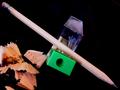
| 08/25/2002 01:02:00 AM |
|
| 08/25/2002 01:06:00 AM |
Sketching the next generationby marcvgComment: Composition is great. The simplicity is nice and just the wood color adds interest and realism. It might have worked in b & w, but it wouldn't have been as effective. |
| 08/24/2002 02:21:00 AM |
|
| 08/25/2002 01:34:00 AM |
Young Sketcherby quarxComment: Nice idea, however black & white or color might be more effective. |
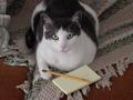
| 08/25/2002 02:20:00 AM |
You want me to do what with this pencil?by jimsappComment: How did you get the cat to participate in this so well? The arrangement of cat, pencil, pad, afghan are all nicely planned in the "still-life" mode. It might have been nice if the color of whatever is under the afghan were just a bit more vivid. Also the pencil being a little out of focus bothers me a little-but not much. I do like cats, by the way, but they don't always lend themselves to the topics of the challenge (or if they do, they don't cooperate and the thing ends up looking really contrived). There are cute cat pictures and there are good cat pictures. This one is good and how nice that it works so well into the theme. Good job and compliments to the cat. |
Home -
Challenges -
Community -
League -
Photos -
Cameras -
Lenses -
Learn -
Help -
Terms of Use -
Privacy -
Top ^
DPChallenge, and website content and design, Copyright © 2001-2026 Challenging Technologies, LLC.
All digital photo copyrights belong to the photographers and may not be used without permission.
Current Server Time: 05/05/2026 09:12:53 PM EDT.