| Image |
Comment |
| 06/14/2005 11:07:44 PM |
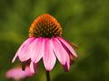
echinacea-5dpc.jpgby L1Comment: Very nice compostion and colors. I wish the flower was a little sharper. |
 Photographer found comment helpful. Photographer found comment helpful. |
| 06/14/2005 11:02:40 PM |
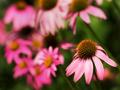
In the Pinkby L1Comment: I very much like the dof combined with the composition of this one. The background flowers add a lot, while the viewer is drawn right to the flower in focus. This is really nice. |
| Photographer found comment helpful. |
| 06/12/2005 10:38:38 PM |
Lonelyby SJCarterComment: I really like the treatment you've done here. You have a good eye for composition IMO, as I've seen in many of your shots. The elements of the curve of the track, the tracks, the bridge and the posts on the bridge just all work together really well.
I would get rid of the power lines if you can, but honestly I didn't even pay much attention to them until reading the other comments. They don't spoil the shot, but it would be improved without them I think. |
| Photographer found comment helpful. |
| 06/07/2005 01:31:35 PM |
Playing Ballby ShannonComment: Very nice shot of the kitty. I like having the ball of yarn there...it adds color and interest and suits the subject as well. I might try a little tighter crop on the subject. The only other thing that shows up here is it seems a lot of work was done on the background. I'm not an expert, but I don't think it's just irregularities of light on a white background. It looks like swipes of editing, cloning whatever that don't quite match up. Particularly to the right of the kitten, along the back; above the head, and in the upper right corner. Hope that helps! |
| Photographer found comment helpful. |
| 06/07/2005 01:26:59 PM |
Czech Princessby ShannonComment: How could this be any more adorable!? Just a wonderful shot of your daughter. I hope you frame and display this one. Technically, I suppose a little more light on the face and catching a bit of light in the eyes would add to the shot. Still, she's not even my young'un and I like the photo alot. |
| Photographer found comment helpful. |
| 06/06/2005 08:19:54 PM |
|
| Photographer found comment helpful. |
| 06/05/2005 06:49:09 PM |
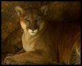
Mountain Lion by moodvilleComment: Just love the way he's looking directly at the camera. What great tones, with some darkness to the shot, but still bringing out the details. He looks like he's sitting for a portrait painting! I've added this one to my favorites! |
| 06/05/2005 06:46:37 PM |
Tulips 03by eostylesComment: I can see why this would be one of your favorites. The angle really makes this shot, I think. Great lighting too. I would personally like to see a little bluer sky and less gray, but that's just my tastes. Nice job! |
| Photographer found comment helpful. |
| 06/05/2005 06:42:54 PM |
Jenby elsapoComment: This is lovely. The tones here really work to bring out the great features of the model - especially the eyes. I really like the gentle messing of the hair, which gives a little movement to the shot and I also like the lighting on the face - bright enough to bring out details, not to be overblown. I would be extremely proud to do a shot of this caliber! |
| Photographer found comment helpful. |
| 06/02/2005 12:24:20 AM |
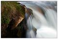
Natures beautyby Magnus_iComment: Beauty is a subjective thing, I know. In my scoring and comments I'm trying to score based on NOT whether or not I would think a particular subject beautiful, but on whether the photographer has succeeded in creating a beautiful photo. I look for the elements of color, lines, focus and dof interest, lighting, and a certain element of grace and lovlieness. I'm looking for a unique and creative appeal for the highest scorers. The description says to create a photo that makes the viewer think "that's beautiful", so it will undoubtedly be very subjective. (This is what I'm putting at the start of all of my comments, and I hope it is helpful.)
That being said, I'll et it is a beautiful spot. I'm not a big fan of the really soft looking water, and this is softer than most I think. Probably the biggest drawbacks to me thinking "beauty" for this shot would be that the top of the composition appears crowded...I'd like to see more of the source of the water. I think maybe less rock on the left would also have helped. |
Home -
Challenges -
Community -
League -
Photos -
Cameras -
Lenses -
Learn -
Help -
Terms of Use -
Privacy -
Top ^
DPChallenge, and website content and design, Copyright © 2001-2026 Challenging Technologies, LLC.
All digital photo copyrights belong to the photographers and may not be used without permission.
Current Server Time: 07/26/2026 11:22:47 AM EDT.