|
|
|
Showing 7241 - 7250 of ~8912 |
| Image |
Comment |
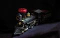
| 09/16/2005 02:11:49 AM | Out of the Darkby thomaspeopleComment: Greetings from the Critique Club:
This is a charming picture of a little train with directed lighting to put the engine strongly in the picture with the remainder in the act of emerging into the light.
Unfortunately, as you've already gathered from the comments, the directed lighting wasn't perceived to be strong enough to qualify for "High Contrast."
It has also been my experience that toys (trains included) simply do not score high at DPChallenge. It's one of those facts that one might as well take into consideration in choosing a Challenge entry.
So, you have a delightful image that the voters didn't think met the challenge particularly well, but would make a charming addition to a young person's bedroom wall!
As they say, "win some, lose some."
Good luck in future Challenges. |  Photographer found comment helpful. Photographer found comment helpful. |
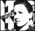
| 09/16/2005 01:58:29 AM | Miss Brownby anthonyczajaComment: Greetings from the Critique Club:
You chose a suberbly beautiful subject for your entry in the High Contrast Challenge. Those classic features could take the emphasis on line and contour and still win through.
It is the background that troubles me. It competes tremendously with the subject, "Miss Brown," and leaves the viewer confused as to what you want the viewer to look at. I'm not the one to suggest what background you should use; you know your territory, I don't. But I would suggest that with a model like that, and with High Contgrast as an objective, you simple the background down to concentrate attention on the model.
Still, it's a powerful image and I'm delighted to have had the chance to study and enjoy it.
SFAlice |
| 09/15/2005 10:38:48 AM | Dawnby DufusComment: Greetings from the Critique Club
Wow, what a great shot of a Reykjavik dawn! It justifiably scored well.
Now, as to composition. The layers of color and texture contrast well. I'd suggest, if at all possible, that you try this shot from some angle where the Radisson Hotel isn't visible. The bright white is a distraction from the lovely colors that make up the major part of this beautiful image. You have plenty of "High Contrast" without it. The large, long building in front is a slight distraction as it is neither centered in the foreground, nor enough off-center to add interest to the composition. However, I do like the city of Reykjavik to appear in the image. It gives another layer of texture and reinforces the contrast between nature's work and that of man.
Technically, I think this is just fine. I wouldn't change a thing.
You have a beautiful city (I visited it some years ago, and remember it well) and you have captured a special moment. (come to think of it, in September, seems to me dawn lasts quite a long time.) | | Photographer found comment helpful. |
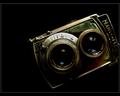
| 09/14/2005 10:47:02 PM | Mamiyaflexby annahComment: Greetings from the Critique Club
This image, justifiably, scored well in the High Contrast Challenge. Technically, it appears to be flawless and it certainly meets the Challenge.
While an off-center composition can be visually exciting, I think this one may suffer just a touch from that technique. It might be interesting to try this image with more of the old camera cut off on that right side, or pull the entire camera into the frame, but still very much off-center.
You have a very good eye for photography. I'll look forward to seeing more of your work on DPC. | | Photographer found comment helpful. |
| 09/14/2005 10:37:36 PM | Old New Juxtapositionby DemonLlamaComment: Greetings from the Critique Club
You have created a humorous image that no doubt got many chuckles from voters. Whether it was a bit subtle for the voters is another question.
The contrast between the guy with the camera and the Minute Men is right on, topically. But technically, the guy in the white shirt is a bit hot and the soldiers are in shadow thus graying them out. I wonder if a polarizer would have helped make this image pop. Or perhaps, in another situation like this, bracketing could be helpful.
Composition might be slightly better if the camera guy was positioned to the right just a touch more.
Still, a fun image, and one to enjoy looking at.
|
| 09/14/2005 07:51:40 PM | Instrumental Abstractby kyeboshComment: Greetings from the Critique Club
You have done a very pleasant abstract for this Challenge.
I would suggest that, while the two very hot areas in this image are certainly in high contrast to the remainder of the image, they are probably not enough to influence voters to judge it high in this category.
You obviouly had fun with the abstract itself with good colors and just enough in focus to give a foundation. I'd suggest moving that focus point into one of the sweet spots (rule of 3rds) to keep the viewer in the picture to enjoy the color patterns.
It's always fun to experiment with a good lens. I"ll look forward to seeing more of your work. | | Photographer found comment helpful. |
| 09/13/2005 10:52:28 PM | Birthday Shoesby PoetryInColorComment: Greetings from the Critique Club:
Congratulations on getting through your first Challenge.You have entered a priceless image of this lovely little baby.
Compositionally, I'd suggest that you crop the image a bit tighter; the carpet really doesn't do much of anything to enhance the picture. Perhaps, instead, you might introduce a brightly patterned pillow. The lighting is quite good - a bit of light to the right wouldn't hurt. And you might want to explore photographing Hannah from different angles, although I realize you wanted to accentuate the feet.
Finally, you learned early that voters take the Challenge theme extremely seriously. So, while this is an appealing image, most felt it just didn't meet the challenge of photographing shoes...
You have a good eye, and I'll look forward to seeing more of your work in future Challenges.
Good luck! |
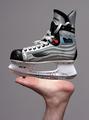
| 09/13/2005 10:38:13 PM | Perferred Shoeby mandradeComment: Greetings from the Critique Club:
Well, it meets the challenge just fine, it's interesting, funny and nicely photographed. And you had a patient significant other who held a pose very well for you.
Composition is good, nice neutral background. I like the spot of red in the skating shoe. I see nothing negative in this image. Maybee a tad over-sharpened. Oh, yes. Someone pointed out your typing wasn't so good in the title. Ooops.
I like it. Keep up the good work. |
| 09/13/2005 09:53:58 PM | Well Wornby barndogComment: Greetings from the Critique Club
This pleasant image fits the Challenge well. The sandals look as if they were photographed at a beach on a nice sunny day.
I wonder if it would help this image to crop the upper and right sides a bit tighter to the sandals. There is some color to the right, but it is indistinct and more of a distraction than a help. I'd also suggest you consider adding interest to the image by introducing color to the plank or nearer the shoes.
Finally, while the image is reasonably sharp, if you could either brace your camera or in some other way steady it and get those sandals and the sand in them tack-sharp, it would make the image pop.
Still, your image meets the challenge easily and well and it's undoubtedly a good memory of a nice day at the beach. | | Photographer found comment helpful. |
| 09/13/2005 09:33:52 PM | Shoes moving Earthby greslizzzComment: Greetings from the Critique Club:
What a pleasure it is to see an image that is in perfect focus. Attention to photographic detail is wonderful. Lighting is fine.
Composition is a bit difficult, I think. It's hard to know precisely what you want the viewer to see as a main focal point. It was difficult to identify the yellow bar as part of a bicycle; a bit more bicycle would have helped. Again, I think this almost comes off as an abstract, but not quite.
And in this case, perhaps because of a language difference, the title didn't quite work. That beautifully photographed shoe doesn't look as if it is moving earth.
Nevertheless, my hat's off to you for technical excellence in this image. | | Photographer found comment helpful. |
|
Showing 7241 - 7250 of ~8912 |
Home -
Challenges -
Community -
League -
Photos -
Cameras -
Lenses -
Learn -
Help -
Terms of Use -
Privacy -
Top ^
DPChallenge, and website content and design, Copyright © 2001-2026 Challenging Technologies, LLC.
All digital photo copyrights belong to the photographers and may not be used without permission.
Current Server Time: 06/21/2026 08:39:04 PM EDT.
|