| Author | Thread |
|
|
02/06/2006 10:35:52 PM |
|
you're right, Damon seem to have seen many things in the photo that I would have also otherwise missed. Thanks for sharing. I learned from your photo and his comment as well. |
|
 Photographer found comment helpful. Photographer found comment helpful. |
|
|
09/16/2005 12:27:31 PM |
Greetings from the Critique Club:
You have received a generous critique from Damon, Rikki, so I won't add too much here.
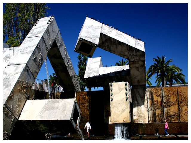
Of course you have immortalized the Vallencourt Fountain.
And you have achieved the High Contrast aspect that the Challenge called for. In composition, I think it is a bit heavy to the left. I'd like to see the sculpture fill the frame. Then, while I like the idea of people in the frame to give it scale, the pink girl is too bright and takes interest away from the main subject. The guy in white works well.
I like the use of the polarizer which does nice things for the sky and prevents the high key areas in the Fountain from becoming too "hot" and thus losing definition.
Keep up the good work!
SFAlice |
|
| Photographer found comment helpful. |
|
|
09/12/2005 02:51:26 AM |
My first impression is that this picture did, indeed, get scored lower than it deserved. I think there's a perfectly good explanation why, which I'll take a shot at shortly--
The colors, especially in the sky, are good, and the rest of your color scheme (grey, brown, green) fits together well. The shapes are interesting, and there is good texture detail in the darker areas.
On the critical side, as some have noted, the kids stick out in this picture and distract from the architecture. As the kids are clearly not the purpose of the picture and they don't really add to it, they don't belong there. The highlights in this picture have suffered a lot of detail loss from either the glare of the sun or the post-processing, with the end result being areas of rather harsh brightness with little visual interest.
Now my shot at an explanation, and some suggestions thrown in with it--
I urge you to remember that votes are given one by one, and each person has to look at this photograph and give it a whole-number vote. This is admittedly woefully imprecise in many cases, but it's what we're stuck with. The most common votes are always 4, 5, and 6; roughly speaking, they stand for "bad, average, good." Voters give out more of these three numbers than anything else.
The bell curve of votes on this picture is skewed heavily towards 5, which is statistically interesting. If this were a more classically formed bell curve, a fair chunk of the 5 votes should be more or less equally distributed between 4 and 6. It will be useful to explore why the votes that one would probabilistically expect to fall on 4 and 6 instead fell on 5.
I'm going to imagine myself as a "typical voter," as much as I can do so. Okay, so I'm voting on the High Contrast entries, and yours comes up. I think, does it meet the challenge? Yes, sure does, plenty of contrast here, no doubt about it. Then: Does this photograph stand out to me? Sort of, the sky is better than most, but otherwise the picture is much like many others, and the bright spots are a little too bright.
Again, remember that most votes are in the 4 to 6 range. That your picture clearly meets the challenge and has a good sky kept most people from classing your photo "bad" (4), though its flaws also kept them from classing it "good" (6). Then the only remaining option is 5.
I bet if there were a 5.5 vote, you'd have gotten a lot of those. That would have been more reflective of its photographic merit, I think, but between the choice of 5 and 6, it looks like most would give it a 5.
My suggestion: keep this, the sociological background of DPC scores, in mind when you're choosing what to submit. Think about what it takes to get a voter to click "6" instead of "5." Look at the images that score close to 6, and see what's done differently there. Let me give you an example from my own recent work:

Note that the peak on my graph is at 6, with more 6's than one would statistically expect. I took this photo with the intent of getting exactly that effect--a lot of votes of 6--rather than trying to take a "10" photo. My thinking was that if I have strong colors and good lighting, a lot of people will see it as generically "good" and vote me above 5 even if they don't really like the photo.
I hope this is helpful :) |
|
| Photographer found comment helpful. |
Comments Made During the Challenge  |
|
|
09/11/2005 10:05:16 PM |
|
Lovely contrast of deep, rich colors. |
|
| Photographer found comment helpful. |
|
|
09/11/2005 06:54:06 PM |
|
Looks like an interesting place. For me, my eyes go right to the kid in the pink top as she stands out. |
|
| Photographer found comment helpful. |
|
|
09/10/2005 09:48:12 AM |
|
Interesting subject. Feels a little too 'snapshot' to me. 6. |
|
| Photographer found comment helpful. |
|
|
09/10/2005 12:48:50 AM |
|
Nice shot and good contrast. The people looks so little, great capture. |
|
| Photographer found comment helpful. |
|
|
09/08/2005 05:01:10 PM |
|
Love the originality of this shot....the people are a bit distracting, but the sky couldn't be more beautiful. Great job. |
|
| Photographer found comment helpful. |
|
|
09/08/2005 08:42:49 AM |
|
I like the angular sense of this. Nice contrast between the scuplture white and the blue sky. Also the golden tone of the building below adds to the opposing colors. The pink of the shirt adds a nice pop of color and helps ground the shot. |
|
| Photographer found comment helpful. |
|
|
09/07/2005 10:37:47 PM |
|
I'm not familiar with this location, perhaps it isn't possible, but the cropping feels unbalanced like there is more to see on the left side. My eye moves directly to the girl in pink. Great contrast resulting in deep blues and greens. |
|
| Photographer found comment helpful. |
|
|
09/07/2005 04:46:42 PM |
|
| Photographer found comment helpful. |
|
|
09/05/2005 12:09:50 PM |
|
| Photographer found comment helpful. |
Home -
Challenges -
Community -
League -
Photos -
Cameras -
Lenses -
Learn -
Help -
Terms of Use -
Privacy -
Top ^
DPChallenge, and website content and design, Copyright © 2001-2026 Challenging Technologies, LLC.
All digital photo copyrights belong to the photographers and may not be used without permission.
Current Server Time: 06/29/2026 07:56:59 PM EDT.