|
|
|
Showing 721 - 730 of ~2077 |
| Image |
Comment |
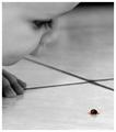
| 06/28/2004 10:50:38 AM | Fascinatingby JackoComment: Soooooooo? Did Sam try to pick up the bug and eat it?
Deannda
I know James would, LOL :)
Again, great shot! You should have been in the top 10! |  Photographer found comment helpful. Photographer found comment helpful. |
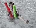
| 06/28/2004 10:44:40 AM | Noodlesby kncoughlinComment: I gave you a 5 on this shot and here is why.
I also love the composition of the shot, the balance of the boy and the water and the noodles are great. Here is what stood out as off to me personally though. The boy still seems to have some color to him, like he's not completely desaturated and that is distracting to me from the noodles. Also the water seems a bit dull yet bright at the same time, it's hard to explain. Maybe a polorizing filter would help with the light reflecting off the water while giving it the pop it needs for contrast. And that is also lacking, no real black or white point, not a lot of contrast in the shot. If you play with this one in PS some more I would love to see the results. It's a great shot that could really pop with a little more work. |
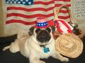
| 06/28/2004 09:58:18 AM | Mayor of Dogvilleby ellamayComment: How cute! I'm betting you're already tired of the "does not meet the challenge" comments since the dog isn't a "person" Shows what they know! I love this shot, the lighting leaves a bit to be desired, the shadows are overpowering the shot itself And DOF is off just a bit, seems the whole shot should be in focus, the ears a bit fuzzy and it's not the hair, LOL! A 7 | | Photographer found comment helpful. |
| 06/28/2004 09:53:04 AM | All American Pug, He thinks he's human!by hallswelComment: I LOVE IT! You're going to pay for having a dog instead of a human but I think this is wonderful! The lighting seems a bit harsh on the right while the left seems a bit dull. The glare on the jam jar is also a bit distracting. Overall a nice composition and great idea, a 7 | | Photographer found comment helpful. |
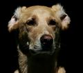
| 06/28/2004 09:51:04 AM | It's In The Eyesby K-RobComment: You're going to get nailed because it's "not a person" and therefore, "Doesn't meet the challenge" comments. Well, you know what I say to that? "PTHLBTHLBTHLBTHLB!" This baby is adorable and is just as human, if not more than most people I know! I love the expressive eyes but the DOF hurts this shot to me. I know they are long dogs (I have one myself) but they aren't that LONG, LOL! Excellent capture, an 8 | | Photographer found comment helpful. |
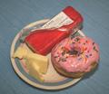
| 06/25/2004 01:08:39 AM | To Carb or Not To Carb? - that is the question.by GalimagesComment: Okay, you have donuts like this in your apartment or were they at work? If they are in your apartment I can help you with that dilemma, just hand them over and no one will get hurt! ;)
As for the shot, some tough comments, I honestly gave this a 4 during the challenge. And for most of the same reasons stated, dull background, slightly out of focus and rather uninteresting composition. This could be done and with a few changes be a much stronger contender.
First the background, go to white or black on shots like this. Give the camera a starting point for the white balance. Some people use posterboard but I prefer cloth, less glare if you have the right material. Second, the plate, the blue rim around the side is a bit distracting, again, a solid color plate, probably white or even a serving platter of some sort to give it an air of elegance.
The lighting seems a bit harsh, I'm thinking you used the flash or had harsh overhead lighting, a more diffused light with the camera on a tripod coming more from the front would have made a big difference in this shot. The set up the shot isn't bad at all, just the surrounding elements. Oh, do get rid of the wrapper with writing if you use cheese in another shot, it detracts and takes the focus away from the food and of course, get a chocolate donut! :)
Deannda |
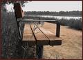
| 06/22/2004 09:05:48 PM | A Selective Benchby ScantyNebulaComment: This is a nice shot with an interesting point of view. I like the bench being left but the path takes away attention from the bench. If you just left he wood on the bench this would have really popped for me. The contrasts are well doen in the rest of the shot, though the sky seems just a bit dull. A 5 | | Photographer found comment helpful. |
| 06/22/2004 09:01:26 PM | La PIazza Dell' Arteby debitiptonComment: What beautiful artwork on the sidewalk. Ah, to be so talented.
I like the composition of this shot but for my taste, too much was left in color. Maybe if you had just left the artwork in color and desaturated everything else it would make a bigger impact to me. The oils being colorless yet so much color, but from where? See what I'm talking about? Just a thought. This is a lovely shot and I hope you got the artists name so you could offer them a print of it. As is a 6 | | Photographer found comment helpful. |
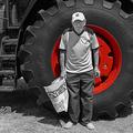
| 06/22/2004 10:30:25 AM | Being thereby jjbeguinComment: Not sure I quite understand the title of this shot, I'm guessing it has something to do either with the man in the picture used to drive one of these trucks or he just happened to be in the area and you asked him to pose in front of the tire. I have to be honest, he doesn't do anything for the shot for me personally and the bag he is holding is very distracting. If you had just shot the tire without the man and then had the wheel red, with good contrasting black and white points this would have been an excellent shot. Also, I'm betting you used the history brush to bring back the red on the wheel. I have found that by enlarging the shot and using the brush you get better detail around the edges and better control On his left shoulder you can still see gray on the wheel and around the edges of the wheel and by the bottom of his sleeve on the right. And he's wearing blue pants? A hint of blue shows up around the pocket on the right. As is a 4, but if you reshoot and try this again with just the wheel, I would love to see it. | | Photographer found comment helpful. |
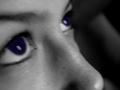
| 06/22/2004 10:25:35 AM | Eyes to the Skyby ClickyChickyComment: This shot has so much potential and I'm sure that 90% of your comments will be, "out of focus" and that is how it appears. If you were going for a soft focus look it's a nice attempt but it looks more like motion blur than soft focus on my monitor. The eyes also seems a bit dar, the pupil on the left seems extremely large and the white on the right puple seems to have some jpg artifacts in it and there appears to be no pupil at all. Also the background on the right is very distracting, solid black would really pull this shot off. If you redo this shot I would love to see it again. As is a 4 | | Photographer found comment helpful. |
|
Showing 721 - 730 of ~2077 |
Home -
Challenges -
Community -
League -
Photos -
Cameras -
Lenses -
Learn -
Help -
Terms of Use -
Privacy -
Top ^
DPChallenge, and website content and design, Copyright © 2001-2026 Challenging Technologies, LLC.
All digital photo copyrights belong to the photographers and may not be used without permission.
Current Server Time: 06/17/2026 01:07:22 PM EDT.
|