| Author | Thread |
Comments Made During the Challenge  |
|
|
06/25/2004 07:18:53 PM |
|
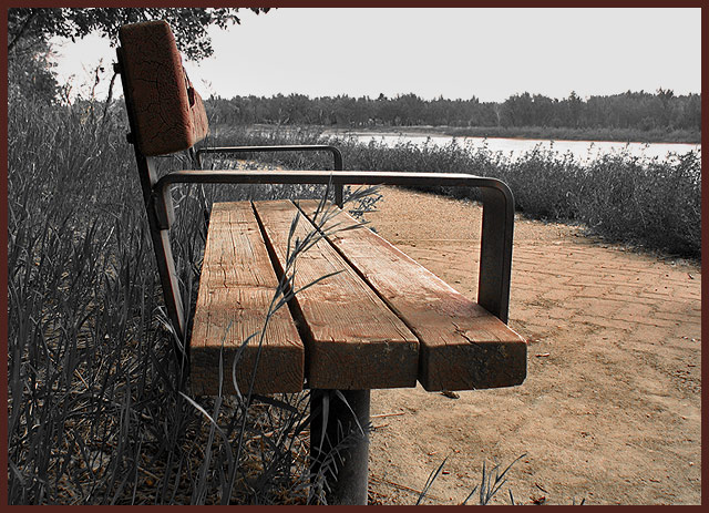
Looks like a sepia toned picture. The brown border only enhances the sepia effect. |
|
 Photographer found comment helpful. Photographer found comment helpful. |
|
|
06/23/2004 08:47:19 PM |
|
Appears if you selectively desaturated colors to achieve this effect. It would've been a pain to manually select the bits of dirt between the grass behind the bench. Nice idea, but I think with so much brown from the dirt on the right half, it draws attention away from the bench. |
|
| Photographer found comment helpful. |
|
|
06/22/2004 09:05:48 PM |
|
This is a nice shot with an interesting point of view. I like the bench being left but the path takes away attention from the bench. If you just left he wood on the bench this would have really popped for me. The contrasts are well doen in the rest of the shot, though the sky seems just a bit dull. A 5 |
|
| Photographer found comment helpful. |
|
|
06/22/2004 12:05:12 PM |
Clean composition, strong detail in the wood grain, and good use of perspective. Perhaps being more aggressive with your desaturation in the grasses and on the far shoreline could have strengthened your vision. Similarly, removing the few grass bits that are overlapping the bench in the foreground would have isolated the bench some more. The border seems a little out of place.
|
|
| Photographer found comment helpful. |
|
|
06/22/2004 10:22:31 AM |
|
Hey, I think I seen this Photo somewhere else...hehe Good Luck! |
|
| Photographer found comment helpful. |
|
|
06/22/2004 01:21:53 AM |
|
How wonderful that you thought of the brown in a de-sat. Wonderful use!!!!! And a great photograph. |
|
| Photographer found comment helpful. |
|
|
06/22/2004 12:28:38 AM |
|
To me, brown is just about the most unattractive color. It's just so dull. I think I would have preferred to see the greens in this, and have the bench and path desaturated. |
|
| Photographer found comment helpful. |
|
|
06/21/2004 03:14:00 PM |
|
I would have just colored the bench. Not the ground. But, what do I know? 6 |
|
| Photographer found comment helpful. |
|
|
06/21/2004 03:52:37 AM |
|
i was just looking through the thumbs, and this one jumped out at me. i love the angle and variation in textures between the wood, dirt, and brick. great image, i hope it does well. |
|
| Photographer found comment helpful. |
Home -
Challenges -
Community -
League -
Photos -
Cameras -
Lenses -
Learn -
Help -
Terms of Use -
Privacy -
Top ^
DPChallenge, and website content and design, Copyright © 2001-2026 Challenging Technologies, LLC.
All digital photo copyrights belong to the photographers and may not be used without permission.
Current Server Time: 06/30/2026 10:29:19 PM EDT.