| Image |
Comment |
| 09/18/2002 12:09:00 AM |
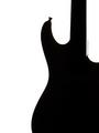
Rock On ..by magnetic9999Comment: What an excellent pic! :o) I'm not a big guitar fan, but this is so very pop art(ish?) that it's appealing anyway. I like your choice to make it vertical. If you look too close it's not a true silhouette tho. There's still a little detail in there so I can't give it a 10. 9 is a good number anyway ~indigo997 |
| 09/16/2002 03:05:00 AM |
|
| 09/16/2002 04:19:00 AM |
All in the Same Boatby MiekaComment: Great skyscape! I love the colors and mood of this pic. You did a pretty good job of exposing, and focusing on the boat even with the low lighting conditions. I think there is a little too much sky tho. It overwhelms the subject rather than emphasizing it. Try cropping a little more maybe. Also, what is just to the left? Could you have maybe included a little more of the black bars holding up the boat? ~indigo997 |
 Photographer found comment helpful. Photographer found comment helpful. |
| 09/18/2002 12:51:00 AM |
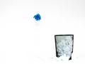
Blew itby FrooberComment: I like the composition. It also works well as high-key. I think it's just a tad overdone tho. The papers on the outside of the basket are barely discernable and have no detail left. I also feel like there's just a little too much empty space. You definitely need some, but maybe not quite so much. Still, it's a fun pic to look at. You did a good job stopping the motion, and the title is cute. I like that you used one lone blue paper. ~indigo997 |
| Photographer found comment helpful. |
| 09/17/2002 11:48:00 PM |
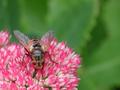
Tachina feraby UberFishComment: This is one of my 10s for the week. It is an excellent insect shot. Great DOF, focus, and colors. ~indigo997 |
| 09/16/2002 12:50:00 AM |
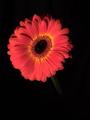
Midnight Flowerby tapnhodgComment: Very nice, but it looks very digital for some reason. Poor quality distracts from the nice color and composition. |
| 09/18/2002 12:05:00 AM |
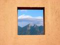
Framedby lmhrComment: Don't you hate it when you have a great idea and someone else has the same one? This is just excellent tho. Nice colors & beautiful view. Light seems a bit harsh maybe. 9 ~indigo997 |
| 09/16/2002 12:51:00 AM |
Hannahby ZeissmanComment: Very adorable, but you aren't supposed to let everyone know which pic is yours! *grin* She looks just like you! I think I woulda left a little more space on the left side instead of cropping her cheek. ~indigo997 |
| 09/18/2002 12:45:00 AM |
Runnerby lionelmComment: Great high-key, but it's a little too blown out. Would make a great stock shot for advertising. Nice composition and use of neg space. ~indigo997 |
| Photographer found comment helpful. |
| 09/16/2002 12:48:00 AM |
Tormentby oniComment: Cool tone. Great focus and lighting. The centering bothers me a bit. Still, I really like the shot. ~indigo997 |
Home -
Challenges -
Community -
League -
Photos -
Cameras -
Lenses -
Learn -
Help -
Terms of Use -
Privacy -
Top ^
DPChallenge, and website content and design, Copyright © 2001-2026 Challenging Technologies, LLC.
All digital photo copyrights belong to the photographers and may not be used without permission.
Current Server Time: 07/18/2026 01:47:05 AM EDT.