| Image |
Comment |
| 10/21/2013 06:48:15 PM |
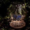
The Bell Jarby grahamgatorComment: Interesting take on the novel. I think it follows the cover art in a way, and that's nice.
I do think it fails to really convey the darkness and despair of the novel, the butterfly is just way too pretty and nice.
...
Photographic merit is pretty good here though, sharpness is really nice, exposure is great, composition is at least good. (there seems to be a slight tilt)..
So... dunno? 6 I suppose |
 Photographer found comment helpful. Photographer found comment helpful. |
| 10/21/2013 06:47:32 PM |
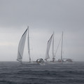
"North and South," by John Jakesby ShaneBlakeComment: Good enough fit.
Love the rain drops and sparks flying from the mouth of the cannon.
What I don't like is the absence of faces, and the ear plug which kinda dispels the period 'feeling' of the shot.
6 |
| Photographer found comment helpful. |
| 10/21/2013 06:46:51 PM |
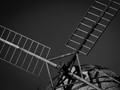
Don Quixote (de la mancha) by HarlequinComment: Initial Reaction: Windmill...
Suitability for Challenge Topic: Tilting at windmills.. Hmm... Figurative, but directly related to the text.
Aesthetic: A little bit low contrast, and a touch soft. Tilted composition works here, and not just because of "tilting at windmills"..
Needs Work: Exposure/contrast
Final Thoughts: While this doesn't really tell me a story, it is at least applicable.
Score: 6 |
| 10/21/2013 06:46:40 PM |
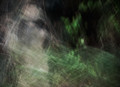
'Something Wicked This Way Comes' by Ray Bradburyby IAmEliKatzComment: Dude. Really?
I mean, it's Halloween season, and you deliver this for "Something Wicked"?
Disappointing. 3
Having spent more time with this, and really trying to see what's going on, I've finally found a face (more obvious in thumbnail), and think it adds to the photograph.
Can't give it HUGE love, because it is so faint, but that 3 just became a 6. |
| Photographer found comment helpful. |
| 10/21/2013 06:46:15 PM |
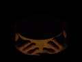
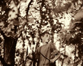
"Please Sir, I want some more"by Shifty_PowersComment: Lovely. The hands look rather well cared for, but I suppose 'poor' hands are hard to come by on short notice.
I think it fits the challenge very well, and is reasonably executed.
The big issue I have here is the lighting, not only is it a bit too harsh (Chiaroscuro is good, but only to a point), but the entire midtone range is quite low-key and the highlights are a bit low as well.
6 for meeting the challenge well, but not quite the processing that I would have preferred. |
| Photographer found comment helpful. |
| 10/21/2013 06:44:52 PM |
Captains Courageous (Rudyard Kipling)by tomeComment: Fits the novel well enough. Not quite perfect, but hey - not bad either.
The image itself leaves something to be desired - it seems flat, and just isn't striking. Despite that, it does fit well and isn't badly deficient in any manner.
6 |
| 10/21/2013 06:44:33 PM |
|
| Photographer found comment helpful. |
| 10/21/2013 06:44:28 PM |
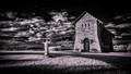
"A Prayer for Owen Meany"by DudskiComment: Fits the novel well enough, since faith and the church was a big part of that one.
I like the image's composition, and the subject.
The building's facade is nearly perfect, but the rest of the image seems to be over-sharp, and the shadow area of the building seems really soft. Quite strange overall.
Add to that the selenium coloration, and hard clouds, and we start heading down a rather dark path.
I'm giving this a 6 for meeting the challenge well, and having a good composition. |
| 10/21/2013 06:44:23 PM |
|
| Photographer found comment helpful. |
| 10/21/2013 06:44:04 PM |
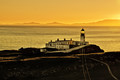
To the Lighthouse (Virginia Woolf)by KroburgComment: This was a novel that literal worked for. I think the tonality here is great, and love that rich yellow.
Powerlines should have been cloned out, and I would have just loved a tiny touch of 'structure' on that building.
Anyway, 7 |
| Photographer found comment helpful. |
Home -
Challenges -
Community -
League -
Photos -
Cameras -
Lenses -
Learn -
Help -
Terms of Use -
Privacy -
Top ^
DPChallenge, and website content and design, Copyright © 2001-2026 Challenging Technologies, LLC.
All digital photo copyrights belong to the photographers and may not be used without permission.
Current Server Time: 06/25/2026 12:10:40 AM EDT.