| Image |
Comment |
| 11/12/2002 06:22:00 PM |
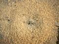
Ant Hillby Delta_6Comment: challenge -- kind of met, i don't get the feeling that you are close up from the photo. this is not really an anthill, more like fine gravel around a crack in the road where ants live. technical -- good. composition -- there's really nothing very interesting in this photo, sorry. ants would make a huge difference. overall, maybe if the hole was a little less off-center could add some dynamics to the photo. -- gr8photos. |
 Photographer found comment helpful. Photographer found comment helpful. |
| 11/14/2002 12:52:00 PM |
sucked outby bayuComment: challenge -- met technical -- nice focus on the main part of the photo. i like how the stem is blurred, but still visible. it gives the sense that the dried flower is 'sticking out' of the photo. flower is just a tad to dark in the center for my personal preference. composition -- i'm wondering how this would look in a portrait format. as it is, the flower looks a little cramped at the top. -- gr8photos. |
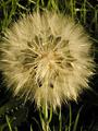
| 11/13/2002 11:06:00 AM |
Dandelion Puff @ Sunriseby sulamkComment: challenge -- met technical -- early morning (or late afternoon for that matter) light is called golden for a reason, isn't it. beautiful lighting. sharpness and focus are also good. composition -- there are two ways you can go with this one ... include all of the dandilion (which you almost did, but you cropped it on the left!) or make the crop look deliberate and include only part of it. this way it looks a little accidental, but still nice. -- gr8photos. |
| Photographer found comment helpful. |
| 11/14/2002 05:32:00 PM |
Redby JeanComment: challenge -- met technical -- love teh red of the tomatoes and that there's just a little sheen, rather than a reflection on it. nicely sharp, too. composition -- i'm trying to figure this one out. is the tomatoe on a glass surface or something? the shadow just doesn't look quite in the right place... curious to see your description on monday. -- gr8photos. |
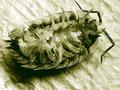
| 11/12/2002 11:41:00 AM |
bixoby adixionComment: challenge -- met technical -- when the photo first displayed i went 'ugh' at the greenish color cast but now that i've looked at the photo some more i find that it actually works. the hind legs kind of melt together because there's no contrast in color and they are blurry. the rest of your focus is good. composition -- fine, maybe upper antenna is a tad too close to the top of the frame. -- gr8photos |
| 11/11/2002 03:24:00 PM |
M@cro shotby dieselbiscuitComment: very cool :) challenge -- met. even though the shot doesn't give me any kind of point of reference as to the actual size of the @, i'm giving you the benefit of the doubt here. what is this i'm looking at? technical -- nicely done, i would love to see the background just a little more white, but then i have this thing for perfectly white backgrounds. nice focus, DOF and color otherwise. composition -- i like the angle you have used here. it definitely adds to the shot. -- gr8photos |
| 11/12/2002 10:40:00 AM |
Kiriumby GordonComment: challenge -- met, really nice and close up. technical -- b&w works well here, you controlled your lighting very well, except for maybe some on the hands, but the impact of that is diminished by it being b&w. composition -- like the way you cropped it. don't like the hands being opposite of each other and creating one line, but that's minor and nitpicky. good photo! -- gr8photos |
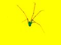
| 11/13/2002 10:38:00 AM |
ARACHNOID!by BukiosComment: wow, that's quite yellow :) challenge -- met technical -- i suspect you played a lot with the contrast because (well, because everything's so colorful ;) some of the spider legs are no longer visible. personally, i would've prefered a more natural rendition of the spider, but that's just me. composition -- having the spider in the middle of the shot works here. |
| 11/15/2002 04:51:00 PM |
Magicalby DianaComment: LOL ... i've been commenting on so many photos that they don't give me a sense of scale and that i'll just have to take their word for it ... unless you have a really HUGE ruler you DEFINITELY have a macro shot here. good idea. challenge -- met technical -- some glare on the ruler (and the figurine, too, but there's it's acceptable IMO), maybe angling the ruler sligthly differently could eliminate that for you. overall, slightly soft image. composition -- good. another idea would've been to get more reflection into the shot because you have such a nice shiny black background to work with, but that would be a different photo .... -- gr8photos. |
| Photographer found comment helpful. |
| 11/12/2002 10:42:00 AM |
A Helping Handby baccarudaComment: challenge -- met technical -- i would like to se more tonal range in the hands, the only really bright spot in this photo is the background and there it's slightly distracting. i do like your choice of b&w very much, and that the hands are of slightly different tones. composition -- hand positions are great, not too sure about background, but can't quite put my finger on (no pun intended) what i would try differently. -- gr8photos |
Home -
Challenges -
Community -
League -
Photos -
Cameras -
Lenses -
Learn -
Help -
Terms of Use -
Privacy -
Top ^
DPChallenge, and website content and design, Copyright © 2001-2026 Challenging Technologies, LLC.
All digital photo copyrights belong to the photographers and may not be used without permission.
Current Server Time: 07/22/2026 06:20:20 AM EDT.