| Image |
Comment |
| 06/04/2002 09:34:00 AM |
G-Stringsby simtengleongComment: I'm sure you get many comments that this one is totally blown out. It is. And it looks great for it! Just proof that sometimes you have to break the rules. :) |
| 06/03/2002 12:39:00 PM |
Ying & Yangby zerplordComment: Funny, especially with the title, but unfortunately, looks too much like a snapshot: not quite sharp, horizon not level, pole coming out of dogs head. |
| 06/05/2002 01:22:00 PM |
Magnoliaby elemessComment: This photo could've been one of my top votes, the composition is VERY good and white (or pale) flowers do actually lend themselves to b&w I think. However, IMO, the picture isn't quite sharp enough and needs more contrast. I've taken the liberty and played around with it some more. Let me know what you think! //www.pbase.com/image/2378485/original |
 Photographer found comment helpful. Photographer found comment helpful. |
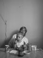
| 06/05/2002 11:51:00 AM |
Breakfastby VodkamanComment: Love the angle and the look on Mum's and baby's face. I'm torn between the format, I'm not sure whether the vertical works or whether I'd prefer a landscape format just with the lower half of the picture. In any case, the hook in the wall and the pull-thingy from the shutters is distracting. Also, the image is a tad soft for my liking (unless you were going for that) and could do with just a little more contrast in my opinion. I did an experiment this week by posting reedits (hope you don't mind). Let me know what you think. //www.pbase.com/image/2377564 |
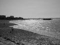
| 06/04/2002 09:41:00 AM |
The Beachby wolfjackComment: Personally, I feel that beaches often work better in color than b&w. The people on the beach could be subjects int he photo, but they are too much the same shade as the sand. Also, the horizon seems a little tilted. |
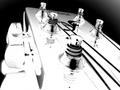
| 06/07/2002 04:05:00 PM |
Take that photo & I`ll punch your lights outby doogbullComment: Great shot and title. Just a tad more even lighting would make the photo even better. I'm no expert at lighting, but I believe the Classic Photo Course under the tutorials has some information on it. Multiple light-sources or moving the light source (or in this case the chair since it looks as if you used natural light) may be options. |
| 06/06/2002 04:24:00 PM |
Smileby jhcrossComment: What a cute and alert face! Good contrast, too. Some of the background is distracting (especially the white material on the left, and the light dot to the left of the head. I personally would've preferred zooming back a little to get the hands in, too. Still a good shot. |
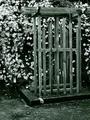
| 06/03/2002 11:44:00 AM |
Lori's Clematisby KathycComment: This seems to have a slight green tinge to it. Is it just my monitor? Good composition, used of ROT. Something a little more to hold my interest would've been nice. |
| 06/07/2002 04:08:00 PM |
Intensityby jasonmccarthyComment: A nice portrait, with good title. I think this photo could be improved further with some post processing to add some more contrast, it's too much gray and gray for my liking at the moment. |
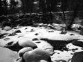
| 06/03/2002 02:58:00 PM |
The Creekby freetimeComment: OMG, you still have snow - poor you! Personally, I would like the shot better if it was a little sharper, and there was a clear focus that draws my eye in. Even though I like the composition. |
Home -
Challenges -
Community -
League -
Photos -
Cameras -
Lenses -
Learn -
Help -
Terms of Use -
Privacy -
Top ^
DPChallenge, and website content and design, Copyright © 2001-2026 Challenging Technologies, LLC.
All digital photo copyrights belong to the photographers and may not be used without permission.
Current Server Time: 07/17/2026 06:59:29 PM EDT.