| Image |
Comment |
| 07/07/2004 02:59:32 AM |
|
| 07/07/2004 02:57:51 AM |
|
 Photographer found comment helpful. Photographer found comment helpful. |
| 07/07/2004 02:56:38 AM |
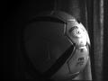
Best for Your Body by sahkoComment: The square frame really detracts from the ad feel, but it definitely still does feel like an add.
Certainly makes me want some water. 7. |
| Photographer found comment helpful. |
| 07/07/2004 12:22:17 AM |
|
| 07/01/2004 01:09:17 AM |
Daydreamerby dagills22191Comment: Really, really beautiful. If the background was more even (black all the way around) I think this would have been a 10, but it's still really great. 8 for now, and I might come back and rate it higher.
Good luck! |
| 07/01/2004 12:07:01 AM |
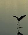
Water Danceby ScottKComment: I would love to have seen more shadow. But I like the silhoutte. More shadow is my only minor complaint. 6. |
| Photographer found comment helpful. |
| 06/30/2004 09:24:08 PM |
Ya' Pinheadby StevePaxComment: Immediately when I saw this, I thought how much better it would be with a white background. My ps skills are not very good, but I decided to take a shot at it, to see if it would look better.
So I did, but I know some people don't like having their photos toyed with, but if you're interested in seeing it, I did it, and I think it makes the photo, which is already great, even better.
And I can't help but think, that if it had been white, you could have got a top ten placement. |
| Photographer found comment helpful. |
| 06/30/2004 12:38:46 AM |
|
| Photographer found comment helpful. |
| 06/30/2004 12:35:25 AM |
|
| Photographer found comment helpful. |
| 06/30/2004 12:33:37 AM |
Bill & Kimby TooCoolComment: This doesn't look like a studio, or even studio like. Just looks outdoors.
But, just to comment on the photo itself, the Bill's shirt looks overexposed (possibly done in post processint) and It's pretty distracting. |
| Photographer found comment helpful. |
Home -
Challenges -
Community -
League -
Photos -
Cameras -
Lenses -
Learn -
Help -
Terms of Use -
Privacy -
Top ^
DPChallenge, and website content and design, Copyright © 2001-2026 Challenging Technologies, LLC.
All digital photo copyrights belong to the photographers and may not be used without permission.
Current Server Time: 07/18/2026 08:08:50 AM EDT.