| Image |
Comment |
| 07/02/2009 11:26:23 PM |
Pristine !by judojoeComment: Commenting here because of the Forum post.........
The Jag has a distinct design that managed to remain relatively modern looking. it is a credit to Jag desingers that they manage to design cars that do not date, and look old, a week after you drive them out of the showroom. having said that, it does have the more modern elements of current jag's and as a result, does not give the 'Old Car' feel that the majority of voters would have been after.........
I am not a fan of the background for this. The car is grey, and yet you have photographed it with a corregated background, which is both grey and in relative focus. The upper part of the car does not jump out from this area, and the roof almost blends into the background. Even the ground, being brickwork, has patterns that detract from the main subject......
The angle you photographed on is a normal, almost boring angle. It is the angle i expect to see in an add selling the car. Photograph at 45 degrees to show the front and undented side panel. As a result, it lacks an artistic flair to the photo that would have helped it. The crop also doesn't help, as it is very similar to what a caryard would use, show the car as big as you can...........
Even the lighting is not great, a bit uneven. Having the shaddow across the front windscreen detracts from the photo. highlights in areas......I find it hard to light a car really well, but when someone does, you can really tell.........
I didn't vote in teh challenge.....I can understand why people thought it was new (or relatively). Hope the comment helps put my opinion across and is of some help |
 Photographer found comment helpful. Photographer found comment helpful. |
| 06/17/2009 10:52:18 PM |
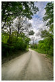
Poetry's Long and Winding Roadby L1Comment: An interesting image that leads off into the distance The road just leads the eye through the photograph and into the foliage that surrounds. Again, I like the colours you have, nice and vivid wiothout being unnatural. |
| Photographer found comment helpful. |
| 06/17/2009 10:50:53 PM |
Lookin' Backby L1Comment: An interesting image and some interesting colours. I would have cropped out the edge of the car though. i don't think you lose much by removing it, and at the moment, there is not enough of it for it to be much other than a distraction. Great processing for the sky....... |
| Photographer found comment helpful. |
| 06/16/2009 11:05:51 PM |
Boundariesby LutchenkoComment: A great rough cut timber fence. The interest int hese is in the imperfections in the wood, the turned beam, the uneven cut of the pickets, the warping of members. And you have captured it really well.
Sepia is perfect for this, an old style fence processed in the oldstyle way... |
| Photographer found comment helpful. |
| 06/16/2009 11:03:29 PM |
June 16 - Papaverby hajekaComment: Poppies are always great to photograph, as you get the great contrast between the bright red flowers and the green around. I feel you could have saturated ytour colours more for this, as the greens especially look a little too dull......A striking contrast of colour would work great |
| Photographer found comment helpful. |
| 06/16/2009 10:59:56 PM |
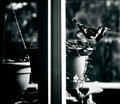
17-june 09 where i live. view from my windowby rozComment: Taking this through the wondow, with the window frame, gives a different effect to this photo than if it was just the bird. In many ways, it makes it much more interesting. The window frame gives an almost split pairing to the photo, as if we have two different photos, but because of the edge of the basket and the next one in that space, works well and ties it to the image, without being a dominant element. The black and white processing is really good and works well for this. An interesting image for the side challenge |
| Photographer found comment helpful. |
| 06/16/2009 10:56:44 PM |
Hard Bodies by L1Comment: Nice processing. You have given the photo an almost painted look as a result. I think it works for this shot and always good to try out some new effects. The off-centre composition is important to avoid it being a boring photo of a building, and therefore that has also worked well. An interesting contrast between the building and the glass front. Shame that white Magna is in the way of the widnows, but not much probably could have been done. Youo have done well to not have more cars in the way.......... |
| Photographer found comment helpful. |
| 06/15/2009 10:59:39 PM |
June 13 - Power linesby hajekaComment: An interesting image of something we all try and avoid. Don't know how many images i havn't liked, or have closed out, powerlines from.........
A shame you didn't have a bright blue sky day here. The overall impression of the image is very grey. You have a good tonal range from balck through to bright in the image, but the grey sky means that much seems to blend into it, instead of the lines and patterns jumping out from the background. |
| Photographer found comment helpful. |
| 06/15/2009 10:55:47 PM |
Trioby L1Comment: An interesting combination. In many wasy, the photos need to be together to give more context to them, rather than as individual images. Hence, the triptych works really well for this, allowing us to see the overall view, as well as the zooms showing more of the detail.
The reflection of the sky and the escape in the windows really adds to the photo for me, givng the splash of coloour into the grey image, as well as the darker shades that make this work. A really good combination. |
| Photographer found comment helpful. |
| 06/10/2009 03:43:09 AM |
Frosty Rochby jomariComment: Must have been pretty cold up in Ballarat this morning. was cold enough down here in Melbourne......... |
| Photographer found comment helpful. |
Home -
Challenges -
Community -
League -
Photos -
Cameras -
Lenses -
Learn -
Help -
Terms of Use -
Privacy -
Top ^
DPChallenge, and website content and design, Copyright © 2001-2025 Challenging Technologies, LLC.
All digital photo copyrights belong to the photographers and may not be used without permission.
Current Server Time: 08/07/2025 09:14:15 AM EDT.