| Image |
Comment |
| 10/06/2003 11:08:28 AM |
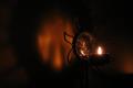
The Shadowby thelselComment: Very effective use of grain, excellent expression captured. Good use of light and shadow, excellent composition. 10 |
 Photographer found comment helpful. Photographer found comment helpful. |
| 10/06/2003 11:07:29 AM |
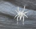
A Living Nightmareby christyrackComment: I'm really puzzled as to how you achieved this... inverting it doesn't seem to make it any clearer! I really like the textures, idea and composition... the outline of the spider make it seem more primal than seeing an actual spider. 10 |
| Photographer found comment helpful. |
| 10/06/2003 08:41:30 AM |
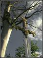
All is Lostby vonautschComment: Great idea, but the composition lets it down. All the elements (tree, bush, sword) seem to blend into each other, and I feel they need to be seperated. Great sky and lighting, but it's a shame about the burnt out highlights on the tree trunk. 6 |
| Photographer found comment helpful. |
| 10/06/2003 08:38:36 AM |
|
| Photographer found comment helpful. |
| 10/06/2003 08:35:46 AM |
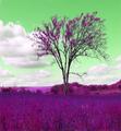
Alternate Realityby tfaustComment: Interesting idea for this challenge, but the photo has to stand on it's own merits before the effects are applied. The composition just doesn't do it for me here... with the correct colours I'd give it a 5, and so the score is 5! |
| Photographer found comment helpful. |
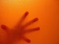
| 10/06/2003 08:31:12 AM |
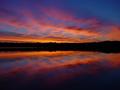
Locked inby ccjpComment: I love this shot... although I'm not sure about your title. Is the viewer locked in, or something that could attack the viewer? Great vivid colours, interesting texture. Good composition. 8 |
| Photographer found comment helpful. |
| 10/06/2003 08:22:11 AM |
Building His Dream Carby dsa157Comment: Superb picture, great in every way. I do feel though that it hasn't really met the spirit of the challenge, and has been shoehorned in a bit. Normally I'd give it a 9 or a 10 (the desat has left a bit of an unattractive grey in places), but here I think I'm going to go for 6. |
| Photographer found comment helpful. |
| 10/06/2003 05:39:47 AM |
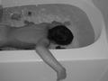
Light Sun & Shadowby michael_pComment: Beautiful shot, but I don't tend to have arty, set-up dreams like this! I see this more as something in the room you sleep in which might trigger dreams. Strange use of negative space... I wonder what you were trying to achieve with it. Maybe this would be more effective with the subject to one side of the frame, or more tightly cropped. 6
Edit: of course this isn't helpful. I don't see any constructive criticism in there (/sarcasm) Message edited by author 2003-10-13 10:23:42. |
| Photographer found comment helpful. |
| 10/06/2003 05:35:35 AM |
A Mothers Nightmareby NukktaComment: Very edgy. It could do with a much tighter crop though... I don't see why the frame is needed both above and to the right of your subject. Perhaps you could focus more on the arm in your composition, this would really add to the shock value. 6 |
| Photographer found comment helpful. |
| 10/06/2003 05:33:00 AM |
He never came!by kiwinessComment: Beautiful model and dress. Shame about the white balance... the skin seems very orange. The photo is just a little underexposed for my taste. Great idea, it made me laugh out loud (not because I'm heartless! It's a great idea for nightmare). The background could enhance the foreground more if it were darker. On the whole, I like this though! 8 |
| Photographer found comment helpful. |
Home -
Challenges -
Community -
League -
Photos -
Cameras -
Lenses -
Learn -
Help -
Terms of Use -
Privacy -
Top ^
DPChallenge, and website content and design, Copyright © 2001-2025 Challenging Technologies, LLC.
All digital photo copyrights belong to the photographers and may not be used without permission.
Current Server Time: 06/28/2025 10:27:20 AM EDT.