|
|
|
Showing 1331 - 1340 of ~2866 |
| Image |
Comment |
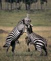
| 01/16/2005 07:12:45 AM | bravadoby ellamayComment: It's a fine moment. I would reall really have taken the clone tool to the gazelles (?) behind the zebra however - they are absolutely a distraction, and i cannot see that they help the shot any, particularly being so partially visible. |  Photographer found comment helpful. Photographer found comment helpful. |
| 01/16/2005 07:10:34 AM | Rusted Windmill Pumpby RobCourseyComment: Compositionally strong, adn the basic tonality is good. It's uch a straightforward image that I wonder if it won't be hurt by those who are looking for more immediate impact. I wouldn't quite count myself amonst those, but I do perhaps think that the light is a touch blank and ordinary, and perhaps some pushing of contrast, or of saturation/desaturation might have given it more punch. Good work though. | | Photographer found comment helpful. |
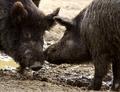
| 01/16/2005 07:01:20 AM | Love Don't Cost a Thing (Warner Bros. 2003)by nsbca7Comment: Proper animal photography, this. I think that all your choices here are well though out - the tonality especially - so many would have been overly tempted to go black and white, but that dirt-brown is essential to my eye. | | Photographer found comment helpful. |
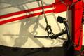
| 01/15/2005 08:07:51 PM | The Anchor (1945)by AzrifelComment: Love that light and shade, and the shadow patterns. It grows on me too - the sheer wackiness of those lines and conjunctions. A strong eye, and a well organised composition. | | Photographer found comment helpful. |
| 01/15/2005 07:55:06 PM | The Passion of the Christby GSRsedanComment: Has some elegance, but I think ti would be stronger for a crop on the right of frame - I rarely make these recommendations, usually presuming that the photographer has made a choice - but in this case it would be easily done, and would certainly strengthen the image in my opinion. The light is good, exposure, focus and all that is fine. Too much of a designer image to really get me going. | | Photographer found comment helpful. |
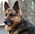
| 01/15/2005 08:32:30 AM | Watchful Eyeby glad2badadComment: I'd be pleased with it, as a portrait of a dog. The purple finging around the right ear is a shame, but would be correctible under decent editing rules. As a portrait, however, it is simply that: there is no other element to this shot, no particular context, reference, etc. What I'm saying is that whilst it's admirable for what it is, it doesn't get a high rating from me because i think photography can be about so much more than this. | | Photographer found comment helpful. |
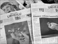
| 01/15/2005 08:26:16 AM | Citizen Kaneby greslizzzComment: I get your point - but this is still just a photograph of some newspapers. It doesn't have any great sense of light either, for me. | | Photographer found comment helpful. |
| 01/14/2005 07:25:39 AM | American Beautyby peeteComment: Interesting the difference of approach throughout tthis challenge - those who've chosen to recreate scenes directly from movies, and those who've simply used a title from a movie to title their image. The latter was clearly the intention of the challenge, but this approach can't be said, I think, to have missed the point.
Hoever, it does have a certain different kind of problem, which is that your asking for your image to be compared to an original, rather than as a piece that stands alone; especially with such a memorable and oft-copied image as the sea of rose petals from this film. The simply enormous number of petals in that scene makes it difficult not to look in a certain sense at this as a cheap version. As far as it's possible to look at this in isolation, to forget about 'the original', it's not a bad piece of work - though I would perhaps quibble with your precise placing of the figure in frame, and with the exceptional softness of the light, and perhaps with your crop overall: I wonder whether a more angled shot, and a still soft but more directional light, and perhaps a concentration on the hand and the stomach might have been stronger? | | Photographer found comment helpful. |
| 01/14/2005 07:16:45 AM | Splashby rudidlComment: oh god - very very clever, in terms of photographic technique - and probably almost impossible to vote down and therefore very successful here. I can just imagine it with the blue ribbon. I'm sure your captue of those flying droplets is exceptional ... in short, I think it probably took a great amount of work, and it does have a very pleasing and simple aspect to it, but...
It's so bloody designed. Controlled, non-spontaneous, non momentary, cold, emotionless, non-pertinent. I hate this kind of stuff - and were I able to shoot it, I would no doubt submit it myself. Lots of contradictory feelings, but in the end, not a kind of photography I like at all.
I'm coming back to this; I wonder if your use of that shade of blue, and the cocktail glass, will make it too close to a certain very popular shot of Kiwiness for people here? It'll be interesting to see how it does, very interesting. | | Photographer found comment helpful. |
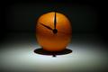
| 01/14/2005 07:11:06 AM | A Clockwork Orangeby casualguyComment: By far the best of the ornage shots so far. What annoys me, with all oranges, is the shininess of the skin, and the fact that it's almost impossible to avoid those bright white reflections. Not sure what to suggest could be done about it - perhaps some hairspray or something to give it a more matte surface? it takes an edge off the intensity of the image for me. | | Photographer found comment helpful. |
|
Showing 1331 - 1340 of ~2866 |
Home -
Challenges -
Community -
League -
Photos -
Cameras -
Lenses -
Learn -
Help -
Terms of Use -
Privacy -
Top ^
DPChallenge, and website content and design, Copyright © 2001-2025 Challenging Technologies, LLC.
All digital photo copyrights belong to the photographers and may not be used without permission.
Current Server Time: 08/22/2025 03:38:43 PM EDT.
|