| Image |
Comment |
| 09/15/2007 11:52:06 AM |
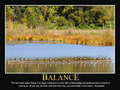
Balanceby aliquiComment: Critique Club feedback -
This was a very solid entry and its score shows that to be true.
Thefont of the quote is a bit hard to make out at these small image sizes, but given the wordiness you only had so much real estate to work with.
Little bit more contrast in the photo, and if possible to do so without introducing other problems it would be even better were that log perfectly horizontal.
Overall this was great. Scored well, but I'm suprised it didn't place a bit higher. |
 Photographer found comment helpful. Photographer found comment helpful. |
| 09/15/2007 11:50:00 AM |
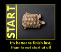
It's better to finish last, than to not start at allby ScapeshotsComment: Critique Club feedback -
I thought this was a creative entry, held back in large part by a rather lackluster font.
Having your keyword in the image itself is really great.
One thing I didn't get (and still don't) is why the turtle is facing away from the starting line. |
| Photographer found comment helpful. |
| 09/15/2007 11:48:12 AM |
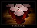
TEAMWORKby SamDoe1Comment: Critique Club feedback -
I thought this was a funny entry, but also one that presented the motivational poster 'package' perfectly. Image matching message, font, design - all dead on.
The lighting isn't the best on the cups, but what really threw me (given my assumption that this was a reference to drinking games) was why these cups weren't filled with beer?
Perhaps you play drinking games with 12oz. cups of vodka. Truly you are a braver man than I. |
| Photographer found comment helpful. |
| 09/15/2007 11:46:16 AM |
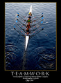
t e a m w o r k by hotpastaComment: Critique Club feedback -
I actually already commented on this image, so I won't bother repeating myself.
Well done! |
| Photographer found comment helpful. |
| 09/15/2007 11:44:43 AM |
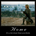
Homeby CorySmithComment: Critique Club feedback -
The only thing that kept this image from scoring even higher (setting aside ridiculous political voting) is the font. This is a great photo and works perfectly with your quotation. If you had gone with more of a classic font, at least on the word Home, the message would have much more impact on the poster and the whole package would just come together perfectly.
This was a great capture. I think the score this got was well deserved. |
| Photographer found comment helpful. |
| 09/15/2007 11:39:24 AM |
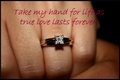
True Loveby andrea22_alsComment: Critique Club feedback -
Probably the best way to approach this challenge would be to ask yourself if you would spend a few hundred dollars on this and hang it in the lunch room where you work.
The image here is very, very out of focus. I remember seeing this in the forums and you questioning if this was a function of resizing. Hopefully you've sorted that out.
The quote itself is ok and certainly goes along with the photo, but the font used does not deliver the message with much impact and its placement on the photo might work better if beneath the ring. |
| Photographer found comment helpful. |
| 09/15/2007 11:37:20 AM |
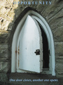
OPPORTUNITYby snafflesComment: Critique Club feedback -
Good choice of imageto go along with your message.
Choice of font for the image itself is ok, though the key word could be much larger as really it is the 'point' of the poster. The color of the font isn't the best for this scene as part of the word blends into the photo beneath.
The photo is nice, but a bit on the soft side. |
| Photographer found comment helpful. |
| 09/15/2007 11:35:27 AM |
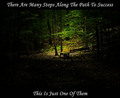
The Path To Successby albc28Comment: Critique Club feedback -
Very odd choice of image and message (or message and image). A step to success is a bench?
Photo itself is very nice, particularly how it fades to black towards the bottom. This probably would have popped more if all the text were at the bottom of the shot in the dark area. The top line looks a bit 'crammed in' and works against a sense of balance for the poster as a whole. |
| Photographer found comment helpful. |
| 09/15/2007 11:33:35 AM |
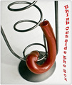
Think Outside The Boxby marvinComment: Critique Club feedback -
Certainly a creative entry. Clever to match the warped font with the warped candle.
The image itself really pulls this poster down. Lot of dirt (or something) on the white background and some shadows here and there which don't flatter the subject.
Overall, I think this is really out of the box so in that sense you presented something that really did present the message you wanted to get across. |
| Photographer found comment helpful. |
| 09/15/2007 11:31:16 AM |
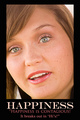
Happiness Is Contagious!by 777STANComment: Critique Club feedback -
Photo matches the message well - a happy face to reinforce a motivation to maintain a happy disposition.
Both the shot and the word happiness seem to be a little on the pinkish side. This impression is reinforced by the pink color of the quote itself. I think a bit of white balance adjustment on the photo would go a long way towards making this poster pop overall, and perhaps putting Happiness in a simple bright white would enhance the poster as well. |
| Photographer found comment helpful. |
Home -
Challenges -
Community -
League -
Photos -
Cameras -
Lenses -
Learn -
Help -
Terms of Use -
Privacy -
Top ^
DPChallenge, and website content and design, Copyright © 2001-2025 Challenging Technologies, LLC.
All digital photo copyrights belong to the photographers and may not be used without permission.
Current Server Time: 06/22/2025 02:22:56 AM EDT.