| Image |
Comment |
| 11/21/2004 01:21:24 AM |
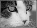
The Light in His Eyesby AutumnCatComment: Good crop and nicely filling the frame with the subject. The image looks nicely sharp, the eyes mostly clear, and the exposure and tonal range looks good. |
 Photographer found comment helpful. Photographer found comment helpful. |
| 11/21/2004 01:19:04 AM |
Date Nail - circa 1951by cpurserComment: When I first saw the image I thought 'cool' and then I scrolled down and saw the portrait orientation and found the nail quickly losing the dynamic impact that I originally saw. I like the diagonal of the wood, the tonal range looks good, the wood also has a good texture to it, and the nail adds interest. I think it would likely have more impact in a landscape orientation. |
| Photographer found comment helpful. |
| 11/21/2004 01:15:55 AM |
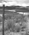
Arizona Fenceby jbeazellComment: The fence leads the eye nicely through the image but there seems to be a lack of contrast in the image. The full tonal range doesnt look present and so the image seems very light and so a little indistinguished. Adding more contrast would define certain areas of the image and give it a little more tonal depth. |
| Photographer found comment helpful. |
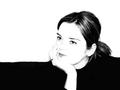
| 11/17/2004 10:58:19 AM |
Contemplationby dartompkinsComment: The composition and crop is good. The expression makes one wonder what she is thinking but mostly as a distant observer. The image doesnt really engage the viewer and bring them in, not that that is always necessary. I'm not really sure if black and white works here. The tone makes the image feel very cold and impersonal, as if the personality has been stripped away with the color. |
| Photographer found comment helpful. |
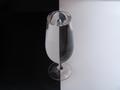
| 11/17/2004 10:49:36 AM |
Black and Whiteby stragsComment: It's a classic image. I think having the checkerboard either straight or an obvious exaggerated tilt would be better. As it is now it just looks kinda awkward and makes me tilt my head to manually straighten up the lines myself. The cups look a little squished together and would have likely benefited from a little more negative space around them, ie not such a tight crop. It's a shame you couldnt get two identical cups just in the different white/black. I'm not sure what the round black thing is under the black cup but it stands out as being different from the pattern. I also think it would likely have done better without the spoon as you can see the reflection and what appears to be a flash. |
| Photographer found comment helpful. |
| 11/17/2004 10:42:04 AM |
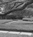
Pathwaysby jaredldrComment: To me the focus of the image is the tree and having the excess length distracts a little so cropping up past the first path would put the emphasis back on the tree. The tones are all in a very similar range - likely the green - and everything seems to be in focus (instead of having a slightly blurred background), which gives the image a fairly low contrast look. Boosting the contrast a little or playing with the highlight/shadows in curves may help give the image a little more depth. It also looks a little too sharp - making your aperature wider (if possible) so some of the background was more blurred and just having the tree in sharp focus would likely help also. |
| Photographer found comment helpful. |
| 11/17/2004 01:48:45 AM |
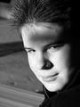
Deep in Thoughtby bjc0001Comment: The image looks a little soft and it looks like the focus was mostly on the hair. The lighting looks a little harsh and the shadow across the forehead looks a little odd. I can see what you were trying for but the lighting is just a little bit off. The background is a little distracting also as they seem to be coming from or attached to his head. |
| Photographer found comment helpful. |
| 11/17/2004 12:40:34 AM |
two paper rollsby pcodyComment: Texture, form, light, and shadow - all the elements to make a good black and white image. The shot is interesting but lacks any wow impact for me. There is a significant amount of noise in the image also. |
| Photographer found comment helpful. |
| 11/17/2004 12:37:19 AM |
Portraitby _wu_Comment: There are a lot of people who like this high-key style of shot. I'm not really a fan of it personally. I do like how the background splits between black and white. I cant really see anything technically wrong with this, it just doesnt have the visual impact for me. |
| Photographer found comment helpful. |
| 11/17/2004 12:30:51 AM |
Estographyby ArnarpComment: The focus on the glass is a little soft and the white looks quite grey. A levels/curves enhancement or more light in the setup would make a significant improvement. |
| Photographer found comment helpful. |
Home -
Challenges -
Community -
League -
Photos -
Cameras -
Lenses -
Learn -
Help -
Terms of Use -
Privacy -
Top ^
DPChallenge, and website content and design, Copyright © 2001-2025 Challenging Technologies, LLC.
All digital photo copyrights belong to the photographers and may not be used without permission.
Current Server Time: 08/01/2025 02:47:26 PM EDT.