| Author | Thread |
Comments Made During the Challenge  |
|
|
11/23/2004 09:10:31 PM |
|
 Photographer found comment helpful. Photographer found comment helpful. |
|
|
11/22/2004 10:22:48 AM |
|
| Photographer found comment helpful. |
|
|
11/19/2004 11:23:45 AM |
|
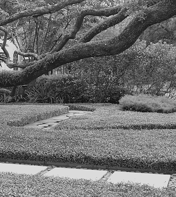
There's lack of contrast in this picture. It could benefit from some. |
|
| Photographer found comment helpful. |
|
|
11/18/2004 03:38:36 PM |
|
The texture is great, remeniscent of pointillism and very appealing. The photo lacks a definite subject, though, and feels busy. |
|
| Photographer found comment helpful. |
|
|
11/18/2004 01:21:57 PM |
|
I think the perspective obscures the background path too much for this to work right. You'd want to be up about 5 more feet or so to bring it out. |
|
| Photographer found comment helpful. |
|
|
11/17/2004 03:35:39 PM |
|
Interesting composition. The diagonals are pleasing. What detracts from this iamge is the fact that it is a little bit too busy. |
|
| Photographer found comment helpful. |
|
|
11/17/2004 11:55:22 AM |
|
I like the way the limb goes acroos the photo and the winding pathway from front to back. The dof is good. I do think it needs a little more contrast and would have preferred a crop bove the walkway at the bottom. It tends to draw my eye down instead of into the photo. |
|
| Photographer found comment helpful. |
|
|
11/17/2004 10:42:04 AM |
|
To me the focus of the image is the tree and having the excess length distracts a little so cropping up past the first path would put the emphasis back on the tree. The tones are all in a very similar range - likely the green - and everything seems to be in focus (instead of having a slightly blurred background), which gives the image a fairly low contrast look. Boosting the contrast a little or playing with the highlight/shadows in curves may help give the image a little more depth. It also looks a little too sharp - making your aperature wider (if possible) so some of the background was more blurred and just having the tree in sharp focus would likely help also. |
|
| Photographer found comment helpful. |
|
|
11/17/2004 10:20:16 AM |
|
|
|
11/17/2004 01:46:01 AM |
|
a little flat, but really interesting subject. like the winding path, and like the tree cutting the image. would love to see this a little more contrasty, specifically with blacker blacks (that's just my preference). |
|
| Photographer found comment helpful. |
|
|
11/17/2004 01:05:55 AM |
|
May be natural but feels over sharpened to me. |
|
| Photographer found comment helpful. |
Home -
Challenges -
Community -
League -
Photos -
Cameras -
Lenses -
Learn -
Help -
Terms of Use -
Privacy -
Top ^
DPChallenge, and website content and design, Copyright © 2001-2026 Challenging Technologies, LLC.
All digital photo copyrights belong to the photographers and may not be used without permission.
Current Server Time: 06/29/2026 02:41:33 PM EDT.