| Image |
Comment |
| 12/25/2005 07:59:14 PM |
LESS IS MOREby yoavbComment: composition is off balance..cropping black area on left would help |
 Photographer found comment helpful. Photographer found comment helpful. |
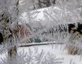
| 12/25/2005 07:57:00 PM |
Frostingby dphillipsComment: interesting how the two patterns overlap but don't clash with each other |
| Photographer found comment helpful. |
| 12/25/2005 07:56:20 PM |
Presentiment of Deathby grusComment: the emphasis of the rose by color is excellent but maybe a more grey toned photo would be better |
| Photographer found comment helpful. |
| 12/25/2005 07:55:07 PM |
|
| Photographer found comment helpful. |
| 12/25/2005 07:54:29 PM |
|
| Photographer found comment helpful. |
| 12/25/2005 07:53:52 PM |
|
| Photographer found comment helpful. |
| 12/25/2005 07:53:29 PM |
Sennheiserby akolaginiComment: this would be a great product advertisement since it focuses on the product..techinically very nice |
| Photographer found comment helpful. |
| 12/25/2005 07:52:48 PM |
Happy Holidaysby tjmuellerComment: if it would be blurred on both sides of the ornament the composition would be more appealing...seems to one sided |
| Photographer found comment helpful. |
| 12/25/2005 07:52:15 PM |
Out of the sewing basketby ShamanComment: great shot...the use of shallow dof to focuse on the needle is perfect and this also the pattern to blend together to not distract the eye |
| Photographer found comment helpful. |
| 12/25/2005 07:51:15 PM |
|
| Photographer found comment helpful. |
Home -
Challenges -
Community -
League -
Photos -
Cameras -
Lenses -
Learn -
Help -
Terms of Use -
Privacy -
Top ^
DPChallenge, and website content and design, Copyright © 2001-2025 Challenging Technologies, LLC.
All digital photo copyrights belong to the photographers and may not be used without permission.
Current Server Time: 08/02/2025 12:17:19 AM EDT.