| Author | Thread |
Comments Made During the Challenge  |
|
|
12/27/2005 03:30:32 PM |
|
 Photographer found comment helpful. Photographer found comment helpful. |
|
|
12/26/2005 09:23:41 PM |
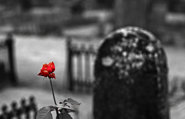
Alright, I'll bite. How'd you do this? :-)
For the background, it seems easy enough... it's grey stone with snow, so not much chroma to be had... But you seem to have gotten the leaves to go away, too.
Hmm, per-channel levels and/or curves?? Anyway, I'm curious. It's a nice shot, and neat to think it was done with only basic editing. |
|
| Photographer found comment helpful. |
|
|
12/25/2005 07:56:20 PM |
|
the emphasis of the rose by color is excellent but maybe a more grey toned photo would be better |
|
| Photographer found comment helpful. |
|
|
12/23/2005 09:25:10 PM |
|
Nice. A bit cheesy with colouring, but quite good as far as dof is concerned. |
|
| Photographer found comment helpful. |
|
|
12/22/2005 04:11:54 PM |
|
This is kind of hokey for my taste and almost as a rule I hate selective desaturation, but I do like the background quite a bit. I like the the way the gates create a visual maze leading you in and out of the picture. I think I would have enjoyed this more without the dying flower and instead the focus being on the headstone. The flower just interrupts my enjoyment of the background. |
|
| Photographer found comment helpful. |
|
|
12/21/2005 01:08:34 PM |
|
ehh, I'm torn. You do have a shallow depth of field here, but then you went and desaturated selectively as well, which almost takes away from the effect of the shallow dof and turns it into an effect of selective desaturation. I do like the image very much, just trying to decide if the selective desat is kind of a cheap shot (but very effective, visually.). OK. Giving this an 8 because it is such a compelling image and you did meet the challenge criteria. |
|
| Photographer found comment helpful. |
|
|
12/21/2005 09:04:43 AM |
|
I feel like the color, not the DOF, is what makes this image what it is. Still a great idea. |
|
| Photographer found comment helpful. |
|
|
12/21/2005 02:10:28 AM |
|
I don't think you used basic editing to get this effect |
|
|
|
12/21/2005 01:25:22 AM |
|
Excellent idea and selective desat. 10. |
|
| Photographer found comment helpful. |
Home -
Challenges -
Community -
League -
Photos -
Cameras -
Lenses -
Learn -
Help -
Terms of Use -
Privacy -
Top ^
DPChallenge, and website content and design, Copyright © 2001-2026 Challenging Technologies, LLC.
All digital photo copyrights belong to the photographers and may not be used without permission.
Current Server Time: 07/01/2026 07:29:29 AM EDT.