| Image |
Comment |
| 01/11/2006 01:10:32 PM |
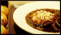
French Onion Soupby notesinstonesComment: I was toggling between a 6 and 7 for this one, but since I've a sucker for food, it was a 7. I do like the composition very much. The lighting gives it such a great atmosphere. I just think there's too much border and the tray (I'm assuming) that the coup is on doesn't work so well. It does look like it comes from a culinary magazine though. Great use of the onions as well. The dried oregano may have been too much. |
 Photographer found comment helpful. Photographer found comment helpful. |
| 01/11/2006 12:59:42 PM |
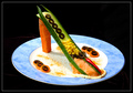
Food or Foot? by nessnajComment: Allow me to say this is extravagant! What I love about it is the design and creativity. Creativity wins the heart of most people. If you didn't put in a caption, I probably would have said it was a slider though. I gave this a 7 just because I'm a bit picky on the lighting (I'm not great at all though). I think if you had another plate that was more simple, I'd say it would be much more interesting. Just because the focal point is a tid bit distracting. |
| Photographer found comment helpful. |
| 01/11/2006 12:54:07 PM |
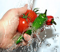
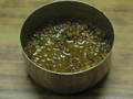
Dynamite Salsa by cheekymunkyComment: Compared to many others, you made this shot stand out very much. I originally gave this a 7, but I'll bump you up to an 8. You chose well on contrast. Great use of shutter speed and lighting. Heck your composition is great. I'll change this to a 9. It's almost flawless, it really is. I guess what made me not give you a 10 is because the white above the hand is just too much. Best of luck in getting a ribbon. I'm routing for you at least. |
| Photographer found comment helpful. |
| 01/11/2006 09:29:44 AM |
Dont Cryby sodastreamerComment: This isn't a culinary challenge, so I won't speak about your diced onions. The composition is alright, but I would have thought having the other half onion a bit further away might be better. I'm not exactly sure what's wrong with the picture, but something isn't work well and it throws me off quite a bit. Maybe it's because it looks like you've got a camera flash going on.
I must admit the frames should have been a lot thinner. It's too thick and it causes quite a lot of distraction to the whole image. So I threw you a 5. |
| Photographer found comment helpful. |
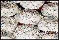
| 01/11/2006 09:23:30 AM |
Sprinklesby missinseattleComment: Oh dear, it's like over exposure on this. Honestly, if you don't mind me being blunt, it hurts my eyes. The sprinkles contrast in white is great, but I think the white is over done. Say if you could have taken a shot of 3 of them together showing a bit of skin of the actual dessert, I think it would have been more appealing. Your focus is good, but the lighting may have been a bit too strong as well. It's a job well done, but it's on overload, so I gave this one a 5. |
| Photographer found comment helpful. |
| 01/11/2006 09:20:29 AM |
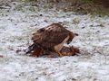
Fresh Dinnerby Buttox07Comment: Too brutal for me, but throwing that thought away and judging it like every other photo, I like the concept. Natural, but darn it freaks me out quite a bit. You've captured the mood of the predator very, unbelievably well. The picture itself is very blurry on its own merits. Maybe if you sharpened it a bit and added some saturation to the existing colours it would have stood out very well.
I'd say if you got this picture at a different angle, like at the bird's height rather than from your view, it would have been spectacular. Oh! Also, if placed off centre as well, it would have given it a more intriguing shot. So 5 for this shot. |
| Photographer found comment helpful. |
| 01/11/2006 09:16:13 AM |
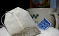
Add Waterby karmatComment: The composition for me works terribly well in this. The major downfall for me is the lighting. I'm not sure if it's the one from your camera or not, but it turns the picture off for me and upsets the whole atmosphere. I'm not sure if the entire setup puts of the picture as well, but I would have loved to see more contrasting colours to make it more appealing. It could be because I associate tea with happy, soothing times and this gives me more of a depressive/dull atmosphere. So a 5 it is. |
| Photographer found comment helpful. |
| 01/11/2006 09:12:28 AM |
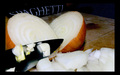
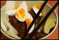
Messynoodlesby MazkaComment: Messy noodles? I swear I see rice. It might have been better without the frame, or at least a different coloured frame. The picture is quite out of focus to me, but you know what? You picture makes me feel like eating it already. It's lacking a bit in the composition, could be because the wooden table doesn't allow the dish to contrast very well. The lighting is alright. So overall, this was given a 5 from me. |
| Photographer found comment helpful. |
| 01/11/2006 09:10:06 AM |
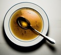
Clear Soupby e301Comment: It's a good picture, but it lacks a bit of compostition for me. I think you're spot on on lighting, but the presentation compared to others was not as attractive and appealing to me. It could be because of the low contrasting colours. So say if you could have a different colour ceramic bowl, it would have contrasted much better with the white background. I'm not sure what the background is, but the lines distract me a bit from the centre piece. It's a certainly good drawn in though. I gave this a 5. |
| Photographer found comment helpful. |
| 01/11/2006 09:05:54 AM |
INDIAN SALTY DISH(DALL)by sandeepsalwan45Comment: Honestly, when I saw this thumbnail, I said to myself I'd probably be giving this a 6 or 7. No offense, but once I enlarged it, it was such a big disappointment to me. The quality itself isn't very great, blurry so to speak. The set up is not so great. I gave this a 4, so I thought it deserved an explanation rather then just giving a low score and you not knowing why.
The colour contrast in the food is not great. Usually, for me top view doesn't work well. So if you could have placed somewhere else except in the centre, and given it a more side view and a few enhancements it might have faired a lot better. |
| Photographer found comment helpful. |
Home -
Challenges -
Community -
League -
Photos -
Cameras -
Lenses -
Learn -
Help -
Terms of Use -
Privacy -
Top ^
DPChallenge, and website content and design, Copyright © 2001-2025 Challenging Technologies, LLC.
All digital photo copyrights belong to the photographers and may not be used without permission.
Current Server Time: 12/20/2025 08:58:15 PM EST.