| Image |
Comment |
| 01/28/2003 05:59:36 PM |
A:\by KonadorComment: 3.5" x 3.7" ... ooh, missed by a fraction!
A good shot, and at least it's a real floppy and not one of those nasty transparent things.
A bit too bright on the sliding panel, but otherwise composition & focus are spot on. Well done. |
 Photographer found comment helpful. Photographer found comment helpful. |
| 01/28/2003 05:55:03 PM |
|
| Photographer found comment helpful. |
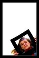
| 01/28/2003 04:56:36 PM |
Subtle Squareby BJComment: How do you find anything in your house? It's all camoflaged!
A nice gentle image. Composition is good but too centered for me. A square border would have helped a lot. |
| Photographer found comment helpful. |
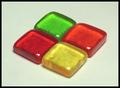
| 01/28/2003 04:54:24 PM |
Jolly Rancher Round-Upby calailleComment: Mmm tasty squares. Could have done with a white background to bring out the colours more, and an off center composition would have been nice. |
| Photographer found comment helpful. |
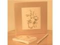
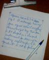
| 01/28/2003 04:51:26 PM |
Out of paper...by cnobreComment: Well, it is square, nicely composed (and neat legible writing!). Could have done with better lighting and a posher pen. |
| Photographer found comment helpful. |
| 01/28/2003 04:23:45 PM |
|
| Photographer found comment helpful. |
| 01/28/2003 02:04:00 PM |
Speeding in Leicester Square £20 fineby PaulkComment: Neat use of the motion effect. You can just make out the thread, but I reckon you can claim it's exhaust fumes.Good composition though maybe slightly overlit - would have liked to see more shadows/colour variance. |
| Photographer found comment helpful. |
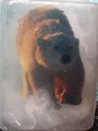
| 01/27/2003 06:46:32 PM |
Caught in a block of iceby camelotnorthComment: That's one hell of a big Fox's Glacier Mint (which probably won't make any sense if you're not British).
The lighting on the fur is lovely. Could have done to be cropped inside the "ice cube" to lose the background in the corners, though that may have made the link to "square" too hard to see. |
| Photographer found comment helpful. |
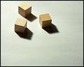
| 01/27/2003 01:32:24 PM |
Three Squareby DougPazComment: Nice simple composition. Lighting and exposure are good, but the image doesn't really grab the viewer. Needs something extra to make it stand out from the crowd. |
| Photographer found comment helpful. |
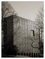
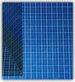
| 01/27/2003 12:48:41 PM |
ArchiSquaresby Dallas_TXComment: They look slightly rectangular to me, and there's a whole bunch of triangles going off in there ... but oh! what a cool photo!
The left hand side adds a bit of interest to what would otherwise be a very plain, repetitive shot. Nice work, well done. |
| Photographer found comment helpful. |
Home -
Challenges -
Community -
League -
Photos -
Cameras -
Lenses -
Learn -
Help -
Terms of Use -
Privacy -
Top ^
DPChallenge, and website content and design, Copyright © 2001-2025 Challenging Technologies, LLC.
All digital photo copyrights belong to the photographers and may not be used without permission.
Current Server Time: 08/01/2025 09:38:51 PM EDT.