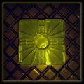
I think I will get a lot of comments saying that it is too centered, use the rule of thirds, etc. However I think that a centered composition works well here.
Statistics
Place: 103 out of 179 Avg (all users): 5.1276 Avg (commenters): 6.8571 Avg (participants): 5.1802 Avg (non-participants): 5.0588 Views since voting: 1476 Votes: 196 Comments: 17 Favorites: 0
FIRST IMPRESSION.. My first impression is that what are the odds, of doing about 6-7 reviews from what I guess is 250 photos, to review your shot again :) On to the photo... :)
COMPOSITION...once again, your description says it all... If more people self-critiqued their work it would make our jobs easier :) You're right, some shots cannot be improved by using the rule of thirds, and I fail to see what would be accomplished by shifting the diskette over to one of the sides. I do think the diskette should have been taken straight on though - the perspective makes the diskette look less of a square than it could have been head on. And not a very photogenic diskette - I guess it would be hard to find a diskette w/o a serial number, but I find as a main element of the photo, the numbers are a distraction. Perhaps also a very dark or very light diskette would have really stood out against the sea of CDs. Just a tad nit-picky, but we all must be sometimes :) ... I've also been wondering what kind of different effect you would get if you stacked something underneath the diskette - stacks of cards, folds of paper, etc...to lift the diskette off the surface of the CDs and therefore providing some depth... Just an idea that popped into my head...
TECHNIQUE... The lighting on 90% of the shot is first rate.I'm talking about catching the reflections off the CD - they came out splendidly. The light was too harsh on the diskette metal piece and I'm sure it could be corrected by moving your light source in a different position. If you ever find that moving your light source does not solve this type of problem, or that moving the light source ruins the lighting of the rest of the photo, you can always try diffusing the light (placing translucent items in front of the light source) or even try lower exposures to see if the problem is reduced. Course if you were doing this yourself you could a double exposure trick in photoshop: Use the above shot, then take one shot underexposed so you don't have that very bright spot in the photo. Layer both photos on top of the others and mask the top layer in such a way as to allow the underexposed shot come through in the right areas.
If that sounds too advanced, I can explain it further...its a technique that can solve lots of exposure problems when people are not moving and I'll try to teach it on any photo that can benefit from it, however small...
OVERALL... A pretty good shot that needed a head on composition, and some lighting solution to the overly bright portion of the disk. See you again next week :) :)
Great title. The picture isn't too bad either. The CD's make for a great background with better color and light effects. Nice idea and good pic - Inspzil
Composition: Disk looks slightly non-flat
Technical: Good focus. Not sure about dark CDs and bright spot on disk slide. Good border too.
Meets challenge: Yes
Overall impression: Lacking tech slightly. 5
Nice take on this shoot. The disk really stands out on top of the cds. This image has good clearity and the colors are good. I like this image, good job.
I think that this picture was a very creative idea. I think that the shine fromt he cds helped bring alot of intrest to your picture. I think that by using a colored disk the picture would have improved a little. Nice job
3.5" x 3.7" ... ooh, missed by a fraction!
A good shot, and at least it's a real floppy and not one of those nasty transparent things.
A bit too bright on the sliding panel, but otherwise composition & focus are spot on. Well done.
fun shot. wonder if there was something more compelling aobut this side of the disk? also the white balance seems a bit golden and there's some glariness on the metal.








 Add photograph to your favorites
 Add photographer to your favorites


 Photographer found comment helpful.


