| Image |
Comment |
| 12/12/2002 08:13:06 PM |
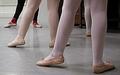
Future Grace in Motionby vtruanComment: very nice composition. i like the two student's white legs facing the instructor's black legs. the extra leg in the upper right is a little distracting. the toes lined up on the left are what makes this photo. nice shot! |
 Photographer found comment helpful. Photographer found comment helpful. |
| 12/12/2002 08:11:09 PM |
Tight Raceby jimmyn4Comment: i like the title and it probably was a tight race but i would have liked this photo better if there was more in it. maybe from a different angle including some marker, the finish line boats, a bouy, or something. |
| Photographer found comment helpful. |
| 12/12/2002 07:18:04 PM |
Grinding Showerby CubComment: interesting composition, nice overall tone. i would like to have seen either more sparks or greater depth of field. |
| Photographer found comment helpful. |
| 12/11/2002 10:39:06 PM |
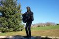
Singing the Blue'sby DianaComment: Critique Club critique:
COMPOSITION/CONTENT: I think you have a very good subject that is the only thing in the shadows. A fill flash might have given your subject the light it needs to be the focal point of the photo.
BACKGROUND: The background is a little off balance with the tree on one side and the sky on the other. I would like to have seen the camera at a higher angle pointing down a little more on the subject. This would bring the trees on the right up higher in the picture balancing the background. Either that or move the camera to an angle where the background has similar weighting on both sides of the statue.
CAMERA WORK/TECHNICAL: Exposure and focus is good.
DIGITAL PROCESSING/TECHNICAL: A little sharpening may have helped around the statue's face. Color is good.
MY OPINION: Maybe all that might be needed is a fill flash. The details of the statue would have shown and may have made a great photograph. If this monument is close by it might be worth trying the same shot with a flash. |
| Photographer found comment helpful. |
| 12/11/2002 08:36:11 PM |
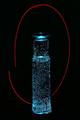
Blue 7by BadPiggComment: Critique Club critique:
COMPOSITION/CONTENT: Excellent composition and use of light. The bottle is not only full of bubbles but also full of light. The red light around the blue bottle creates a very nice contrast and the simple shapes make the photo very interesting.
BACKGROUND: The black background adds to the richness of the light shapes.
CAMERA WORK: Exposure and focus are just right giving the picture good contrast.
DIGITAL PROCESSING/TECHNICAL: good saturation of colors.
MY OPINION: I think the reason some for the comments about the red circle around the bottle are because the red light is assymetrical and of different quality and texture than the smooth and symmetrical bottle. If you left out the red light and zoomed in on the bottle I would have liked it also, but I like it better the way you did it. You might have started something here by your creative use of light. Great job!
|
| Photographer found comment helpful. |
| 12/11/2002 07:30:37 PM |
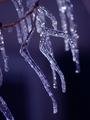
Icy Coldby RiderGalComment: Critique Club Critique:
(I will re-iterate and rephrase some of my previous comments since I already commented on your photo.)
COMPOSITION-CONTENT: The ice looks neat and i like it against the dark background. I would like to see more of that piece of ice at the left of the picture near the bottom. I think it might add to the picture. It is in focus about the same as the three main pieces of ice, making it part of the focal point of the photo, but not much of it is showing. Your comment on the submission says you 'cropped only to fit in the size specifications'. Maybe resizing instead of cropping could have included that piece.
BACKGROUND: The simple and uncluttered dark background sets off the shiney ice in the foreground quite well.
CAMERA WORK - TECHNICAL: Exposure is perfect, the tonal range and contrast add to the effect of the photo. Great use of depth of field.
DIGITAL PROCESSING - TECHNICAL: Turning up the blue for the challenge worked well. I would have turned down the red a little to take away the slightly purplish tint.
MY OPINION - I think it's a great subject and you did an excellent job of creating a cold and blue mood in the photo. All of the characteristics of the photo are in line with a great photo. Changing the camera angle, zooming out some, or maybe even resizing differently may have made it a great photo. |
| Photographer found comment helpful. |
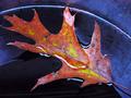
| 12/10/2002 10:48:21 PM |
wet leafby shutterflyComment: nice colors, the orange and blues and water. it looks like the leaf is in a bowl of some kind. if the dark part of the picture at the bottom is water in the bowl, and the bowl is blue underneath the water, i would have liked to see the blue there instead of the black. it would have kind of completed great color and quality you have in the rest of the photo. |
| Photographer found comment helpful. |
| 12/10/2002 10:41:22 PM |
|
| Photographer found comment helpful. |
| 12/10/2002 10:29:53 PM |
Last Year's Resolutionby myqylComment: the photo and title make sense, but moving the white stick thing out of the corner would improve this photo. it looks good in grayscale, good choice. |
| Photographer found comment helpful. |
| 12/09/2002 10:09:23 PM |
|
| Photographer found comment helpful. |
Home -
Challenges -
Community -
League -
Photos -
Cameras -
Lenses -
Learn -
Help -
Terms of Use -
Privacy -
Top ^
DPChallenge, and website content and design, Copyright © 2001-2025 Challenging Technologies, LLC.
All digital photo copyrights belong to the photographers and may not be used without permission.
Current Server Time: 08/01/2025 11:42:51 PM EDT.