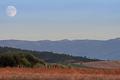
Tetons Storm Breakby
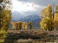
kearockComment: I have a feeling that it would have looked nicer to skip those trees to the left and right in the foreground and instead focuson the small group of trees in the back. What I would have done would have to be a bit closer to those trees and shoot at bit wider angle (stitching would be an option if this was you widest setting - check out autostitch). If possibly it would have been nice to make the rightmost tree in the background more prominent than the others (as it stand apart and has a slightly different color).
I would have placed those trees to the left in the frame and the mountaintop slightly to the right of the trees.
Now, my view of the scene is most certainly not more 'coorect' than yours, however I find that it always fun to see others interpretion of the scene.
However, if we only look at the image you captured instead, the blown out sky is quite distracting here and in my opinion the shadow in the foreground is also a distraction - either it should not be there at all or at least to be a bit darker.
As for nitpicking, I would like the snow on the mountaintop to be slightly brighter and the 'blue' and grey mountains a bit darker to increase contrast. This can be achieved by using dodge and burn (dodge the highlights [snow} and burn the shadows and perhaps the midrange (the mountains).
I think a slightly more sharpening would be in order here, I tried to use 0.2 in radius and 90% using smart sharpening in Photoshop CS2 and felt that was a slight improvement.
A slight S-curve would also be nice to increase the contrast in the image.
I also feel that you should use the sponge tool to increase the saturation in selective arease. In particular the bush under the tree to the right is a bit too desaturated for my taste. Perhaps also the lower dark portion of the rightmost tree?
I think you should have moved one step to the right when taking this photo so the tree to the left in the foreground wouldn't 'blend' with the leftmost tree in the background. A distraction as it is, in my opinion.
I find the signature in the bottom right corner to be quite irritating. At first I thought this white small pattern was a pattern of the picture so I think you either need to make the signature more prominent (and so one can read your name) or forego it.
EDIT: Perhaps being closer to the ground would have been nice?
Here's a quick editing job in Photoshop. (I know the tree to the left is too sharpened in this version.)
Message edited by author 2005-07-31 12:10:51.